
Product
Rust Support Now in Beta
Socket's Rust support is moving to Beta: all users can scan Cargo projects and generate SBOMs, including Cargo.toml-only crates, with Rust-aware supply chain checks.
By Mikola Lysenko, Trevor Norris - Sep 11, 2025
storybook-conditional-toolbar-selector
Advanced tools
Helper Storybook addon to define story specific toolbar dropdown to use in custom decorators

Helper Storybook addon to define story specific toolbar dropdown to use in custom decorators, similar to globals but with multiple variants.
E.g. for different sets of languages or themes available for backend vs public site specific stories or having some options not available on all stories.
With npm:
npm install --save-dev storybook-conditional-toolbar-selector
With yarn:
yarn add -D storybook-conditional-toolbar-selector
Register addon in .storybook/main.js or .storybook/main.ts
module.exports = {
  // ...
  addons: [
    'storybook-conditional-toolbar-selector',
    // ...
  ],
};
Define available sets and options in .storybook/preview.js or .storybook/preview.ts
export const parameters = {
actions: { argTypesRegex: '^on[A-Z].*' },
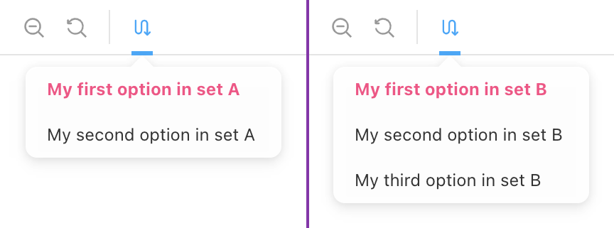
customConditionalToolbar: {
/** Defines the possible sets that can be shown */
sets: [
{
id: 'set-a',
options: [
{ id: 'a1', title: 'My First Option in Set A' },
{ id: 'a2', title: 'My Second Option in Set B' },
],
},
{
id: 'set-b',
options: [{ id: 'b1', title: 'Set B Option 1' }, { id: 'b2' }],
},
],
/** Icon to use in toolbar, defaults to `switchalt`. All possible icons here: https://storybookjs.netlify.app/official-storybook/?path=/story/basics-icon--labels */
icon: 'redirect',
/** title when hovering over the icon */
title: 'Test title',
/** Setting disable to true makes the addon disabled by default */
// disable: true,
},
};
Use the customConditionalToolbar parameter in you story to define if and which set to use:
export const MyStory = Template.bind({});
MyStory.parameters = {
  customConditionalToolbar: {
    setToUse: 'set-b',
    defaultOption: 'b2',
  },
};
{
  /** Title for the toolbar icon - (Optional) */
  title?: string;

  /** Icon to use in toolbar, defaults to `switchalt`. All possible icons here: https://storybookjs.netlify.app/official-storybook/?path=/story/basics-icon--labels - (Optional) */
  icon?: IconsProps["icon"];

  /** Sets of dropdown options */
  sets: DropdownSet[];

  /** Default set to use `null | undefined` do disable theme selection if not explicitly set - (Optional) */
  default?: string | null;

  /** If nothing is selected the first option is auto-selected - defaults to `true` - (Optional)*/
  autoSelectFirstOption?: boolean;

  /** If `true` toolbar item is disabled (hidden) - (Optional) */
  disable?: boolean;
};
Typescript type ConditionalToolbarSelectorParameter
All options that Preview Parameters API (Global) provides (all as optional) plus the options below:
{
  /** Set to pick the theme from - (Optional)*/
  setToUse?: string | null;

  /** default option to select - (Optional) */
  defaultOption?: string | null;
}
Typescript type CustomConditionalToolbarStoryParameter
Notes:
FAQs
Helper Storybook addon to define story specific toolbar dropdown to use in custom decorators
We found that storybook-conditional-toolbar-selector demonstrated a not healthy version release cadence and project activity because the last version was released a year ago. It has 1 open source maintainer collaborating on the project.
Did you know?

Socket for GitHub automatically highlights issues in each pull request and monitors the health of all your open source dependencies. Discover the contents of your packages and block harmful activity before you install or update your dependencies.
Product
Socket's Rust support is moving to Beta: all users can scan Cargo projects and generate SBOMs, including Cargo.toml-only crates, with Rust-aware supply chain checks.

Product
Socket Fix 2.0 brings targeted CVE remediation, smarter upgrade planning, and broader ecosystem support to help developers get to zero alerts.

Security News
Socket CEO Feross Aboukhadijeh joins Risky Business Weekly to unpack recent npm phishing attacks, their limited impact, and the risks if attackers get smarter.