Styled Components Carousel
A simple React Carousel component written in Typescript and built with styled-components using React Hooks.
Heavily inspired by react-slick with a simplified API and small behaviour changes.
Getting Started
Prerequisites
This component expects that you will have the following packages installed:
Installation
NPM
npm install styled-components-carousel
Yarn
yarn add styled-components-carousel
Examples
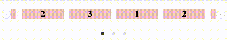
Basic Usage
import Carousel from 'styled-components-carousel';

const Example = () => (
    <Carousel
        center
        infinite
        showArrows
        showIndicator
        slidesToShow={3}
    >
        <div>
            <span>1</span>
        </div>
        <div>
            <span>2</span>
        </div>
        <div>
            <span>3</span>
        </div>
    </Carousel>
);
Breakpoints Usage
You can define custom settings per breakpoint for truly responsive behaviour.
import Carousel from 'styled-components-carousel';

const Example = () => (
    <Carousel
        slidesToShow={3}
        center
        centerPadding={30}
        breakpoints={[
            {
                size: 200,
                settings: {
                    slidesToShow: 1,
                    showArrows: false,
                    showIndicator: false,
                    swipeable: true,
                },
            },
            {
                size: 600,
                settings: {
                    slidesToShow: 3,
                    showArrows: false,
                    showIndicator: true,
                    swipeable: true,
                },
            },
            {
                size: 1000,
                settings: {
                    slidesToShow: 4,
                    showArrows: true,
                    showIndicator: true,
                    center: true,
                    swipeable: true,
                },
            },
        ]}
    >
        <div>
            <span>1</span>
        </div>
        <div>
            <span>2</span>
        </div>
        <div>
            <span>3</span>
        </div>
    </Carousel>
);
Props
| center | boolean | No | Should the items be centered? | False |
| infinite | boolean | No | Should the carousel infinitely scroll the items | False |
| showIndicator | boolean | No | Should the bottom item indicator be shown? | True |
| showArrows | boolean | No | Should the side navigation arrows be shown? | True |
| swipeable | boolean | No | Is the carousel swipeable? | True |
| debug | boolean | No | A dev helper prop for debugging development | False |
| slidesToShow | number | No | The number of slides to show at once. | 1 |
| scaleOnFocus | number | No | How much should the focused item scale? | 1 |
| centerPadding | number | No | Used in conjunction with center property to adding padding to center card | 0 |
| breakpoints | array | No | An array of settings in order to have responsive behaviour for different screen sizes | undefined |
Development
Storybook
yarn storybook
Run tests
yarn test
Build
yarn build
RoadMap (open to feature requests)
- Accessibility support
- Custom slide animation
- Custom arrow component
- Custom indicator component
- Vertical track


