Product
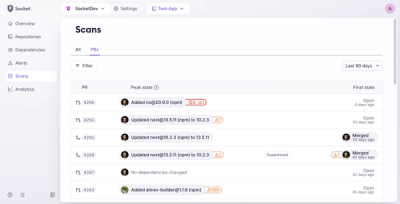
Introducing Pull Request Stories to Help Security Teams Track Supply Chain Risks
Socket’s new Pull Request Stories give security teams clear visibility into dependency risks and outcomes across scanned pull requests.
styled-components-media-query
Advanced tools
Styled components utility for building media queries
Simple styled components utility that you can use for building media queries.
yarn add styled-components-media-querynpm i --save styled-components-media-queryimport { styled, css } from 'styled-components'
import MqInit from 'styled-components-media-query'
// initialize
const bp = {s: 400, sl: 500, m: 768, ml: 992, l: 1100}
const mq = MqInit({ bp })
// use like this
const ComponentStyled = styled.div`
background: red;
// max-width(399px)
${mq(null, 's')(css`
background: green;
`)}
// between min-width(400px) and max-width(767px)
${mq('s', 'm')(css`
background: black;
`)}
// min-width(768px)
${mq('m')(css`
background: orange;
`)}
// min-width(1100px)
${mq('l')(css`
background: purple;
`)}
`
/* compiled css */
.myClass {
  background: red;
}
@media only screen and (max-width: 399px) {
  .myClass {
    background: green;
  }
}
@media only screen and (min-width: 400px) and (max-width: 767px) {
  .myClass {
    background: black;
  }
}
@media only screen and (min-width: 768px) {
  .myClass {
    background: orange;
  }
}
@media only screen and (min-width: 1100px) {
  .myClass {
    background: purple;
  }
}
MqInit({ bp, type })
bp (object): a breakpoint object (optional).type (string): can be 'width' or 'height' (optional).import { styled, css } from 'styled-components'
import MqInit from 'styled-components-media-query'
const bp = {s: 300, m: 500, l: 800}
// this will build min-width, max-width queries
const mqWidth = MqInit({ bp, type: 'width' })
// this will build min-height, max-height queries
const mqHeight = MqInit({ bp, type: 'height' })
If you don't pass any value when initializing MqInit, it will use the default bp object and type string, which are:
const bp = {
  xxxs: 0,
  xxs: 200,
  xs: 320,
  s: 400,
  sl: 500,
  m: 768,
  ml: 992,
  l: 1100,
  xl: 1200,
  xxl: 1300,
  xxxl: 1400,
  xxxxl: 1500,
  xxxxxl: 1600,
  xxxxxxl: 1700,
}
const type = 'width'
You can also use mq directly without initializing MqInit at all, but I don't recommend using my breakpoints, always better to tailor them for the specific project.
import { styled, css } from 'styled-components'
import {mq} from 'styled-components-media-query'

const CompStyled = styled.div`
  // min-width(768px)
  ${mq('m')(css``)}
`
mq(min, max)
min (string|number|null): min-width or min-height value.max (string|number|null): max-width or max-height value.You can use the mq function to specify min-width, max-width, min-height and max-height. Examples:
import { styled, css } from 'styled-components'
import MqInit from 'styled-components-media-query'

const bp = {s: 300, m: 500, l: 800}
const mq = MqInit({ bp })
const mqHeight = MqInit({ bp, type: 'height' })

const CompStyled = styled.div`
  // min-width(500px)
  ${mq('m')(css``)}

  // max-width(500px)
  ${mq(null, 'm')(css``)}

  // between min-width(500px) and max-width(799px)
  ${mq('m', 'l')(css``)}

  // min-height(500px)
  ${mqHeight('m')(css``)}

  // max-height(500px)
  ${mqHeight(null, 'm')(css``)}

  // between min-height(500px) and max-height(799px)
  ${mqHeight('m', 'l')(css``)}
`
If you specify a string that is not in the bp object, it will throw an error, however, if needed, you can pass a specific number directly:
import { styled, css } from 'styled-components'
import MqInit from 'styled-components-media-query'

const mq = MqInit()

const CompStyled = styled.div`
  // min-width(300px)
  ${mq(300)(css``)}

  // max-width(603px)
  ${mq(null, 603)(css``)}

  // between min-width(23px) and max-width(900px)
  ${mq(23, 900)(css``)}
`
Also, the css helper is not necessary, so if you want you can use mq like this:
import { styled } from 'styled-components'
import MqInit from 'styled-components-media-query'

const mq = MqInit()

const CompStyled = styled.div`
  // min-width(300px)
  ${mq(300)(``)} // note that 'css' helper is missing
`
1.0.15 (2019-01-10)
<a name="1.0.14"></a>
FAQs
Styled components utility for building media queries
We found that styled-components-media-query demonstrated a not healthy version release cadence and project activity because the last version was released a year ago. It has 1 open source maintainer collaborating on the project.
Did you know?

Socket for GitHub automatically highlights issues in each pull request and monitors the health of all your open source dependencies. Discover the contents of your packages and block harmful activity before you install or update your dependencies.

Product
Socket’s new Pull Request Stories give security teams clear visibility into dependency risks and outcomes across scanned pull requests.

Research
/Security News
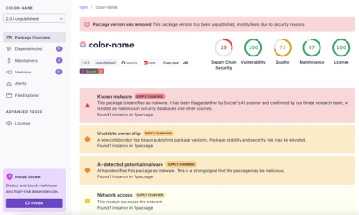
npm author Qix’s account was compromised, with malicious versions of popular packages like chalk-template, color-convert, and strip-ansi published.

Research
Four npm packages disguised as cryptographic tools steal developer credentials and send them to attacker-controlled Telegram infrastructure.