Sunlit Theme 日/夜主题切换组件
一个基于 Vue 3 的日/夜主题切换组件,灵感来自 Sunlit Place 和 Daylight Computer。
特性
- 优雅的日/夜间主题切换效果
- 支持
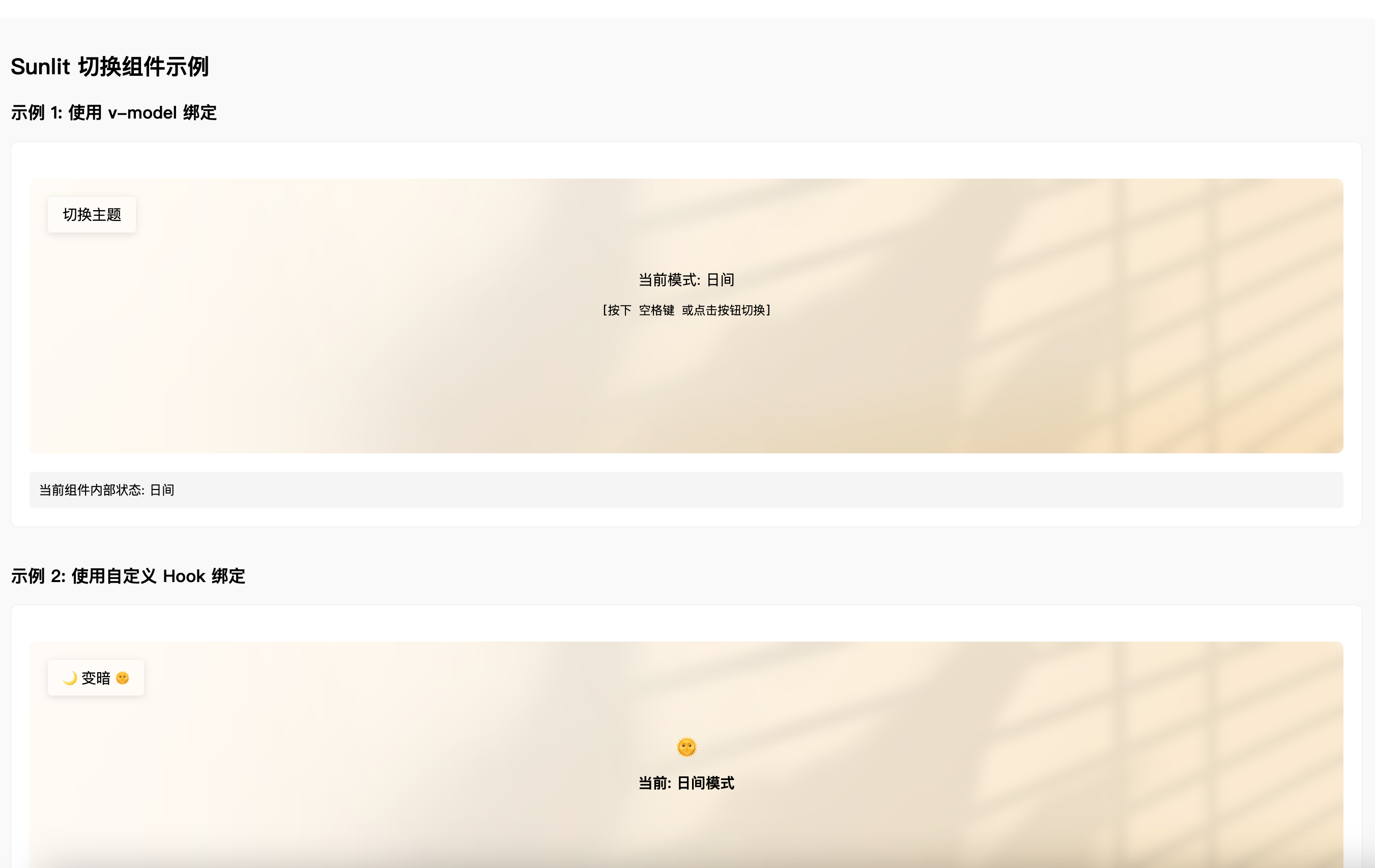
v-model 双向绑定
- 提供
useSunlitTheme Hook,方便在整个应用中使用
- 支持作为 Vue 插件使用
- 完全可定制的 UI (通过插槽)
- 支持本地存储主题偏好
- 通过空格键切换主题
安装
npm install sunlit-theme
yarn add sunlit-theme
pnpm add sunlit-theme
使用方法
基本用法
<template>
  <SunlitToggle v-model="isDark" />
</template>

<script setup>
import { ref } from "vue";
import { SunlitToggle } from "sunlit-theme";
import "sunlit-theme/style.css";

const isDark = ref(false);
</script>
使用 Hook
<template>
  <SunlitToggle v-model="isDark" />
  <button @click="toggle">程序化切换</button>
</template>

<script setup>
import { SunlitToggle, useSunlitTheme } from "sunlit-theme";
import "sunlit-theme/style.css";

const { isDark, toggle } = useSunlitTheme({
  initialDark: false,
  onChange: (value) => {
    console.log(`主题已切换为: ${value ? "夜间" : "日间"}模式`);
  },
});
</script>
自定义内容
<template>
  <SunlitToggle v-model="isDark">
    <!-- 自定义按钮内容 -->
    <template #button>
      <span> {{ isDark ? "变亮" : "变暗" }} </span>
    </template>

    <!-- 自定义状态显示 -->
    <template #status>
      <div class="custom-status">
        <div class="icon">{{ isDark ? "" : "" }}</div>
        <div class="text">当前: {{ isDark ? "夜间模式" : "日间模式" }}</div>
      </div>
    </template>
  </SunlitToggle>
</template>

<script setup>
import { ref } from "vue";
import { SunlitToggle } from "sunlit-theme";
import "sunlit-theme/style.css";

const isDark = ref(false);
</script>
作为 Vue 插件使用
import { createApp } from "vue";
import App from "./App.vue";
import SunlitTheme from "sunlit-theme";
import "sunlit-theme/style.css";

const app = createApp(App);
app.use(SunlitTheme);
app.mount("#app");
API
SunlitToggle 组件
Props
| modelValue | boolean | false | 用于 v-model 绑定 |
| label | string | '切换模式' | 按钮显示文本 |
| animationEnabled | boolean | true | 是否启用动画 |
事件
| update:modelValue | (value: boolean) | v-model 更新事件 |
| change | (value: boolean) | 主题切换事件 |
插槽
| button | 自定义按钮内容 |
| status | 自定义状态显示内容 |
useSunlitTheme Hook
参数
| initialDark | boolean | false | 初始主题状态 |
| storageKey | string | 'sunlit-theme-mode' | 本地存储的键名 |
| onChange | (isDark: boolean) => void | undefined | 主题变化时的回调 |
| enableStorage | boolean | true | 是否启用本地存储 |
| updateHtmlClass | boolean | true | 是否更新 HTML 类名 |
| darkClassName | string | 'dark-mode' | 暗色模式对应的类名 |
返回值
| isDark | Ref<boolean> | 当前主题状态的响应式引用 |
| toggle | () => void | 切换主题的函数 |
| setDark | (value: boolean) => void | 设置主题状态的函数 |
打包与开发
安装依赖
pnpm install
开发
pnpm dev
打包组件库
pnpm build:lib
许可证
MIT


