Svelte Native - NativeScript UI
Provides support for using NativeScript UI in Svelte Native Applications
Usage
npm install any of the following nativescript ui packages you wish to use.
Supported:
In your project's app.ts file, add:
import RadListViewElement from "svelte-native-nativescript-ui/listview"
import RadSideDrawerElement from "svelte-native-nativescript-ui/sidedrawer"
import RadCalendarElement from "svelte-native-nativescript-ui/calendar"
import Charts from "svelte-native-nativescript-ui/chart"
import RadDataFrom from "svelte-native-nativescript-ui/dataform"
import Gauges from "svelte-native-nativescript-ui/gauge"
import AutoCompleteElement from "svelte-native-nativescript-ui/autocomplete"
RadListViewElement.register();
RadSideDrawerElement.register();
RadCalendarElement.register();
Charts.register();
RadDataFrom.register();
Gauges.register();
AutoCompleteElement.register();
Then use them in your .svelte components:
  <radSideDrawer>
    ...
    <radSideDrawer.mainContent>
       <radListView>
        ...
       </radListView>
    </radSideDrawer.mainContent>
  </radSideDrawer>
Demo Project
The included demo project can be launched with:
$ cd demo
$ npm install
$ tns run android
The demo contains examples for each of the supported elements that you can use as a starting poing.
Usage
The documentation for the supported controls can be obtained from the NativeScript site
The differences between the documentation at the nativescript site and the usage in svelte-native can be observed by looking at the examples in the demo project.
The main differences are the assigning of configuration elements to their parent's properties, and the handling of templates.
Automatic parent properties
Most configuration elements in the nativescript-ui components only have a single valid parent component and property that they can be assigned to. Svelte Native sets the default parent property for these configuration elements where possible.
eg
  <chart:RadCartesianChart id="cartesianChart">
    <chart:RadCartesianChart.horizontalAxis>
        <chart:CategoricalAxis/>
    </chart:RadCartesianChart.horizontalAxis>
    <chart:RadCartesianChart.verticalAxis>
        <chart:LinearAxis/>
    </chart:RadCartesianChart.verticalAxis>
    <chart:RadCartesianChart.series>
        <chart:LineSeries items="{{ categoricalSource }}" categoryProperty="Country" valueProperty="Amount">
        </chart:LineSeries>
    </chart:RadCartesianChart.series>
  </chart:RadCartesianChart>
becomes:
  <radCartesianChart id="cartesianChart">
    <categoricalAxis prop:horizontalAxis />
    <linearAxis prop:verticalAxis/>
    <lineSeries items="{ categoricalSource }" categoryProperty="Country" valueProperty="Amount" />
  </radCartesianChart>
Note that since the axis elements are valid on either the horizontalAxis or verticalAxis properties, they still need to be specified using svelte-natives prop: directive.
Template Element
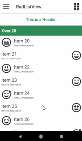
When a controls needs to render a child view multiple times (RadAutoCompleteTextView, RadListView) , Svelte Native configures the controls to use Template elements.
For RadListView the item the template represents is given by the type, eg:
  <Template type="{ListViewViewType.HeaderView}" >
    <label class="header">This is a Header</label>
  </Template>

  <Template type="{ListViewViewType.FooterView}" >
    <label class="footer">This is a Footer</label>
  </Template>
For Autocomplete it is given as the child of a suggestionView element:
  <suggestionView suggestionViewHeight="300">
    <Template let:item>
        <stackLayout orientation="horizontal" height="40">
            <label text="{ item.text }" marginLeft="10" verticalAlignment="center"/>
        </stackLayout>
    </Template>
  </suggestionView>