Product
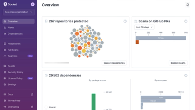
A New Overview in our Dashboard
We redesigned Socket's first logged-in page to display rich and insightful visualizations about your repositories protected against supply chain threats.
By André Staltz - Apr 29, 2025
A package for building tabs that comply with WCAG accessibility guidelines. The tabs can be navigated using both a mouse and a keyboard. The package also includes various configuration options.
tabs-a11y/dist/js/script.min.csstabs-a11y/dist/css/styles.min.cssInclude the css file from dist/css/styles.min.css
<div class="tabs" id="tabs">
    <div class="tabs__nav"></div>
    <div class="tabs__panels">
        <div class="tab-panel">
            <h3 class="tab-panel__title">Aliquid architecto</h3>
            <div class="tab-panel__content">Assumenda dolores est fuga id iure minima non rem repellat, ullam voluptatem.</div>
        </div>
        <div class="tab-panel">
            <h3 class="tab-panel__title">Consectetur deserunt</h3>
            <div class="tab-panel__content">Accusantium adipisci animi consectetur delectus dolor dolores, magni molestiae nulla odit quo saepe suscipit unde.</div>
        </div>
        <div class="tab-panel">
            <h3 class="tab-panel__title">Ducimus</h3>
            <div class="tab-panel__content">In libero molestiae odio odit perferendis praesentium repellat sed vero voluptatum? Eius quidem recusandae sapiente?</div>
        </div>
    </div>
</div>
Include the js file from dist/js/script.min.css
or
//commonjs
var tabs = require('tabs-a11y');

new tabs();
{
    contextID: 'tabs',
    classes: {
        tabsNavContainer: '.tabs__nav',
        tabsNavList: '.tabs__nav-list',
        tabsNavButton: '.tabs__nav-btn',
        tabPanel: '.tab-panel',
        tabPanelTitle: '.tab-panel__title',
    },
    selectors: {
        tabPanelIdPrefix: 'tabpanel',
        tabPanelOpen: 'tab-panel--open',
    },
    options: {
        useCustomNav: false,
        customNavTitles: [],
        initSelectedItem: 1,
        removeTabPanelTitle: false,
    }
}
| Option | Type | Description |
|---|---|---|
| contextID | string | Main Container ID. |
| classes.tabsNavContainer | string | Navigation tabs container css class. Use this only when you want create custom navigation. |
| classes.tabsNavList | string | Navigation tabs list css class. Use this only when you want create custom navigation. |
| classes.tabsNavButton | string | Navigation tabs buttons css class. Use this only when you want create custom navigation. |
| classes.tabPanel | string | Single tab panel css class. |
| classes.tabPanelTitle | string | Single tab title panel css class. This text will be copy to navigation button. |
| selectors.tabPanelIdPrefix | string | Selector that will be used as ID prefix to add correct aria structure for accessibility. |
| selectors.tabPanelOpen | string | Selector that will be used as css class to indicate open tab panel. |
| options.useCustomNav | boolean | Indicate if should use custom tabs navigation. Important note is that you have to put your css classes to configuration object. |
| options.customNavTitles | array | Array with custom titles. |
| options.initSelectedItem | number | Indicate which tab should be open on initial state. Count start from 0. |
| options.removeTabPanelTitle | boolean | Indicate if we should remove title from tab panel that will be moved to navigation tab buttons. |
You can use the data-nav-title attribute on the tabPanelTitle CSS class to copy its content to the navigation tabs button."
<div class="tabs" id="tabs">
    <div class="tabs__nav"></div>
    <div class="tabs__panels">
        <div class="tab-panel">
            <h3 class="tab-panel__title" data-nav-title="This is a custom title 1">Aliquid architecto</h3>
            <div class="tab-panel__content">Assumenda dolores est fuga id iure minima non rem repellat, ullam voluptatem.</div>
        </div>
        <div class="tab-panel">
            <h3 class="tab-panel__title">Consectetur deserunt</h3>
            <div class="tab-panel__content">Accusantium adipisci animi consectetur delectus dolor dolores, magni molestiae nulla odit quo saepe suscipit unde.</div>
        </div>
        <div class="tab-panel">
            <h3 class="tab-panel__title" data-nav-title="This is a custom title 2">Ducimus</h3>
            <div class="tab-panel__content">In libero molestiae odio odit perferendis praesentium repellat sed vero voluptatum? Eius quidem recusandae sapiente?</div>
        </div>
    </div>
</div>
<div class="tabs" id="tabs">
    <div class="custom-tabs__nav">
        <div class="custom-tabs__nav-inner">
            <button class="custom-tabs__nav-button" role="tab">Tab 1</button>
            <button class="custom-tabs__nav-button" role="tab">Tab 2</button>
            <button class="custom-tabs__nav-button" role="tab">Tab 3</button>
        </div>
    </div>
    <div class="tabs__panels">
        <div class="tab-panel">
            <h3 class="tab-panel__title">Aliquid architecto</h3>
            <div class="tab-panel__content">Assumenda dolores est fuga id iure minima non rem repellat, ullam voluptatem.</div>
        </div>
        <div class="tab-panel">
            <h3 class="tab-panel__title">Consectetur deserunt</h3>
            <div class="tab-panel__content">Accusantium adipisci animi consectetur delectus dolor dolores, magni molestiae nulla odit quo saepe suscipit unde.</div>
        </div>
        <div class="tab-panel">
            <h3 class="tab-panel__title">Ducimus</h3>
            <div class="tab-panel__content">In libero molestiae odio odit perferendis praesentium repellat sed vero voluptatum? Eius quidem recusandae sapiente?</div>
        </div>
    </div>
</div>
//commonjs
var tabs = require('tabs-a11y');

new tabs({
    classes: {
        tabsNavContainer: '.custom-tabs__nav',
        tabsNavList: '.custom-tabs__nav-inner',
        tabsNavButton: '.custom-tabs__nav-button',
    },
    options: {
        useCustomNav: true,
    }
});
<div class="tabs" id="tabs">
    <div class="tabs__nav"></div>
    <div class="tabs__panels">
        <div class="tab-panel">
            <h3 class="tab-panel__title" data-nav-title="This is a custom title 1">Aliquid architecto</h3>
            <div class="tab-panel__content">Assumenda dolores est fuga id iure minima non rem repellat, ullam voluptatem.</div>
        </div>
        <div class="tab-panel">
            <h3 class="tab-panel__title">Consectetur deserunt</h3>
            <div class="tab-panel__content">Accusantium adipisci animi consectetur delectus dolor dolores, magni molestiae nulla odit quo saepe suscipit unde.</div>
        </div>
        <div class="tab-panel">
            <h3 class="tab-panel__title" data-nav-title="This is a custom title 2">Ducimus</h3>
            <div class="tab-panel__content">In libero molestiae odio odit perferendis praesentium repellat sed vero voluptatum? Eius quidem recusandae sapiente?</div>
        </div>
    </div>
</div>
//commonjs
var tabs = require('tabs-a11y');

new tabs({
    options: {
        customNavTitles: [
            'Custom title 1',
            'Custom title 2',
            'Custom title 3',
        ],
    }
});
FAQs
Tabs with Full Accessibility
The npm package tabs-a11y receives a total of 28 weekly downloads. As such, tabs-a11y popularity was classified as not popular.
We found that tabs-a11y demonstrated a healthy version release cadence and project activity because the last version was released less than a year ago. It has 0 open source maintainers collaborating on the project.
Did you know?

Socket for GitHub automatically highlights issues in each pull request and monitors the health of all your open source dependencies. Discover the contents of your packages and block harmful activity before you install or update your dependencies.
Product
We redesigned Socket's first logged-in page to display rich and insightful visualizations about your repositories protected against supply chain threats.
Product
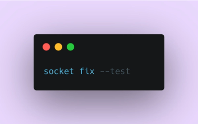
Automatically fix and test dependency updates with socket fix—a new CLI tool that turns CVE alerts into safe, automated upgrades.

Security News
CISA denies CVE funding issues amid backlash over a new CVE foundation formed by board members, raising concerns about transparency and program governance.