Security News
/Research
Wallet-Draining npm Package Impersonates Nodemailer to Hijack Crypto Transactions
Malicious npm package impersonates Nodemailer and drains wallets by hijacking crypto transactions across multiple blockchains.
tailwindcss-safe-area-capacitor
Advanced tools
Tailwind CSS safe area helpers for capacitor-plugin-safe-area.
Safe area inset utilities extending margin, padding, and height. The plugin provides base, offset, and or utilities for better adaptability across various scenarios. This is an adaptation of the tailwindcss-safe-area project that is intended to pair with the AlwaysLoveme/capacitor-plugin-safe-area plugin for Capacitor.
npm install --dev tailwindcss-safe-area-capacitor
Then add the plugin to your tailwind.config.js file:
// tailwind.config.js
module.exports = {
	theme: {},
	plugins: [require('tailwindcss-safe-area-capacitor')],
}
This plugin extends the padding and margin utilities with three types:
Base Utilities: The base safe area inset utilities. These include the initial padding and margin utilities with the safe area in consideration. They can be used where you want the element to respect the safe area insets.
Offset Utilities: These utilities allow you to extend the base safe area inset by a given offset. This can be particularly useful when you want a bit more spacing than the safe area provides, for example in situations where you have a translucent UI over a background image or video and want to ensure important visual content isn't covered.
Or Utilities: These utilities let you specify a minimum value to use if it's greater than the safe area inset. This can be used when you have certain layout elements that should respect the safe area but should never be smaller than a certain size.
Here are some examples:
<header class="pt-safe">...</header>

<main class="px-safe">
	<p>ciao</p>
</main>

<footer class="pb-safe">...</footer>
The offset utilities can be used by appending -offset-{value} to the base utility. This applies an additional margin or padding equal to the specified value. For example, if you want to apply a right padding that is equal to the safe area inset plus 4 units of your spacing scale, you can use:
<div class="pr-safe-offset-4">...</div>
The or utilities can be used by appending -or-{value} to the base utility. This applies a margin or padding that is the larger of the safe area inset and the specified value. For example, if you want to apply a bottom padding that is the larger of the safe area inset and 8 units of your spacing scale, you can use:
<div class="pb-safe-or-8">...</div>
| Utilities | Styles |
|---|---|
m-safe, p-safe | var(--safe-area-inset-{top, right, bottom, left}) |
mx-safe, px-safe | var(--safe-area-inset-{right, left}) |
my-safe, py-safe | var(--safe-area-inset-{top, bottom}) |
mt-safe, pt-safe | var(--safe-area-inset-top) |
mr-safe, pr-safe | var(--safe-area-inset-right) |
mb-safe, pb-safe | var(--safe-area-inset-bottom) |
ml-safe, pl-safe | var(--safe-area-inset-left) |
min-h-screen-safe, h-screen-safe | calc(100vh - (var(--safe-area-inset-top) + var(--safe-area-inset-bottom)))-webkit-fill-available |
*-safe-offset-{value} | calc(var(--safe-area-inset-*) + {value}) |
*-safe-or-{value} | max(var(--safe-area-inset-*), {value}) |
Tip: To extend html content behind the safe area, set
viewport-fit=cover
<meta
	name="viewport"
	content="width=device-width, initial-scale=1.0, viewport-fit=cover"
/>
<header class="pt-safe">...</header>
This applies a top padding to the header that is equal to the safe area inset at the top. The generated CSS would be:
.pt-safe {
	padding-top: var(--safe-area-inset-top);
}
<div class="pr-safe-offset-4">...</div>
This applies a right padding to the div that is equal to the safe area inset on the right plus 4 units of your spacing scale. Assuming your spacing scale unit is 8px (default in Tailwind CSS), the generated CSS would be:
.pr-safe-offset-4 {
	padding-right: calc(var(--safe-area-inset-right) + 1rem);
}
<div class="pb-safe-or-8">...</div>
This applies a bottom padding to the div that is the larger of the safe area inset at the bottom and 8 units of your spacing scale. Assuming your spacing scale unit is 8px (default in Tailwind CSS), the generated CSS would be:
.pb-safe-or-8 {
	padding-bottom: max(var(--safe-area-inset-bottom), 2rem);
}
The h-screen-safe and min-h-screen-safe utilities may not work as expected on Google Chrome. Add height: -webkit-fill-available on parent nodes:
@tailwind base;
@tailwind components;
@tailwind utilities;

@layer base {
	html {
		height: -webkit-fill-available;
	}

	body {
		height: -webkit-fill-available;
	}

	/* If using React, set height on the root div as well */
	#root {
		height: -webkit-fill-available;
	}
}
FAQs
Tailwind CSS safe area helpers for capacitor-plugin-safe-area.
The npm package tailwindcss-safe-area-capacitor receives a total of 1,540 weekly downloads. As such, tailwindcss-safe-area-capacitor popularity was classified as popular.
We found that tailwindcss-safe-area-capacitor demonstrated a not healthy version release cadence and project activity because the last version was released a year ago. It has 1 open source maintainer collaborating on the project.
Did you know?

Socket for GitHub automatically highlights issues in each pull request and monitors the health of all your open source dependencies. Discover the contents of your packages and block harmful activity before you install or update your dependencies.

Security News
/Research
Malicious npm package impersonates Nodemailer and drains wallets by hijacking crypto transactions across multiple blockchains.

Security News
This episode explores the hard problem of reachability analysis, from static analysis limits to handling dynamic languages and massive dependency trees.

Security News
/Research
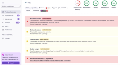
Malicious Nx npm versions stole secrets and wallet info using AI CLI tools; Socket’s AI scanner detected the supply chain attack and flagged the malware.