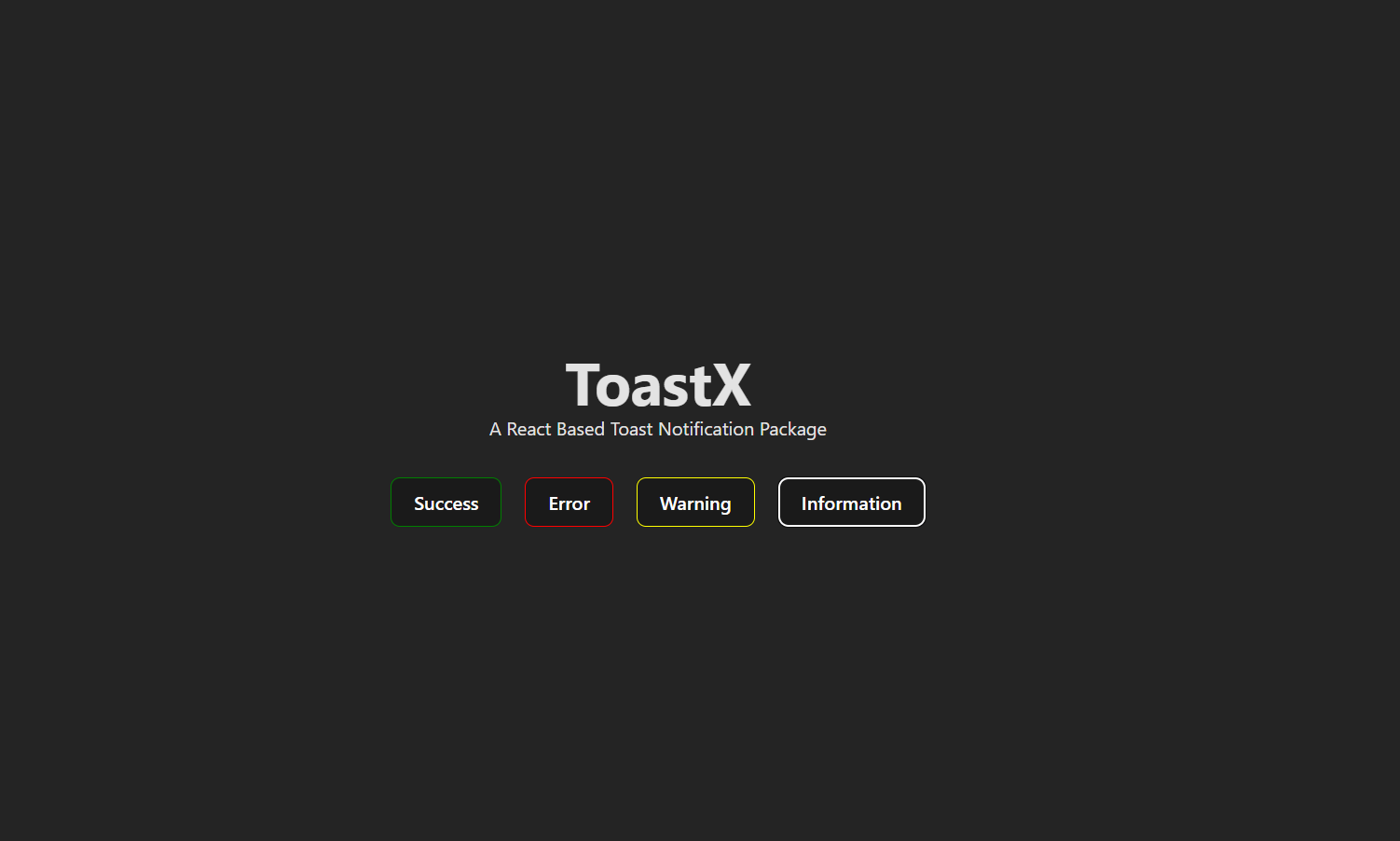
ToastX - A Beautiful and Customizable Toast Notification Library
ToastX is a lightweight and highly customizable React toast notification package that provides visually appealing and responsive notifications with smooth animations.
Highly customizable, we can use images, our own css styles (i.e background colors etc) to modify this toasts and
Open other pages also just by clicking on the toast just like notifications.
🚀 Features
-
Fully customizable styles
-
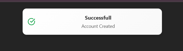
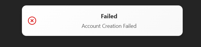
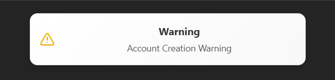
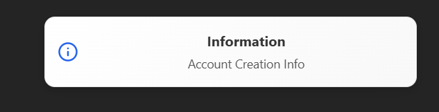
Supports success, error, warning, and info toasts
-
Smooth animations using Framer Motion
-
Auto-dismiss after a configurable duration
-
Clickable notifications with optional navigation
-
Lightweight and easy to use
🖼️ Screenshots
📦 Installation
To install ToastX, run the following command:
npm install toastx
or using Yarn:
yarn add toastx
🔧 Usage
1️⃣ Use your app with ToastContainer
In your root component (e.g., App.jsx, main.jsx), use your application with the ToastContainer.
import React from "react";
import {ToastContainer} from "toastx";

const App = () => {
  return (
<>
      <ToastContainer />
      <YourMainComponent />
</>
);
};

export default App;
2️⃣ Triggering a Toast Notification
Use the toast to trigger a toast anywhere in your app.
import React from "react";
import { toast } from "toastx";

const MyComponent = () => {

  return (
    <button
      onClick={() => toast.success("Success!", "Your action was successful", "img url", "URL for another page", {backGroundColor: "red", etc}, {}, {}, {})}
    >
      Show Toast
    </button>
  );
};

export default MyComponent;
🎨 Customization
ToastX supports various custom styles for complete flexibility. It is done sequentially only using parameters to keep it simple.
The sequence for this parameters are in this way -
toast.success("Notification Name",
          "Sub message",
          "Image URL",
          "URL if any(to open a new page),
          { styles for outer box of toast (use camle case for this (I.e fontSize: "10px"))},
          { style for Notification Message Style}
          { style for sub message notificatin},
          { style for img}
          );
All of this are optional, it will give a default message if all this parameters are not defined.
This Toasts are fully customizable and you can also use images, headings, subheading, and give particular styles to all the components just by passing the styles in form of object direct to the parameters
showToast(
"Custom Toast",
"This is a fully customized toast!",
"",
"https://example.com",
{ backgroundColor: "#222", color: "#fff" },
{ fontSize: "18px", fontWeight: "bold" },
{ fontSize: "14px", color: "#ddd" },
{},
"info",
5000
);
🔥 Github
Github
Linkedin
email
👨💻 Contributing
Feel free to submit issues or pull requests to improve ToastX.
📬 Support
For issues, suggestions, or feature requests, create an issue on GitHub or contact jayeshkarma77@gmail.com 📩
If you love my work, consider buying me a coffee! ☕
Enjoy using ToastX and make your notifications stand out! 🚀
✨ Made with ❤️ by Jayesh Karma


