Product
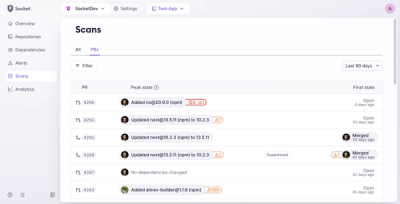
Introducing Pull Request Stories to Help Security Teams Track Supply Chain Risks
Socket’s new Pull Request Stories give security teams clear visibility into dependency risks and outcomes across scanned pull requests.
React components with minimal styling, easily to extend. Based on styled-components.
React components with minimal styling, easily to extend. Based on styled-components. Inspired by React Native components and SemanticUI. Will cover all common used html tags and adding convenient components for widely used UI elements.
WIP: This package is in an early alpha stage. Breaking changes can occur without notification. Already used in production (caution!). Feedback and contributions are welcome.
Versioning (prior to 1.0.0)
0.Y.Z:
$ yarn add unstyled
or (if you prefer)
$ npm i --save unstyled
As this lib is mainly used with GatsbyJS for fast prototyping of new websites I'll cover that first.
yarn add unstyled styled-components gatsby-plugin-styled-components
Make sure to install "gatsby-plugin-styled-components" and configure it in `gatsby-config':
plugins: ["gatsby-plugin-styled-components", ...]
import React from "react";
import { Container, Button } from "unstyled";

const App = () => (
  <Container>
      <h1>Elements</h1>
      <Button>Basic Button</Button>
  </Container>
);

export default App;
It's easy to extend elements and apply your own styles.
Just use styled-components
extend feature.
import Button from 'unstyled'

const CustomButton = Button.extend`
  color: tomato;
`
Wrap your own theme via styled-components ThemeProvider.
import styled, { ThemeProvider } from "styled-components"
import {StyledComponentsTheme, Button} from "unstyled"

const Element = () => (
  <ThemeProvider theme={StyledComponentsTheme}>
    <div>
      <h2>Button with custom theme:</h2>
      <Button>
        Styled Button
      </Button>
    </div>
  </ThemeProvider>
)

export default Element
Licensed under the MIT License, Copyright © 2017 superlumen.
See LICENSE for more information.
FAQs
React components with minimal styling, easily to extend. Based on styled-components.
We found that unstyled demonstrated a not healthy version release cadence and project activity because the last version was released a year ago. It has 1 open source maintainer collaborating on the project.
Did you know?

Socket for GitHub automatically highlights issues in each pull request and monitors the health of all your open source dependencies. Discover the contents of your packages and block harmful activity before you install or update your dependencies.

Product
Socket’s new Pull Request Stories give security teams clear visibility into dependency risks and outcomes across scanned pull requests.

Research
/Security News
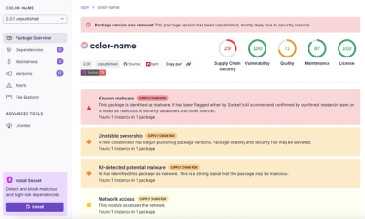
npm author Qix’s account was compromised, with malicious versions of popular packages like chalk-template, color-convert, and strip-ansi published.

Research
Four npm packages disguised as cryptographic tools steal developer credentials and send them to attacker-controlled Telegram infrastructure.