
Vidify
🔗 🚀 Live Demo: Demo
✨ Features
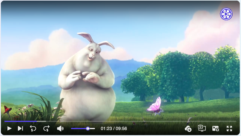
- 📹 Video player component that provides consistent UI/UX on different browsers.
- 🎨 Super customizable layout.
- 🎥 Enhanced Playback Speed Control with Custom Options
- 📝 Provide tools for users to add annotations.
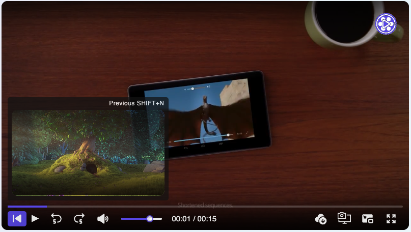
- 🔄 Vidify supports passing an array of video sources.
- 📱 Flexbox css with SVG icons. Mobile friendly.
- 🎨 Provide options for users to customize the primary color.
- ♿️ Accessibility supported, keyboards events supported.
- ✔️ Vidify offers all the essential features expected from a modern video player.
- 🛠️ Customize the control bar, progress bar, and more to match your a- pplication's design and user experience requirements.
- 🎮 Define states and actions to control Vidify with your own user interface elements.
- 📋 Vidify supports customizable ccontrol bar for enhanced user interaction.
- 🎬 Interactive Play Triggers (Hover, Click...).
- 🚫 Tailored Error Components for Enhanced User Experience
- 🎨 Customizable UI icons.
- 🌐 Multilingual Support (en, ar, fr) for Global Reach.
- 🎞 Dynamic Video Filter Customization (Opacity, Saturation, Blur...).
- 🍔 Context Menu Customization for Precise User Interactions.
- ⏳ Custom Loader Options for Smooth User Engagement.
- 💻 Written in TypeScript.
📦 Install
You can install Vidify via npm:
npm i vidify
Or using yarn:
yarn add vidify
🔨 Usage
import { VideoPlayer } from "vidify";

const MyVideoPlayer = ({ src }) => (
  <VideoPlayer src={src} autoplay className="my-video-player" />
);

export default MyVideoPlayer;
⌨️ Keyboard shortcuts (When video player focused)
| Space or K | Play/Pause |
| shift + P | Next video |
| shift + N | Previous video |
| shift + D | Download |
| shift + S | Screenshot |
| ← | Rewind |
| → | Forward |
| ↑ | Volume up |
| ↓ | Volume down |
| M | Toggle mute |
| F | Toggle fullscreen |
🛠️ Props
🏷️ HTML Video Tag Native Attributes
| src | string| string[] | '' | |
| preload | 'auto'| 'metadata' | 'none' | 'auto' | |
| autoPlay | boolean | false | |
| loop | boolean | false | |
| muted | boolean | false | |
| volume | number | 1.0 | |
| crossOrigin | string | 'anonymous' | |
🛠️ Vidify Props
| src | string | string[] | The source(s) of the video file(s). |
| defaultSrcIndex | number | The index of the default source to play. |
| startTime | number | The time (in seconds) to start playing the video from. |
| children | React.ReactNode | Child elements to be rendered within the video player component. |
| className | string | Additional CSS class(es) to apply to the video player component. |
| id | string | The unique identifier of the video player component. |
| primaryColor | string | The primary color used for styling the video player interface. |
| annotation | ReactNode | Additional content (such as text or icons) to be displayed on the video player. |
| annotationStyle | CSSProperties | CSS styles to apply to the annotation content. |
| width | string | The width of the video player. |
| height | string | The height of the video player. |
| durationType | "remainingTime" | "default" | The type of duration display for the video player. |
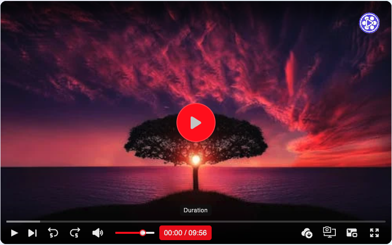
| placeholder | string | The URL of an image to display as a placeholder before the video loads. |
| title | string | The title of the video player. |
| style | CSSProperties | Custom CSS styles to apply to the video player. |
| controller | contextmenu | boolean | contextmenuRender | Configurations for the control bar of the video player. |
| volume | number | The volume level of the video player (0 to 1). |
| paused | boolean | Whether the video is paused or not. |
| poster | string | The URL of an image to display as the video poster. |
| thumbnail | string | The URL of an image to display as the video thumbnail. |
| autoPlay | boolean | Whether the video should automatically start playing when loaded. |
| playbackRate | number | The playback rate of the video (e.g., 1 for normal speed, 2 for double speed). |
| playsInline | boolean | Whether the video should play inline (e.g., in the same layout as other content). |
| preload | string | Specifies how the video should be loaded when the page loads. |
| crossOrigin | "anonymous" | "use-credentials" | "" | undefined | The CORS setting for the video resource. |
| loop | boolean | Whether the video should loop playback. |
| muted | boolean | Whether the video should be muted. |
| containerRef | React.Ref | Reference to the container element of the video player. |
| block | boolean | Whether the video player should be displayed full width or not. |
| rounded | boolean | |
| lang | "ar" | "en" | "fr" | Specifies the language for video captions and UI elements. |
| playOn | "click" | "hover" | "focus" | "visible" | Determines when the video starts playing. |
| customLoader | ReactNode | |
| error | errorOtions | Options for handling and displaying video playback errors. |
| customIcons | ICustomIcons | Custom icons to replace default icons in the video player UI. |
| contextMenu | itemMenu[ ] | Array of items for the context menu. |
| enableContextMenu | boolean | Enables or disables the context menu feature. |
| defaultPlaybackSpeed | boolean | Sets the default playback speed for the video player. |
🎉 Event Props
| onClick | Function (Event) | null | Called when click on video player |
| onClickNext | Function (Event) | null | Called when click Next button |
| onClickPrevious | Function (Event) | null | Called when click Previous button |
| onPlay | Function (Event) | null | Called when user plays the video |
| onPause | Function (Event) | null | Called when user pauses the video |
| onAbort | Function (Event) | null | Called when unloading the video player, like when switching to a different src file |
| onEnded | Function (Event) | null | Called when playback has finished to the end of the file |
| onError | Function (Event) | null | Called when the video tag encounters an error |
| onProgress | Function (Event) | null | Called when the video is on progress |
| onLoadStart | Function (Event) | null | Called when the video is loading |
| onDurationChange | Function (Event) | null | Called when the duration video change |
| onVolumeChange | Function (Event) | null | Called when the volume video change |
| onScreenshot | Function (File) | null | Called when the user screenshot |
| onLoadedData | Function () | null | Called when the video data loaded |
| onWaiting | Function () | null | Called when the user is waiting the video to load |
| onDownload | Function () | null | Called when the user download the video |
🔄 Dynamic Source Switching with Tooltip Preview
Vidify supports passing an array of video sources (srcs) to enable dynamic source switching. This feature allows users to seamlessly switch between different video sources within the same player instance. Additionally, when hovering over the next or previous video button, Vidify displays a tooltip previewing the next or previous video. This enhancement provides users with a visual preview of upcoming content, enabling informed decisions when switching between videos.
import { VideoPlayer } from "vidify";

const videoSources = [
  "https://example.com/video1.mp4",
  "https://example.com/video2.mp4",
  "https://example.com/video3.mp4",
];

const MyVideoPlayer = () => (
  <VideoPlayer
    src={videoSources}
    controls
    autoplay
    className="my-video-player"
  />
);

export default MyVideoPlayer;
🎨 Customizable Primary Color
Vidify provides a 'primaryColor' prop that allows users to specify a custom primary color for the video player interface. This feature enables users to match the video player's appearance to their application's branding or design scheme.
import { VideoPlayer } from "vidify";

const MyVideoPlayer = () => (
  <VideoPlayer
    src="https://example.com/video.mp4"
    controls
    autoplay
    primaryColor="red"
    className="my-video-player"
  />
);

export default MyVideoPlayer;
🛠️ Control Bar and Progress Bar Customization
The controller prop in Vidify allows for fine-grained control over the visibility and customization of the control bar and progress bar. Users can choose from various options to tailor the video player interface according to their needs.
Option 1: Hide Control Bar and Progress Bar
Setting controller={false} hides both the control bar and progress bar, providing a minimalist video player interface.
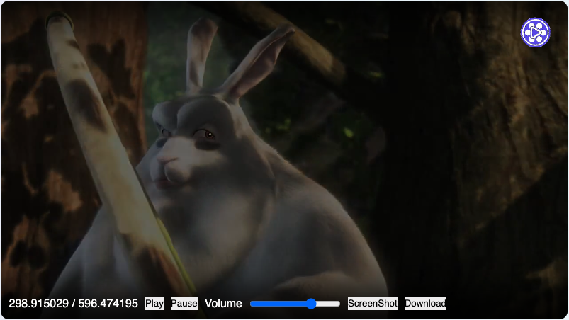
Option 2: Custom Control Bar
Passing a function to the controller prop allows users to create their own custom control bar using React components. The function receives an actions object containing methods to control the video playback (e.g., play, pause).
controller={(actions, info) => (
  <div>
    <span onClick={actions?.play}>Play</span>
    <span onClick={actions?.pause}>Pause</span>
  </div>
)}
Option 3: Advanced Control Options
Users can provide an object to the controller prop to enable advanced control options. This object allows for granular control over individual components of the video player interface, such as the screenshot button, fullscreen button, and progress bar.
controller={{
  screenshot: {
    allow: true,
    style: { color: "red" },
    className: "custom-button",
  },
  fullscreen: false,
  progressBar: false,
  controlBar: (actions, info) => (
    <div style={{ display: "flex", columnGap: "10px" }}>
      <p>{info.currentTime} / {info.duration}</p>
      <button onClick={actions?.play}>Play</button>
      <button onClick={actions?.pause}>Pause</button>
      <p>Volume</p>
      <input
        type="range"
        onChange={(e) => actions?.setVolume(+e.target. value / 100)}
      />
      <button onClick={actions?.screenShot}  >ScreenShot</button>
      <button onClick={actions?.download}>Download</button>
    </div>
  ),
}}
Option 4: Custom Buttons
Users can add custom buttons to the control bar by providing an array of custom button objects. Each button object specifies the button's content and placement (either "left" or "right").
controller={{
  customButtons: [
    { content: <div>Button 1</div>, placement: "left" },
    { content: <div>Button 2</div>, placement: "right" },
  ],
}}
❤️ Support
If you've found Vidify useful and would like to support its ongoing development, you can donate via Buy Me a Coffee:

Your support is greatly appreciated! ☕️❤️
⌨️ Development
🚀 Follow these steps to clone and run Vidify locally:
$ git clone https://github.com/braiekhazem/Vidify.git
$ cd vidify
$ npm install
$ cd demo
$ npm install
$ cd ..
$ npm run dev
$ npm run demo
Open your browser and visit http://localhost:3000.
🤝 How to Contribute
Thank you for considering contributing to Vidify! Here's how you can help:
Opening Issues
If you encounter any bugs or have suggestions for improvements, please open an issue on GitHub. Be sure to include detailed information about the issue or suggestion, along with any relevant screenshots or code examples.
Pull Requests
We welcome contributions from the community! If you'd like to contribute code changes, enhancements, or new features, please follow these steps:
- Fork the repository to your GitHub account.
- Create a new branch for your feature or bug fix.
- Make your changes and ensure they are thoroughly tested.
- Submit a pull request with a clear description of your changes and the problem they solve.
- We'll review your pull request and provide feedback or merge it into the main branch.
Code Style
Please adhere to the existing code style and conventions when making changes to the codebase. This helps maintain consistency and readability across the project.
Feature Requests
If you have an idea for a new feature or improvement, feel free to open an issue to discuss it with the maintainers and community members. We're always interested in hearing your ideas!
By contributing to Vidify, you're helping to make it a better tool for everyone. Thank you for your support!
📜 License
Copyright 2024 Hazem braiek

Licensed under the Apache License, Version 2.0.
You may not use this file except in compliance with the License.
You may obtain a copy of the License at

    http://www.apache.org/licenses/LICENSE-2.0

Unless required by applicable law or agreed to in writing, software
distributed under the License is distributed on an "AS IS" BASIS,
WITHOUT WARRANTIES OR CONDITIONS OF ANY KIND, either express or implied.
See the License for the specific language governing permissions and
limitations under the License.


