Product
Introducing Data Exports
Export Socket alert data to your own cloud storage in JSON, CSV, or Parquet, with flexible snapshot or incremental delivery.
vue-autosize-input
Advanced tools
A text input for Vue that resizes itself to the current content.
Live demo: houjiazong.github.io/vue-autosize-input
To run the examples locally, run:
yarn install
yarn serve
Then open localhost:8000 in a browser.
npm install vue-autosize-input --save
yarn add vue-autosize-input
Vue-autosize-input generates an input field, wrapped in a <div> tag so it can detect the size of its value. Otherwise it behaves very similarly to a standard Vue input.
<template>
  <autosize-input
    v-model="value"
    @change="onChange />
</template>

<script>
import AutosizeInput from 'vue-autosize-input'

export default {
  components: {
    AutosizeInput,
  },
  data () {
    return {
      value: '',
    }
  },
  methods: {
    onChange (e) {
      console.log(e.target.value)
    },
  },
}
</script>
The styles applied to the input are only copied when the component mounts. Because of this, subsequent changes to the stylesheet may cause size to be detected incorrectly.
To work around this, either re-mount the input (e.g. by providing a different key prop) or call the copyInputStyles() method after the styles change.
The input will automatically inject a stylesheet that hides IE/Edge's "clear" indicator, which otherwise breaks the UI. This has the downside of being incompatible with some CSP policies.
To work around this, you can pass the injectStyles={false} prop, but if you do this I strongly recommend targeting the input element in your own stylesheet with the following rule:
input::-ms-clear {display: none;}
If your input uses custom font sizes, you will need to provide the custom size to AutosizeInput.
<template>
  <autosize-input
    name="form-field-name"
    v-model="value"
    :style={{ fontSize: '36px' }}
    @change="onChange />
</template>

<script>
import AutosizeInput from 'vue-autosize-input'

export default {
  components: {
    AutosizeInput,
  },
  data () {
    return {
      value: '',
    }
  },
  methods: {
    onChange (e) {
      console.log(e.target.value)
    },
  },
}
</script>
Copyright (c) 2018 houjiazong. MIT License.
FAQs
Auto-resizing Input Component for Vue
The npm package vue-autosize-input receives a total of 183 weekly downloads. As such, vue-autosize-input popularity was classified as not popular.
We found that vue-autosize-input demonstrated a not healthy version release cadence and project activity because the last version was released a year ago. It has 1 open source maintainer collaborating on the project.
Did you know?

Socket for GitHub automatically highlights issues in each pull request and monitors the health of all your open source dependencies. Discover the contents of your packages and block harmful activity before you install or update your dependencies.

Product
Export Socket alert data to your own cloud storage in JSON, CSV, or Parquet, with flexible snapshot or incremental delivery.

Research
/Security News
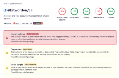
Bitwarden CLI 2026.4.0 was compromised in the Checkmarx supply chain campaign after attackers abused a GitHub Action in Bitwarden’s CI/CD pipeline.

Research
/Security News
Docker and Socket have uncovered malicious Checkmarx KICS images and suspicious code extension releases in a broader supply chain compromise.