Product
Introducing Reachability for PHP
Reachability analysis for PHP is now available in experimental, helping teams identify which vulnerabilities are actually exploitable.
vue-dialog-drag
Advanced tools
Simple draggable dialog
Features:
npm install vue-dialog-drag --save
Import and register component
import DialogDrag from 'vue-dialog-drag'

export default{
  ...
  components:{
    DialogDrag
  }
}
include css
<style src='vue-dialog-drag/dist/vue-dialog-drag.css'></style>
Or import source component from: 'vue-dialog-drag/src/vue-dialog-drag.vue' And install devDependencies. (stylus and pug) see package.json)
<template>
  <div id="app">
    <dialog-drag id="dialog-1">
      <p> Test dialog</p>
    </dialog-drag>
    <drop-area @drop='drop'>
      <p>Drop Here</p>
    </drop-area>
  </div>
</template>

<script>
import DialogDrag from 'vue-dialog-drag'
import DropArea from 'vue-dialog-drag/dist/drop-area'
export default {
  name: 'app',
  components: {
    DialogDrag,
    DropArea
  },
  methods: {
    drop (id) {
      console.log('drop id:', id)
    }
  }
}
</script>

<style src="vue-dialog-drag/dist/vue-dialog-drag.css"></style>
<style src="vue-dialog-drag/dist/drop-area.css"></style>

<!-- optional dialog styles, see example -->
<style src="vue-dialog-drag/dist/dialog-styles.css"></style>
All event emits an object: { id, left, top, x, y, z, width, height, pinned } You can format it, whith 'eventCb' prop.
The main container has class .dialog-drag, and .dialog-drag .fixed when dialog is pinned
You can import extra dialog styles from dist/dialog-styles.css.
view: example styles
Over: content rendered when the dialog is dragged over drop area.
drop: fired when drop the dialog, emits dialog id.
FAQs
A Vue Draggable Dialog Component
The npm package vue-dialog-drag receives a total of 301 weekly downloads. As such, vue-dialog-drag popularity was classified as not popular.
We found that vue-dialog-drag demonstrated a not healthy version release cadence and project activity because the last version was released a year ago. It has 1 open source maintainer collaborating on the project.
Did you know?

Socket for GitHub automatically highlights issues in each pull request and monitors the health of all your open source dependencies. Discover the contents of your packages and block harmful activity before you install or update your dependencies.

Product
Reachability analysis for PHP is now available in experimental, helping teams identify which vulnerabilities are actually exploitable.

Product
Export Socket alert data to your own cloud storage in JSON, CSV, or Parquet, with flexible snapshot or incremental delivery.

Research
/Security News
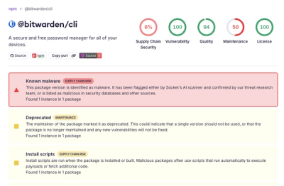
Bitwarden CLI 2026.4.0 was compromised in the Checkmarx supply chain campaign after attackers abused a GitHub Action in Bitwarden’s CI/CD pipeline.