
Product
Introducing Reports: An Extensible Reporting Framework for Socket Data
Explore exportable charts for vulnerabilities, dependencies, and usage with Reports, Socket’s new extensible reporting framework.
By André Staltz - Apr 21, 2026
vue-hotel-datepicker
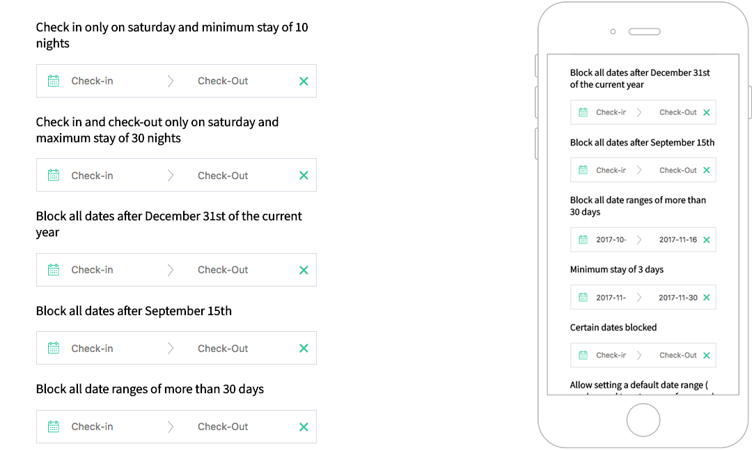
Advanced tools
A responsive date range picker for Vue.js that displays the number of nights selected and allow several useful options like custom check-in/check-out rules, localization support and more


A responsive date range picker for Vue.js that displays the number of nights selected and allow several useful options like custom check-in/check-out rules, localisation support and more.
https://ZestfulNation.github.io/vue-hotel-datepicker/
npm install vue-hotel-datepicker
pnpm install vue-hotel-datepicker
yarn add vue-hotel-datepicker
import HotelDatePicker from 'vue-hotel-datepicker'
import 'vue-hotel-datepicker/dist/vueHotelDatepicker.css';

export default {
  components: {
    HotelDatePicker,
  },
}
<HotelDatePicker />
| Name | Type | Default | Description |
|---|---|---|---|
| alwaysVisible | Boolean | false | If true shows display calendar in the page without an input. |
| bookings | Array | [] | If you want to show bookings. |
| closeDatepickerOnClickOutside | Boolean | true | Closes the date picker when the user clicks outside the date picker. |
| disableCheckoutOnCheckin | Boolean | false | If set to true, disable checkout on the same date has checkin. |
| disabledDates | Array | [] | An array of strings in this format: YYYY-MM-DD. All the dates passed to the list will be disabled. |
| disabledDaysOfWeek | Array | [] | DEPRECATED: An array of strings in this format: ['Monday', 'Tuesday', 'Wednesday', 'Thursday', 'Friday', 'Saturday', 'Sunday']. All the days passed to the list will be disabled. It depends on the translated names. |
| disabledWeekDays | Object | {} | An object with the following properties: sunday, monday, tuesday, wednesday, thursday, friday, saturday, the value indicates if that day is disabled (true) or enabled (false). |
| displayClearButton | Boolean | true | If set to true, displays a clear button on the right side of the input if there are dates set. |
| enableCheckout | Boolean | false | If true, allows the checkout on a disabled date. |
| endDate | [Date, String, Number] | Infinity | The end view date. All the dates after this date will be disabled. |
| endingDateValue | Date | null | The initial value of the end date. |
| firstDayOfWeek | Number | 0 | The first day of the week. Where Sun = 0, Mon = 1, ... Sat = 6. You need to set the right order in i18n.day-names too. |
| format | String | 'YYYY-MM-DD' | The date format string. |
| gridStyle | Boolean | true | If false hides the grid around the days. |
| halfDay | Boolean | true | Allows to have half a day, if you have check in at noon and checkout before noon |
| hoveringTooltip | [Boolean, Function] | true | Shows a tooltip with the number of nights when hovering a date. |
| i18n | Object | see below | Holds the traslation of the date picker. |
| lastDateAvailable | [Number, Date] | Infinity | Allows to stop calendar pagination after the month of that date |
| maxNights | Number | null | Maximum nights required to select a range of dates. 0 or null for no limit. |
| minNights | Number | 1 | Minimum nights required to select a range of dates. |
| periodDates | Array | [] | If you want to have specific startAt and endAt period with different duration or price or type of period. See below for more information |
| positionRight | Boolean | false | If true shows the calendar on the right of the input. |
| priceDecimals | Number | 0 | The price decimals for weekly periods (see periodDates). |
| priceSymbol | String | '' | The price symbol added before the price when showPrice is true and a price has been set in one of the periodDates array items (period). |
| showPrice | Boolean | false | If set to true, displays a price contains on your periodDates. |
| showSingleMonth | Boolean | false | If set to true, display one month only. |
| showWeekNumbers | Boolean | false | If set to true, displays the week numbers. |
| showYear | Boolean | true | Shows the year next to the month. |
| singleDaySelection | Boolean | false | When true only one day can be selected instead of a range. |
| startDate | [Date, String] | new Date() | The start view date. All the dates before this date will be disabled. |
| startingDateValue | Date | null | The initial value of the start date. |
| tooltipMessage | String | null | If provided, it will override the default tooltip "X nights" with the text provided. You can use HTML in the string. |
| value | Boolean | false | The v-model prop, controls the visibility of the date picker. |
| yearBeforeMonth | Boolean | false | Show the year before the month, only when showYear is true. |
i18n: {
  "night": "Night",
  "nights": "Nights",
  "week": "week",
  "weeks": "weeks",
  "day-names": ["Sun", "Mon", "Tue", "Wed", "Thur", "Fri", "Sat"],
  "check-in": "Check-in",
  "check-out": "Check-out",
  "month-names": [
      "January",
      "February",
      "March",
      "April",
      "May",
      "June",
      "July",
      "August",
      "September",
      "October",
      "November",
      "December",
  ],
  "tooltip": {
      "halfDayCheckIn": "Available CheckIn",
      "halfDayCheckOut": "Available CheckOut",
      "saturdayToSaturday": "Only Saturday to Saturday",
      "sundayToSunday": "Only Sunday to Sunday",
      "minimumRequiredPeriod": "%{minNightInPeriod} %{night} minimum.",
  },
}
Array[]
If you want to have specific startAt and endAt period with different duration or price or type of period-| Key | Type | Description |
|---|---|---|
| endAt | String | YYYY-MM-DD |
| startAt | String | YYYY-MM-DD |
| minimumDuration | Number | Minimum stay (Type: weekly => per_week | Type: nightly => per night) |
| periodType | String | nightly, weekly_by_saturday, weekly_by_sunday |
| price | Float | Price displayed on each day for this period |
Example:
periodDates: [
  {
    startAt: "2020-06-09",
    endAt: "2020-07-26",
    minimumDuration: 4,
    periodType: "nightly"
  },
  {
    startAt: "2020-07-26",
    endAt: "2020-09-30",
    minimumDuration: 1,
    periodType: "weekly_by_saturday"
  },
  {
    startAt: "2020-09-30",
    endAt: "2020-11-30",
    minimumDuration: 2,
    periodType: "weekly_by_sunday",
    price: 4000.0
  }
],
MinimumDuration with a periodType weekly-~ equals to a weekIf you want to show bookings
Array[]| Key | Type | Description |
|---|---|---|
checkInDate | String | 'YYYY-MM-DD' |
checkOutDate | String | 'YYYY-MM-DD' |
style | Object | Style, (see the example) |
Example:
bookings: [
  {
    event: true,
    checkInDate: "2020-08-26",
    checkOutDate: "2020-08-29",
    style: {
      backgroundColor: "#399694"
    }
  },
  {
    event: false,
    checkInDate: "2020-07-01",
    checkOutDate: "2020-07-08",
    style: {
      backgroundColor: "#9DC1C9"
    }
  }
],
⚠️ In order to open/close the datepicker from an external element, such as a button make sure to set closeDatepickerOnClickOutside to false
| Name | Description |
|---|---|
hideDatepicker | Hides the datepicker |
showDatepicker | Shows the datepicker |
toggleDatepicker | Toggles (shows or hides) the datepicker |
| Name | Params enum | Description |
|---|---|---|
booking-clicked | MouseEvent, Date, Object | Emitted every time a booking is clicked. The first param is the mouse javascript event, the second is the clicked Date and the third is the clicked booking. |
check-in-changed | Emitted every time a new check in date is selected with the new date as payload. | |
check-out-changed | Emitted every time a new check out date is selected with the new date as payload. | |
clear-selection | Emitted every time you clicked on clear Date button. | |
day-clicked | Date, String, Date|Number|String | Emitted every time when day is clicked. The params are clicked: date, format and next disabled date. |
handle-checkin-checkout-half-day | Object | Emitted on [beforeMount, clear-selection, checkout]. Param: Object of checkin-checkout date. |
next-month-rendered | Emitted every time the next month is rendered. | |
period-selected | Event, Date, Date | Emitted every time when a checkOut is clicked. Params: Mouse Event, checkIn, checkOut |
booking-clicked examples{
checkInDate: "YYYY-MM-DD",
checkOutDate: "YYYY-MM-DD",
style: {
backgroundColor: "#399694",
}
}
This component was originally built as a Vue wrapper component for the Hotel Datepicker by @benitolopez. Version 2.0.0 was completely rewritten with Vue, removing the original library, removing some features and introducing others.
FAQs
A responsive date range picker for Vue.js that displays the number of nights selected and allow several useful options like custom check-in/check-out rules, localization support and more
The npm package vue-hotel-datepicker receives a total of 924 weekly downloads. As such, vue-hotel-datepicker popularity was classified as not popular.
We found that vue-hotel-datepicker demonstrated a not healthy version release cadence and project activity because the last version was released a year ago. It has 2 open source maintainers collaborating on the project.
Did you know?

Socket for GitHub automatically highlights issues in each pull request and monitors the health of all your open source dependencies. Discover the contents of your packages and block harmful activity before you install or update your dependencies.
Product
Explore exportable charts for vulnerabilities, dependencies, and usage with Reports, Socket’s new extensible reporting framework.

Product
Socket for Jira lets teams turn alerts into Jira tickets with manual creation, automated ticketing rules, and two-way sync.

Company News
Socket won two 2026 Reppy Awards from RepVue, ranking in the top 5% of all sales orgs. AE Alexandra Lister shares what it's like to grow a sales career here.