vue-loading-twa
⏳ Loading inside a container or full screen for Vue.js. This is a improved extension from [vue-element-loading]
💻 Install
npm install vue-loading-twa
🕹 Usage
import Vue from 'vue'
import VueLoading from 'vue-loading-twa'

Vue.component('VueLoading', VueLoading)
or
import VueLoading from 'vue-loading-twa'

export default {
  components: {
    VueLoading,
  },
}
🔎 Example
Inside container
<div class="parent">
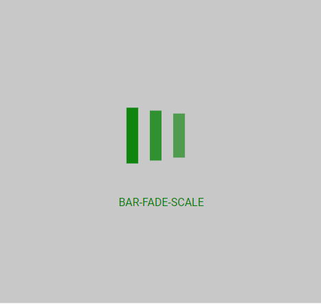
<vue-loading :active="show" spinner="bar-fade-scale" />
<span>
This is my content.
</span>
</div>
Full screen
<body>
  <vue-loading :active="show" is-full-screen />
</body>
Adjust Spinner Color
Use the color parameter to set the color of the displayed spinner (does not affect custom spinner images).
<div class="parent">
  <vue-loading :active="show" spinner="bar-fade-scale" color="#FF6700" />
  <span>
    This is my content.
  </span>
</div>
Set text
Use the text parameter to set the text which will appear below loader.
<div class="parent">
  <vue-loading
    :active="show"
    spinner="bar-fade-scale"
    color="#FF6700"
    text="Please wait..."
  />
  <span>
    This is my content.
  </span>
</div>
Set text style
Use the textStyle parameter to set the style of text( you need to pass css-in-js way using camelCase exp. fontSize, backgroundColor etc).
<div class="parent">
  <vue-loading
    :active="show"
    spinner="bar-fade-scale"
    color="#FF6700"
    text="Please textStyle={fontSize: '25px'}  wait..."
  />
  <span>
    This is my content.
  </span>
</div>
Adjust Spinner Size
Use the size parameter to set the size of the displayed spinner (does not affect custom spinner images).
<div class="parent">
  <vue-loading :active="show" spinner="bar-fade-scale" size="128" />
  <span>
    This is my content.
  </span>
</div>
Adjust Spinner Animation Speed
Use the duration parameter to set the animation loop duration in seconds (does not affect custom spinner images).
<div class="parent">
  <vue-loading :active="show" spinner="bar-fade-scale" duration="1.0" />
  <span>
    This is my content.
  </span>
</div>
Customize loader
<div class="parent">
<vue-loading :active="show">
<img src="/static/pikachu.gif" width="55px" height="55px" />
</vue-loading>
</div>
<div class="parent">
<vue-loading
:active="show"
spinner="Custom"
color="red"
size="64"
duration="1.5"
svgCode="<svg width='{size}'><path fill='{color}'><animateTransform dur='{duration}' /></path></svg>"
/>
</div>
Text
<div class="parent">
  <vue-loading :active="show1" :text="showText1" />
  <vue-loading :active="show2" :text="showText2" />
  <vue-loading :active="show3" :text="showText3" />
</div>
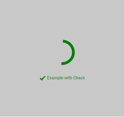
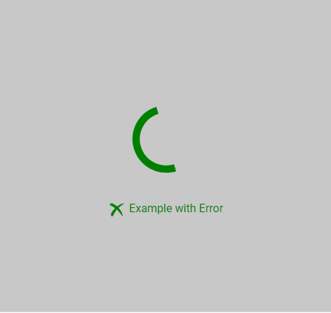
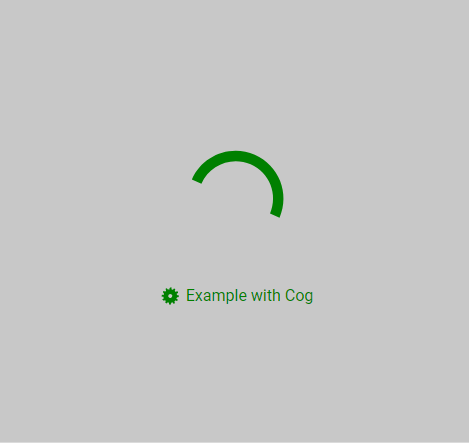
showText1 = 'Example'
showText2 = { text: 'Example2', icon: 'Cog' }
showText3 = [
{ text: 'Example3', icon: 'Cog' },
{ text: 'Example3', icon: 'Cog' },
]
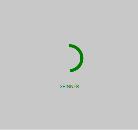
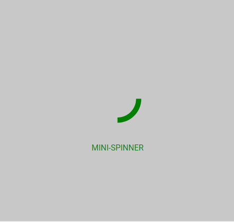
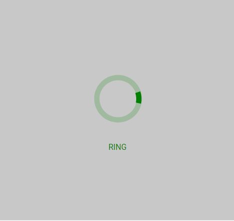
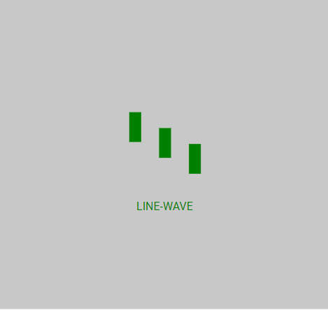
🌀 Spinner and Icons
⚙️ Props
| active | Boolean | - | Status for show/hide loading |
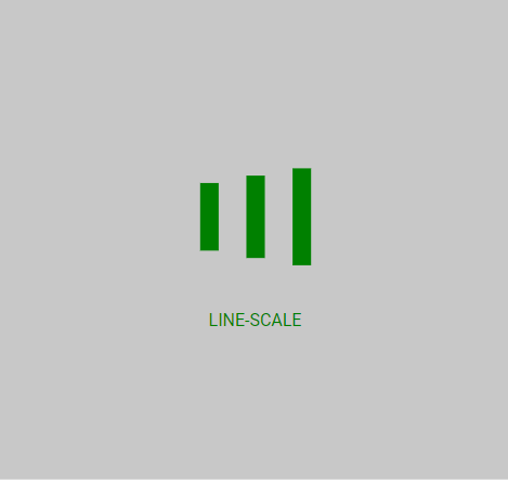
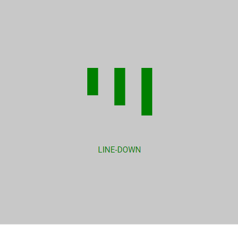
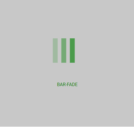
| spinner | String | spinner | Spinner icon name: spinner, mini-spinner, ring, line-wave, line-scale, line-down, bar-fade, bar-fade-scale, Custom |
| svgCode | String | "" | String with SVG content, only works if spinner its equal to Custom |
| color | String | #000 | Color of spinner icon |
| background-color | String | rgba(255, 255, 255, .9) | Background color of spinner icon (for overlay) |
| size | String | "40" | The size to display the spinner in pixels (NOTE: this will not affect custom spinner images) |
| duration | String | "0.6" | The duration of one 'loop' of the spinner animation, in seconds (NOTE: this will not affect custom spinner images) |
| is-full-screen | Boolean | false | Loader will overlay the full page |
| text | String or Array | - | Text will appear below loader |
| text-style | Object | {} | Change style of the text below loader |
| fade | Boolean | true | If text its an array by default fade effect its apllied to text |
📄 License
MIT


