Research
/Security News
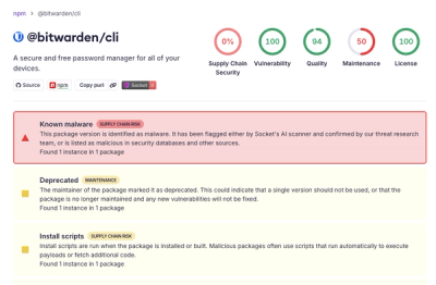
Bitwarden CLI Compromised in Ongoing Checkmarx Supply Chain Campaign
Bitwarden CLI 2026.4.0 was compromised in the Checkmarx supply chain campaign after attackers abused a GitHub Action in Bitwarden’s CI/CD pipeline.
vue-popperjs
Advanced tools

VueJS popover component based on popper.js
Recommended: https://unpkg.com/vue-popperjs, which will reflect the latest version as soon as it is published to npm. You can also browse the source of the npm package at https://unpkg.com/vue-popperjs/
npm install vue-popperjs --save
yarn add vue-popperjs
bower install vue-popperjs --save
# install dependencies
npm install

# build dist files
npm run build
<template>
  <popper
    trigger="clickToOpen"
    :options="{
      placement: 'top',
      modifiers: { offset: { offset: '0,10px' } }
    }">
    <div class="popper">
      Popper Content
    </div>

    <button slot="reference">
      Reference Element
    </button>
  </popper>
</template>

<script>
  import Popper from 'vue-popperjs';
  import 'vue-popperjs/dist/vue-popper.css';

  export default {
    components: {
      'popper': Popper
    },
  }
</script>
<link rel="stylesheet" href="vue-popper.css">
<script type="text/javascript" src="popper.js"></script>
<script type="text/javascript" src="vue.js"></script>
<script type="text/javascript" src="vue-popper.js"></script>

<div id="app">
  <popper
    trigger="clickToOpen"
    :options="{
      placement: 'top',
      modifiers: { offset: { offset: '0,10px' } }
    }">
    <div class="popper">
      Popper Content
    </div>

    <button slot="reference">
      Reference Element
    </button>
  </popper>
</div>

<script type="text/javascript">
  new Vue({
    el: '#app',
    components: {
      'popper': VuePopper
    }
  });
</script>
| Props | Type | Default | Description |
|---|---|---|---|
| disabled | Boolean | false | |
| delay-on-mouse-over | Number | 10 | Delay in ms before showing popper during a mouse over |
| delay-on-mouse-out | Number | 10 | Delay in ms before hiding popper during a mouse out |
| append-to-body | Boolean | false | |
| visible-arrow | Boolean | true | |
| force-show | Boolean | false | |
| trigger | String | hover | Optional value:
|
| content | String | null | |
| enter-active-class | String | null | |
| leave-active-class | String | null | |
| boundaries-selector | String | null | |
| transition | String | empty | |
| options | Object | { placement: 'bottom', gpuAcceleration: false } | popper.js options |
| data-value | Any | null | data of popper |
| stop-propagation | Boolean | false | |
| prevent-default | Boolean | false | |
| root-class | String | empty | Class name for root element |
| Name | Params | Description |
|---|---|---|
| created | context[Object] | Created popper component |
| show | Show popover | |
| hide | Hide popover | |
| document-click |
| Project | Status | Description |
|---|---|---|
| vue-ls |  | Vue plugin for work with local storage, session storage and memory storage from Vue context |
| vue-gallery |  | Responsive and customizable image and video gallery, carousel and lightbox, optimized for both mobile and desktop web browsers |
This project exists thanks to all the people who contribute. [Contribute].
Become a financial contributor and help us sustain our community. [Contribute]
Support this project with your organization. Your logo will show up here with a link to your website. [Contribute]
MIT © Igor Ognichenko
FAQs
VueJS popover
The npm package vue-popperjs receives a total of 14,562 weekly downloads. As such, vue-popperjs popularity was classified as popular.
We found that vue-popperjs demonstrated a not healthy version release cadence and project activity because the last version was released a year ago. It has 2 open source maintainers collaborating on the project.
Did you know?

Socket for GitHub automatically highlights issues in each pull request and monitors the health of all your open source dependencies. Discover the contents of your packages and block harmful activity before you install or update your dependencies.

Research
/Security News
Bitwarden CLI 2026.4.0 was compromised in the Checkmarx supply chain campaign after attackers abused a GitHub Action in Bitwarden’s CI/CD pipeline.

Research
/Security News
Docker and Socket have uncovered malicious Checkmarx KICS images and suspicious code extension releases in a broader supply chain compromise.

Product
Stay on top of alert changes with filtered subscriptions, batched summaries, and notification routing built for triage.