vue-tree-list
A vue component for tree structure. Support adding treenode/leafnode, editing node's name and dragging.
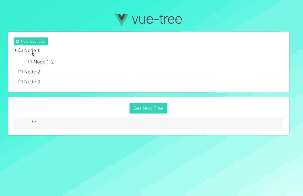
Live Demo
install
Install the plugin then you can use the component globally.
import Vue from 'vue'
import VueTreeList from 'vue-tree-list'
Vue.use(VueTreeList)
Or just register locally like the example below.
use
npm install vue-tree-list
<template>
  <div>
    <button @click="addNode">Add Node</button>
    <vue-tree-list
      @click="onClick"
      @change-name="onChangeName"
      @delete-node="onDel"
      @add-node="onAddNode"
      :model="data"
      default-tree-node-name="new node"
      default-leaf-node-name="new leaf"
      v-bind:default-expanded="false"
    >
      <template v-slot:leafNameDisplay="slotProps">
        <span>
          {{ slotProps.model.name }} <span class="muted">#{{ slotProps.model.id }}</span>
        </span>
      </template>
      <span class="icon" slot="addTreeNodeIcon">📂</span>
      <span class="icon" slot="addLeafNodeIcon">+</span>
      <span class="icon" slot="editNodeIcon">📃</span>
      <span class="icon" slot="delNodeIcon">✂️</span>
      <span class="icon" slot="leafNodeIcon">🍃</span>
      <span class="icon" slot="treeNodeIcon">🌲</span>
    </vue-tree-list>
    <button @click="getNewTree">Get new tree</button>
    <pre>
      {{newTree}}
    </pre>
  </div>
</template>

<script>
  import { VueTreeList, Tree, TreeNode } from 'vue-tree-list'
  export default {
    components: {
      VueTreeList
    },
    data() {
      return {
        newTree: {},
        data: new Tree([
          {
            name: 'Node 1',
            id: 1,
            pid: 0,
            dragDisabled: true,
            addTreeNodeDisabled: true,
            addLeafNodeDisabled: true,
            editNodeDisabled: true,
            delNodeDisabled: true,
            children: [
              {
                name: 'Node 1-2',
                id: 2,
                isLeaf: true,
                pid: 1
              }
            ]
          },
          {
            name: 'Node 2',
            id: 3,
            pid: 0,
            disabled: true
          },
          {
            name: 'Node 3',
            id: 4,
            pid: 0
          }
        ])
      }
    },
    methods: {
      onDel(node) {
        console.log(node)
        node.remove()
      },

      onChangeName(params) {
        console.log(params)
      },

      onAddNode(params) {
        console.log(params)
      },

      onClick(params) {
        console.log(params)
      },

      addNode() {
        var node = new TreeNode({ name: 'new node', isLeaf: false })
        if (!this.data.children) this.data.children = []
        this.data.addChildren(node)
      },

      getNewTree() {
        var vm = this
        function _dfs(oldNode) {
          var newNode = {}

          for (var k in oldNode) {
            if (k !== 'children' && k !== 'parent') {
              newNode[k] = oldNode[k]
            }
          }

          if (oldNode.children && oldNode.children.length > 0) {
            newNode.children = []
            for (var i = 0, len = oldNode.children.length; i < len; i++) {
              newNode.children.push(_dfs(oldNode.children[i]))
            }
          }
          return newNode
        }

        vm.newTree = _dfs(vm.data)
      }
    }
  }
</script>

<style lang="less" rel="stylesheet/less">
  .vtl {
    .vtl-drag-disabled {
      background-color: #d0cfcf;
      &:hover {
        background-color: #d0cfcf;
      }
    }
    .vtl-disabled {
      background-color: #d0cfcf;
    }
  }
</style>

<style lang="less" rel="stylesheet/less" scoped>
  .icon {
    &:hover {
      cursor: pointer;
    }
  }

  .muted {
    color: gray;
    font-size: 80%;
  }
</style>
props
props of vue-tree-list
| model | TreeNode | - | You can use const head = new Tree([]) to generate a tree with the head of TreeNode type |
| default-tree-node-name | string | New node node | Default name for new treenode |
| default-leaf-node-name | string | New leaf node | Default name for new leafnode |
| default-expanded | boolean | true | Tree is expanded or not |
props of TreeNode
attributes
| id | string, number | current timestamp | The node's id |
| isLeaf | boolean | false | The node is leaf or not |
| dragDisabled | boolean | false | Forbid dragging tree node |
| addTreeNodeDisabled | boolean | false | Show addTreeNode button or not |
| addLeafNodeDisabled | boolean | false | Show addLeafNode button or not |
| editNodeDisabled | boolean | false | Show editNode button or not |
| delNodeDisabled | boolean | false | Show delNode button or not |
| children | array | null | The children of node |
methods
| changeName | name | Change node's name |
| addChildren | children: object, array | Add children to node |
| remove | - | Remove node from the tree |
| moveInto | target: TreeNode | Move node into another node |
| insertBefore | target: TreeNode | Move node before another node |
| insertAfter | target: TreeNode | Move node after another node |
events
| click | TreeNode | Trigger when clicking a tree node. You can call toggle of TreeNode to toggle the folder node. |
| change-name | {'id', 'oldName', 'newName'} | Trigger after changing a node's name |
| delete-node | TreeNode | Trigger when clicking delNode button. You can call remove of TreeNode to remove the node. |
| add-node | TreeNode | Trigger after adding a new node |
| drop | {node, src, target} | Trigger after dropping a node into another. node: the draggable node, src: the draggable node's parent, target: the node that draggable node will drop into |
| drop-before | {node, src, target} | Trigger after dropping a node before another. node: the draggable node, src: the draggable node's parent, target: the node that draggable node will drop before |
| drop-after | {node, src, target} | Trigger after dropping a node after another. node: the draggable node, src: the draggable node's parent, target: the node that draggable node will drop after |
customize operation icons
The component has default icons for addTreeNodeIcon, addLeafNodeIcon, editNodeIcon, delNodeIcon, leafNodeIcon, treeNodeIcon button, but you can also customize them and can access model, root, expanded as below:
<template v-slot:leafNameDisplay="slotProps">
  <span>{{ slotProps.model.name }} #{{ slotProps.model.id }}</span>
</template>
<template v-slot:addTreeNodeIcon="slotProps">
  <span class="icon">📂</span>
</template>
<template v-slot:addLeafNodeIcon="slotProps">
  <span class="icon">+</span>
</template>
<template v-slot:editNodeIcon="slotProps">
  <span class="icon">📃</span>
</template>
<template v-slot:delNodeIcon="slotProps">
  <span class="icon">✂️</span>
</template>
<template v-slot:leafNodeIcon="slotProps">
  <span class="icon">🍃</span>
</template>
<template v-slot:treeNodeIcon="slotProps">
  <span class="icon">
    {{ (slotProps.model.children && slotProps.model.children.length > 0 && !slotProps.expanded) ?
    '🌲' : '' }}</span
  >
</template>