一个轻量、灵活的 Vue 3 右键菜单组件,支持根据不同组件标识配置差异化右键菜单,内置多级子菜单、分隔线、禁用状态等常用特性,指令式调用简单易用。
特性
🚀 适配 Vue 3 生态(支持 Options API / Composition API)
🎨 支持按组件标识(data-component)区分菜单
📋 支持多级子菜单、分隔线、禁用菜单项,左右标头(icon、rightLabel) 可以直接通过h函数完全的自定义
🔧 自定义菜单点击回调,携带完整上下文信息
⚡ 指令式调用,接入成本低
因为蛋黄蛋君还要工作,所以会不定时更新或者发布新的小工具,希望大家会用的上,那么祝大家使用愉快, 拜拜啦!!
git:https://github.com/eggyolkegg/vue3-context-menu-plus
安装
npm install vue3-context-menu-plus
yarn add vue3-context-menu-plus
使用用法
在 main.js / main.ts 文件中
import { createApp } from 'vue'
import App from './App.vue'
import VueContextMenu from 'vue3-context-menu-plus'

const app = createApp(App)
app.use(VueContextMenu) // 注册全局指令
app.mount('#app')
模版
<template>
<!-- 用法1:v-contextmenu:10(10:当前组件的层级可以调成任何纯数字,如果不写默认9999) + 当第一参数是对象是,需要配置配置data-component匹配菜单 -->
<div
data-component="component-a"
v-contextmenu:10="{ menus: componentMenus,onItemClick: handleClick }"
>
右键点击(组件A)
</div>
<div
data-component="component-b"
v-contextmenu="{ componentMenus, onItemClick: handleClick }"
>
右键点击(组件B)
</div>
<!-- 用法2:自定义菜单(不依赖data-component) -->
<div
v-contextmenu="{customMenus, handleClick }"
>
右键点击(自定义菜单)
</div>
</template>
// 组件式API 写法
<script setup lang="ts">
import { reactive, ref } from "vue";
const componentMenus = reactive({
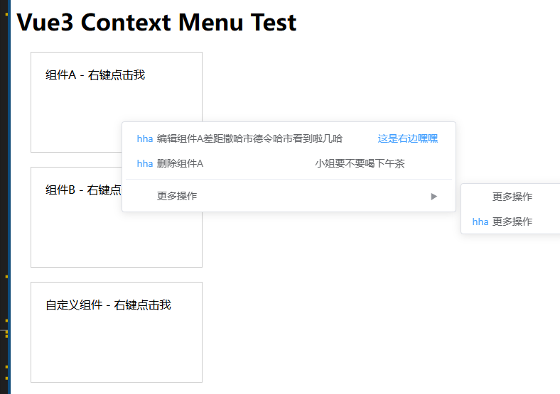
'component-a': [
{
id: 1,
label: '编辑组件A差距撒哈市德令哈市看到啦几哈',
icon: () =>h(ElText, { type: "primary" }, 'hha'),
rightLabel: () =>h(ElText, { type: "primary" }, '这是右边嘿嘿'),
},
{
id: 2,
label: '删除组件A',
icon: () =>h(ElText, { type: "primary" }, 'hha'),
rightLabel: () => h('div', '小姐要不要喝下午茶')
},
{
id: 3, divider: true
},
{
id: 4,
label: '更多操作',
children: [
{
id: 5,
label: '操作1'
},
{
id: 6,
label: '操作2',
icon: () =>h(ElText, { type: "primary" }, 'hha')
}
]
}
],
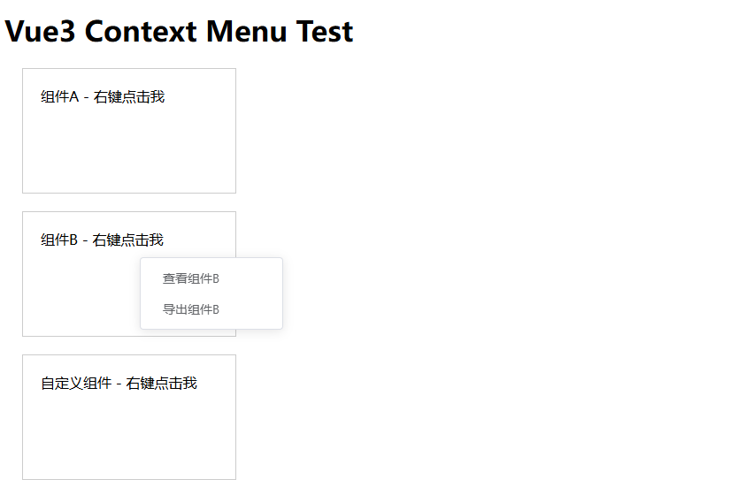
"component-b": [
{ id: 7, label: "查看组件B" },
{ id: 8, label: "导出组件B" },
],
});
// 自定义菜单配置
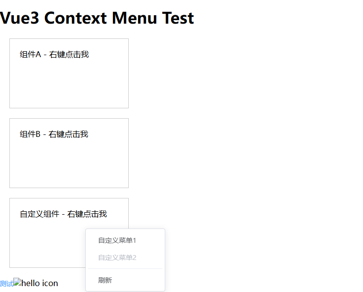
const customMenus = ref([
{ id: 9, label: "自定义菜单1" },
{ id: 10, label: "自定义菜单2", disabled: true }, // 禁用项
{ id: 11, divider: true }, // 分隔线
{ id: 12, label: "刷新" },
]);
const handleClick = (item:any, event:any, context:any) => {
console.log('点击的菜单项:', item)
console.log('原生事件对象:', event)
console.log('上下文信息:', context)
};
</script>
// 选项式 API 写法
<script>
export default {
data() {
return {
// 按组件分类的菜单配置
componentMenus: {
'component-a': [
{
id: 1,
label: '编辑组件A差距撒哈市德令哈市看到啦几哈',
icon: () =>h(ElText, { type: "primary" }, 'hha'),
rightLabel: () =>h(ElText, { type: "primary" }, '这是右边嘿嘿'),
},
{
id: 2,
label: '删除组件A',
icon: () =>h(ElText, { type: "primary" }, 'hha'),
rightLabel: () => h('div', '小姐要不要喝下午茶')
},
{
id: 3, divider: true
},
{
id: 4,
label: '更多操作',
children: [
{
id: 5,
label: '操作1'
},
{
id: 6,
label: '操作2',
icon: () =>h(ElText, { type: "primary" }, 'hha')
}
]
}
],
'component-b': [
{ id: 7, label: '查看组件B' },
{ id: 8, label: '导出组件B' }
]
},
// 自定义菜单配置
customMenus: [
{ id: 9, label: '自定义菜单1' },
{ id: 10, label: '自定义菜单2', disabled: true }, // 禁用项
{ id: 11, divider: true }, // 分隔线
{ id: 12, label: '刷新' }
]
}
},
methods: {
// 菜单点击回调
handleClick(item, event, context) {
console.log('点击的菜单项:', item)
console.log('原生事件对象:', event)
console.log('上下文信息:', context)
// 业务逻辑处理
}
}
}
</script>


