Vue 3 Search Select Component
vue3-search-select


A light-weight, flexible and easy-to-use Vue 3 Search and Select component that allows users to search and select options from a dynamic or static list.
Installation
Install the package via npm:
npm i vue3-search-select
Demo
Check out the live demonstration to see the package in action.
QUICK PREVIEW
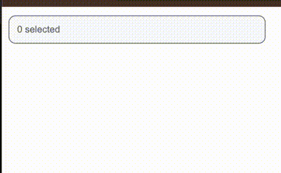
Search Select
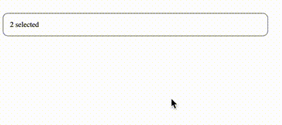
Dynamic Multi Select
Components in this package
- Search Select
- Dynamic Multi Select
Search Select
✨ Key Features
🗂 Custom Display Order -
Arrange options in any order, helping users easily find frequently selected or high-priority items.
🔢 Conditional Count Display -
Display options dynamically based on specific conditions, so users see only relevant choices.
🔍 Search Functionality -
Integrated search allows users to quickly filter options by typing, ideal for large lists.
🔑 Primary Key Tracking -
Each option is linked to a unique identifier (primary key), ensuring accurate selection and tracking of values.
⭐ Default Value Selection -
Pre-select default values to highlight the most relevant choice, improving the initial user experience.
Search Select Usage
import { SearchSelect } from 'vue3-search-select'
import "vue3-search-select/Vue-Search-Select.css";
<SearchSelect
:data="pseudoEmployeeData"
placeholderName="Employee"
displayKey="firstName lastName - employeeId"
:selectMax="2"
v-model="employee"
primaryKey="employeeId"
:defaultValue="['emp-0001']"
/>
Dynamic Multi Select
The DynamicMultiSelect component is packed with advanced functionality, allowing users to select multiple options from a dynamic list with ease and flexibility.
🚀 Key Features
🎛️ Slot Manipulation -
Customize component slots to control how each item selected will be displayed, allowing for unique visual arrangements.
🔍 Show Results on Search (optional) -
Can display search results when users begin typing, keeping the interface clean and focused until needed.
🗂️ Custom Display Order -
Easily reorder options to prioritize frequently selected or high-importance items at the top of the list.
🔑 Primary Key Tracking -
Each item is uniquely identified by a primary key, ensuring consistent data handling and accurate selections.
🔢 Conditional Count Display -
Apply conditions to dynamically control the visibility of options based on specific counts, improving list relevance.
🔍 Multi-Select Search -
Built-in search functionality enables users to filter multiple selections, making large lists more manageable.
🖼️ Image Prefix for Options -
Add an image prefix to each list option, creating a visually rich experience and making options more recognizable.
⭐ Default Value Selection -
Set default values to highlight recommended or commonly selected options, enhancing the user experience from the start.
🚫 Auto-Close on Maximum Selection -
Automatically close the dropdown when the maximum number of selections is reached, ensuring users know their selection limit.
🔍 Show on Search -
Only show dropdown options after the user starts typing, instead of displaying all options immediately. Useful when the list is long or fetched from an external source.
🌐 Search with API -
Trigger an API call when the user types in the input field, instead of filtering a local array. Ideal for real-time search through a remote database.
⏱️ Debounce API Call By -
Waiting a specified number of milliseconds after the user stops typing before making the API call. Helps reduce the number of requests when users type quickly.
import { DynamicMultiSelect } from 'vue3-search-select'
import "vue3-search-select/Vue-Search-Select.css";
<DynamicMultiSelect
v-model="anotherEmploye"
:data="pseudoEmployeeData"
display-key="firstName lastName - employeeId"
primary-key="employeeId"
imgPrefix="src"
:select-max="3"
:defaultValue="['APN999000', 'APN0001']"
:closeAfterMax="true"
>
<template #listClassPrefix="{ item }"> // optional slot manipulation to add prefix to each item in a list
<div :class="item.tag === 'tech' ? 'red-circle' : 'blue-circle'"></div>
</template>
<template #dynamicAction="{ item }">
{{ fullNameList(item) }}
</template>
</DynamicMultiSelect>
const fullNameList = (item: Person[]) => {
let allItems = item?.map((obj) => `${obj.firstName} ${obj.lastName}`).join(', ')
return allItems
}
Another shiny use case is API - Show On Search
It helps when you want to keep the full list hidden by default and only show results based on what the user is actively searching for.
<DynamicMultiSelect
v-model="selectedUsers"
:data="searchResults"
displayKey="name"
primaryKey="id"
:showOnSearch="true"
:searchApi="searchUsersApi"
:selectMax="5"
:debounceApiCallBy="1500"
/>
const selectedUsers = ref([])
const searchResults = ref([])
const searchUsersApi = async (searchTerm: string) => {
const response = await fetch(`https://api.github.com/search/repositories?q=${searchTerm}`)
const data = await response.json()
return (searchResults.value = data.items)
}
Explanations of All Props
-
data: This is where you pass your data to, it houses/consumes your data.
-
placeholderName: This is what is attached to the count of the things you will pick in the input box e.g 2 Employee Selected. Take note of the "Employee that was passed to the component". You can change it to whatever you want. This is optional prop. If you exclude the placeholderName prop, once you pick items what will show in the input will be e.g "1 item selected"
-
displayKey: This is what will be displayed from the data you are passing. You can decide to add a separator. From the example component you can decide to use
firstName lastName
OR
firstName lastName | employeeId
-
selectMax: This is an optional prop, if you want to pick from the list inifintely, you can take off the selectMax prop from the component. But if you have need to cap the number of items to be picked from the list then add the selectMax prop. Once it is met, all other items will be disabled.
-
v-model: of course we know what v-model is.
-
primaryKey: Primary key is an essential part of this component, because it tells the component to keep track of a particular key in the array that is being passed to it and this is what v-model will be keep track of. If your primary key is employeeId, as you keeping picking from the list, it will keep adding employeeId to v-model as an array e.g [00000, 22222, 44444].
-
defaultValue: This is an optional prop. This is the prop you will use if you need to pass default value that matches the primaryKey. E.g in an edit page, you will certainly be passing default value.
-
imgPrefix: This is an optional prop for Dynamic Multi Select. All that is needed is to reference key in the object from the data you are sending to the dynamic multiselect. The key can be src, image, link etc. What is important is that, it must be an image.
-
slots: Only two slots are available for Dyamic Multi Select and they are:
- List Prefix: You can add a prefix to the list being displayed in the drop down, e.g you want to add a blue circle/banner to the prefix of each item if their tag is tech and blue circle for others. NOTE: To use this slot, make sure the imgPrefix is taken off the component because it will take precedence over this list class prefix prop.
EXAMPLE
  <template #listClassPrefix="{ item }">
    <div :class="item.tag === 'tech' ? 'red-circle' : 'blue-circle'"></div>
  </template>
- Dynamic Action: This is the slot you can use to manipulate the display of the items you have picked. By using this slot you can add only images to slot, show the name of items piacked, add banners etc. All you need to do make use of the item that passed down to the slot template.
EXAMPLE
<template #dynamicAction="{ item }">
{{ fullNameList(item) }}
</template>
const fullNameList = (item: Person[]) => {
let allItems = item?.map((obj) => `${obj.firstName} ${obj.lastName}`).join(', ')
return allItems
}
- closeAfterMax: If you added selectMax to any of the components. Once there is a closeAfterMax is added to your component, it will close the selection dropdown once selectMax is true.
Other Search Select optional props
| listBackgroundColor | This is the background of the dropdown list. | #e5e7eb |
| inputBorderColour | This is the input border colour. | 1px solid gray |
| inputFocusBorderColor | When the input is active or focused on, what colour do you want to show. this is where to specify it. | 1px solid #6a7ada |
| closeAfterMax | Close the selection field once the selectMax condition/count specified is met. | false |
Other Dynamic Multi Select optional props
| dynamicListBackgroundColor | This is the background of the dropdown list. | #e5e7eb |
| debounceApiCallBy | Debounce API calls in DynamicMultiSelect | 1000 (ms) |
| dynamicInputBorderColour | This is the input border colour. | 1px solid gray |
| dynamicInputFocusBorderColor | When the input is active or focused on, what colour do you want to show. this is where to specify it. | 1px solid #6a7ada |
| closeAfterMax | Close the selection field once the selectMax condition/count specified is met. | false |
| isDisabled | Use this to disable both SearchSelect and DynamicMultiSelect | false |
License
This package is open-source software licensed under the MIT license.
Happing coding!


