React components for the Wurd CMS
Wurd is a service that lets you integrate a CMS into any website or app in minutes. This module provides components for integrating content and inline editing into your React app as easily as possible.
Example
import wurd from 'wurd-react';
import { marked } from 'marked';
wurd.connect('my-app', {
editMode: true,
markdown: marked,
});
wurd.load('shared,homepage')
.then(content => {
document.title = content.text('homepage.title');
const page = content.block('homepage');
ReactDOM.render(
<div>
<h1><content.Text id="shared.company" /></h1>
<h2><page.Text id="title" /></h2>
<page.Image id="hero.image" width="300" />
<page.Text id="hero.title" />
</div>,
document.getElementById('root')
);
});
See more in the examples folder or run them with npm run example.
Installation
Using NPM:
npm install wurd-react
Usage
- Create a Wurd account and app
- Connect to a Wurd app with
wurd.connect('appName', {editMode: true})
- Load top level 'sections' of content you'll be using with
wurd.load('section')
- In your views/templates etc., use the provided components to integrate content and editing functionality:
<WurdText id="section.title"/>
Components
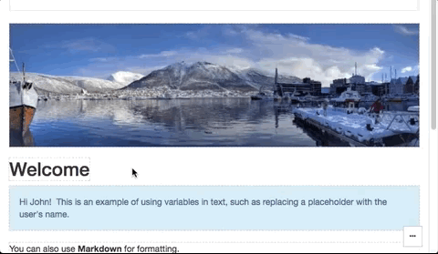
Text
Creates an editable text region.
<content.Text
id="title",
type="h1",
vars={{name: 'John'}},
/>
Image
Creates an editable image (<img>).
<content.Image
id="hero.image",
/>
Markdown
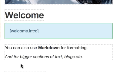
Creates an editable text region that displays formatted Markdown.
NOTE: This uses dangerouslySetInnerHTML, read up on it here.
<content.Markdown
id="home.intro",
type="div",
vars={{name: 'John'}},
/>
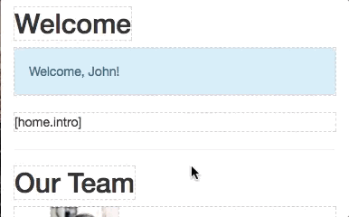
List
Creates an editable list of content. The children passed will represent an item in the list.
<content.List
id="team.members"
keys="name"
>
{item =>
<li key={item.id()}>
<item.Image id="pic" width="50" />
<item.Text id="name" />
</li>
}
</content.List>
Object
Allows editing a section of content, (like the properties of an object).
This editor is useful for:
- Off-page content such as metadata
- The content of complex page elements such as dropdowns, modals and popovers
- Editing many properties at once
<content.Object
id="meta"
keys="title,description"
type="span"
/>


