Research
/Security News
Critical Vulnerability in NestJS Devtools: Localhost RCE via Sandbox Escape
A flawed sandbox in @nestjs/devtools-integration lets attackers run code on your machine via CSRF, leading to full Remote Code Execution (RCE).
zenui-image-react
Advanced tools
Render responsive images with lazy loading and optimized performance using customizable placeholders and skeletons.
A highly customizable, performance-focused React component for lazy loading images with advanced features like placeholder effects, image optimization, and responsive loading.

If our GitHub repository reaches 200 stars ⭐, we will proudly launch the Vue version of this package.
npm install zenui-image-react
import { LazyLoadImage } from 'zenui-image-react';

function MyComponent() {
  return (
    <LazyLoadImage
      src="https://example.com/image.jpg"
      alt="Example"
      placeholderType="effect"
      effectType="blur"
    />
  );
}
Choose from multiple placeholder types while your image loads:
// Effect Placeholder (blur, opacity, or color)
<LazyLoadImage
  src="image.jpg"
  placeholderType="effect"
  effectType="blur"
  effectAmount={10}
/>

// Custom Image Placeholder
<LazyLoadImage
  src="image.jpg"
  placeholderType="image"
  placeholderImage="placeholder.jpg"
/>

// Custom Component Placeholder
<LazyLoadImage
  src="image.jpg"
  placeholderType="custom"
  customPlaceholder={<MyCustomLoader />}
/>
Enable automatic responsive image optimization:
<LazyLoadImage
  src="image.jpg"
  optimize
  quality={80}
  breakpoints={{
    sm: 576,
    md: 768,
    lg: 992,
    xl: 1200
  }}
  imageWidths={{
    sm: [576],
    md: [768],
    lg: [992],
    xl: [1200]
  }}
/>
Control the intersection observer and loading offset:
<LazyLoadImage
  src="image.jpg"
  useIntersectionObserver={true}
  offset={200} // Start loading 200px before entering viewport
  onLoad={() => console.log('Image loaded')}
  onError={(e) => console.error('Load failed:', e)}
/>
| Prop | Type | Default | Description |
|---|---|---|---|
src | string | Required | Image source URL |
alt | string | '' | Alt text for the image |
className | string | '' | CSS class name |
style | object | {} | Inline styles |
placeholderType | enum | 'none' | Type of placeholder ('none', 'effect', 'image', 'custom') |
effectType | enum | 'blur' | Effect type ('blur', 'opacity', 'color') |
effectAmount | number | 10 | Intensity of the effect |
placeholderImage | string | - | URL for placeholder image |
customPlaceholder | element | - | Custom React component as placeholder |
optimize | boolean | false | Enable responsive image optimization |
quality | number | 80 | Image quality (1-100) when optimize is true |
breakpoints | object | - | Custom breakpoints for responsive loading |
imageWidths | object | - | Width configurations for each breakpoint |
sizes | string | - | Custom sizes attribute for responsive images |
useIntersectionObserver | boolean | true | Enable/disable intersection observer |
offset | number | 0 | Loading offset in pixels |
onLoad | function | - | Callback when image loads |
onError | function | - | Callback when image fails to load |
{
  xs: 320,
  sm: 576,
  md: 768,
  lg: 992,
  xl: 1200,
  xxl: 1400
}
{
  xs: [320],
  sm: [576],
  md: [768],
  lg: [992],
  xl: [1200],
  xxl: [1400]
}
optimize prop for automatic responsive handlingoffset based on your use casequality propMIT © Asfak Ahmed ( rahi )
FAQs
Render responsive images with lazy loading and optimized performance using customizable placeholders and skeletons.
The npm package zenui-image-react receives a total of 1 weekly downloads. As such, zenui-image-react popularity was classified as not popular.
We found that zenui-image-react demonstrated a healthy version release cadence and project activity because the last version was released less than a year ago. It has 0 open source maintainers collaborating on the project.
Did you know?

Socket for GitHub automatically highlights issues in each pull request and monitors the health of all your open source dependencies. Discover the contents of your packages and block harmful activity before you install or update your dependencies.

Research
/Security News
A flawed sandbox in @nestjs/devtools-integration lets attackers run code on your machine via CSRF, leading to full Remote Code Execution (RCE).

Product
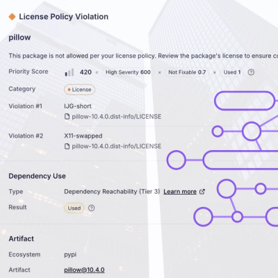
Customize license detection with Socket’s new license overlays: gain control, reduce noise, and handle edge cases with precision.

Product
Socket now supports Rust and Cargo, offering package search for all users and experimental SBOM generation for enterprise projects.