Product
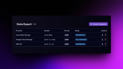
Introducing Data Exports
Export Socket alert data to your own cloud storage in JSON, CSV, or Parquet, with flexible snapshot or incremental delivery.
By Ola Adekola - Apr 23, 2026
barplots
Advanced tools
![]()
![]()
![]()
Python package to easily make barplots from multi-indexed dataframes.
As usual, just download it using pip:
pip install barplots
Most methods, in particular those exposed to user usage, are provided with docstrings. Consider reading these docstrings to learn about the most recent updates to the library.
The dataframe to be provided to the barplots library may look like the following:
| miss_rate | fall_out | mcc | evaluation_type | unbalance | graph_name | normalization_name |
|---|---|---|---|---|---|---|
| 0.0332031 | 0.705078 | 0.353357 | train | 10 | AlligatorSinensis | Traditional |
| 0.240234 | 0.478516 | 0.289591 | train | 1 | CanisLupus | Right Laplacian |
| 0.0253906 | 0.931641 | 0.101643 | train | 100 | AlligatorSinensis | Right Laplacian |
| 0.121094 | 0.699219 | 0.220219 | train | 10 | HomoSapiens | Traditional |
| 0.0136719 | 0.292969 | 0.722095 | test | 1 | CanisLupus | Right Laplacian |
| 0.0605469 | 0.90625 | 0.0622185 | test | 10 | AmanitaMuscariaKoideBx008 | Traditional |
| 0.0078125 | 0.4375 | 0.614287 | train | 100 | AmanitaMuscariaKoideBx008 | Traditional |
| 0.171875 | 0.869141 | -0.0572194 | train | 100 | AlligatorSinensis | Traditional |
| 0.0859375 | 0.810547 | 0.150206 | train | 10 | MusMusculus | Right Laplacian |
| 0.0273438 | 0.646484 | 0.415357 | test | 10 | MusMusculus | Right Laplacian |
Specifically, in this example, we may create bar plots for the features Miss rate, fallout, and Matthew Correlation Coefficient by grouping on the evaluation_type, unbalance, graph_name, and normalization_name columns.
An example CSV file can be seen here.
Here follows a set of examples of common usages. Basically, every graph shows either the same data or a mean based on the provided group by indices. Choose whatever representation is best for visualizing your data, as one is not necessarily better than another for every dataset.
Note: The data used in the following examples are randomly generated for testing purposes. DO NOT consider these values as valid results for experiments using the same labels (cell lines, etc.), which are only used to show possible usages.
For every example, the considered dataframe df is loaded as follows:
import pandas as pd

df = pd.read_csv("tests/test_case.csv")
Also, for every example, the custom_defaults used to sanitize the labels specific to the dataset is:
custom_defaults = {
    "P": "promoters",
    "E": "enhancers",
    "A": "active ",
    "I": "inactive ",
    "+": " and ",
    "": "anything",
    "Validation": "val"
}
In the following example, we will plot the bars horizontally, rotating the group labels by 90 degrees, and displaying the bar labels as a shared legend.
from barplots import barplots
import pandas as pd

df = pd.read_csv("tests/test_case.csv")
custom_defaults = {
    "P": "promoters",
    "E": "enhancers",
    "A": "active ",
    "I": "inactive ",
    "+": " and ",
    "": "anything",
    "Validation": "val"
}

barplots(
    df,
    groupby=["task", "model"],
    orientation="horizontal",
    show_legend=True,
    minor_rotation=90,
    custom_defaults=custom_defaults
)
Result can be seen here.
In this example, we will plot the top index as multiple subplots with horizontal bars, rotating the group labels by 90 degrees, and displaying the bar labels as a shared legend.
from barplots import barplots
import pandas as pd

df = pd.read_csv("tests/test_case.csv")
custom_defaults = {
    "P": "promoters",
    "E": "enhancers",
    "A": "active ",
    "I": "inactive ",
    "+": " and ",
    "": "anything",
    "Validation": "val"
}

barplots(
    df,
    groupby=["cell_line", "task", "model"],
    orientation="horizontal",
    show_legend=True,
    subplots=True,
    minor_rotation=90,
    custom_defaults=custom_defaults
)

In this example, we will plot horizontal bars, rotating the top group labels by 90 degrees, and displaying the bar labels as minor ticks.
from barplots import barplots
import pandas as pd

df = pd.read_csv("tests/test_case.csv")
custom_defaults = {
    "P": "promoters",
    "E": "enhancers",
    "A": "active ",
    "I": "inactive ",
    "+": " and ",
    "": "anything",
    "Validation": "val"
}

barplots(
    df,
    groupby=["task", "model"],
    orientation="horizontal",
    show_legend=False,
    major_rotation=90,
    custom_defaults=custom_defaults
)
Result can be seen here.
In this example, we will plot the top index as multiple subplots with horizontal bars, rotating the group labels by 90 degrees, and displaying the bar labels as minor ticks.
from barplots import barplots
import pandas as pd

df = pd.read_csv("tests/test_case.csv")
custom_defaults = {
    "P": "promoters",
    "E": "enhancers",
    "A": "active ",
    "I": "inactive ",
    "+": " and ",
    "": "anything",
    "Validation": "val"
}

barplots(
    df,
    groupby=["cell_line", "task", "model"],
    orientation="horizontal",
    show_legend=False,
    major_rotation=90,
    subplots=True,
    custom_defaults=custom_defaults
)

In this example, we will plot the bars vertically and display the bar labels as a shared legend.
from barplots import barplots
import pandas as pd

df = pd.read_csv("tests/test_case.csv")
custom_defaults = {
    "P": "promoters",
    "E": "enhancers",
    "A": "active ",
    "I": "inactive ",
    "+": " and ",
    "": "anything",
    "Validation": "val"
}

barplots(
    df,
    groupby=["task", "model"],
    orientation="vertical",
    show_legend=True,
    custom_defaults=custom_defaults
)
Result can be seen here.
In this example, we will plot the top index as multiple subplots with vertical bars, displaying the bar labels as a shared legend.
from barplots import barplots
import pandas as pd

df = pd.read_csv("tests/test_case.csv")
custom_defaults = {
    "P": "promoters",
    "E": "enhancers",
    "A": "active ",
    "I": "inactive ",
    "+": " and ",
    "": "anything",
    "Validation": "val"
}

barplots(
    df,
    groupby=["cell_line", "task", "model"],
    orientation="vertical",
    show_legend=True,
    subplots=True,
    custom_defaults=custom_defaults
)

In this example, we will plot vertical bars, rotating the minor group labels by 90 degrees, and displaying the bar labels as minor ticks.
from barplots import barplots
import pandas as pd

df = pd.read_csv("tests/test_case.csv")
custom_defaults = {
    "P": "promoters",
    "E": "enhancers",
    "A": "active ",
    "I": "inactive ",
    "+": " and ",
    "": "anything",
    "Validation": "val"
}

barplots(
    df,
    groupby=["task", "model"],
    orientation="vertical",
    show_legend=False,
    minor_rotation=90,
    custom_defaults=custom_defaults
)
Result can be seen here.
In this example, we will plot the top index as multiple subplots with vertical bars, rotating the minor group labels by 90 degrees, and displaying the bar labels as minor ticks.
from barplots import barplots
import pandas as pd

df = pd.read_csv("tests/test_case.csv")
custom_defaults = {
    "P": "promoters",
    "E": "enhancers",
    "A": "active ",
    "I": "inactive ",
    "+": " and ",
    "": "anything",
    "Validation": "val"
}

barplots(
    df,
    groupby=["cell_line", "task", "model"],
    orientation="vertical",
    show_legend=False,
    minor_rotation=90,
    subplots=True,
    custom_defaults=custom_defaults
)

FAQs
Python package to easily make barplots from multi-indexed dataframes.
We found that barplots demonstrated a healthy version release cadence and project activity because the last version was released less than a year ago. It has 1 open source maintainer collaborating on the project.
Did you know?

Socket for GitHub automatically highlights issues in each pull request and monitors the health of all your open source dependencies. Discover the contents of your packages and block harmful activity before you install or update your dependencies.
Product
Export Socket alert data to your own cloud storage in JSON, CSV, or Parquet, with flexible snapshot or incremental delivery.
Research
/Security News
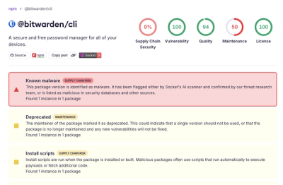
Bitwarden CLI 2026.4.0 was compromised in the Checkmarx supply chain campaign after attackers abused a GitHub Action in Bitwarden’s CI/CD pipeline.

Research
/Security News
Docker and Socket have uncovered malicious Checkmarx KICS images and suspicious code extension releases in a broader supply chain compromise.