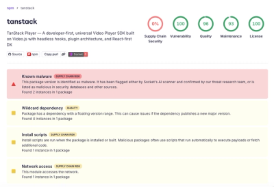


A zero-dependency python package that prints basic charts to a Jupyter output
Charts supported:
- Bar graphs
- Scatter plots
- Histograms
- 🍑📊👏
Examples
Bar graphs can be drawn quickly with the bar function:
from chart import bar

x = [500, 200, 900, 400]
y = ['marc', 'mummify', 'chart', 'sausagelink']

bar(x, y)
       marc: ▇▇▇▇▇▇▇▇▇▇▇▇▇▇▇▇▇
    mummify: ▇▇▇▇▇▇▇
      chart: ▇▇▇▇▇▇▇▇▇▇▇▇▇▇▇▇▇▇▇▇▇▇▇▇▇▇▇▇▇▇
sausagelink: ▇▇▇▇▇▇▇▇▇▇▇▇▇
And the bar function can accept columns from a pd.DataFrame:
from chart import bar
import pandas as pd

df = pd.DataFrame({
    'artist': ['Tame Impala', 'Childish Gambino', 'The Knocks'],
    'listens': [8_456_831, 18_185_245, 2_556_448]
})
bar(df.listens, df.artist, width=20, label_width=11, mark='🔊')
Tame Impala: 🔊🔊🔊🔊🔊🔊🔊🔊🔊
Childish Ga: 🔊🔊🔊🔊🔊🔊🔊🔊🔊🔊🔊🔊🔊🔊🔊🔊🔊🔊🔊🔊
 The Knocks: 🔊🔊🔊
Histograms are just as easy:
from chart import histogram

x = [1, 2, 4, 3, 3, 1, 7, 9, 9, 1, 3, 2, 1, 2]

histogram(x)
▇
▇
▇
▇
▇ ▇
▇ ▇
▇ ▇
▇ ▇     ▇
▇ ▇     ▇
▇ ▇   ▇ ▇
And they can accept objects created by scipy:
from chart import histogram
import scipy.stats as stats
import numpy as np

np.random.seed(14)
n = stats.norm(loc=0, scale=10)

histogram(n.rvs(100), bins=14, height=7, mark='🍑')
            🍑
            🍑   🍑
            🍑 🍑 🍑
            🍑 🍑 🍑
        🍑   🍑 🍑 🍑
      🍑 🍑 🍑 🍑 🍑 🍑 🍑 🍑 🍑
      🍑 🍑 🍑 🍑 🍑 🍑 🍑 🍑 🍑   🍑
Scatter plots can be drawn with a simple scatter call:
from chart import scatter

x = range(0, 20)
y = range(0, 20)

scatter(x, y)
                                       •
                                   • •
                                 •
                             • •
                         • •
                       •
                  •  •
                •
            • •
        • •
      •
  • •
•
And at this point you gotta know it works with any np.array:
from chart import scatter
import numpy as np

np.random.seed(1)
N = 100
x = np.random.normal(100, 50, size=N)
y = x * -2 + 25 + np.random.normal(0, 25, size=N)

scatter(x, y, width=20, height=9, mark='^')
^^
 ^
    ^^^
    ^^^^^^^
       ^^^^^^
        ^^^^^^^
            ^^^^
             ^^^^^ ^
                ^^ ^
In fact, all chart functions work with pandas, numpy, scipy and regular python objects.
Preprocessors
In order to create the simple outputs generated by bar, histogram, and scatter I had to create a couple of preprocessors, namely: NumberBinarizer and RangeScaler.
I tried to adhere to the scikit-learn API in their construction. Although you won't need them to use chart here they are for your tinkering:
from chart.preprocessing import NumberBinarizer

nb = NumberBinarizer(bins=4)
x = range(10)
nb.fit(x)
nb.transform(x)
[0, 0, 0, 1, 1, 2, 2, 3, 3, 3]
from chart.preprocessing import RangeScaler

rs = RangeScaler(out_range=(0, 10), round=False)
x = range(50, 59)
rs.fit_transform(x)
[0.0, 1.25, 2.5, 3.75, 5.0, 6.25, 7.5, 8.75, 10.0]
Installation
pip install chart
Contribute
For feature requests or bug reports, please use Github Issues
Inspiration
I wanted a super-light-weight library that would allow me to quickly grok data. Matplotlib had too many dependencies, and Altair seemed overkill. Though I really like the idea of termgraph, it didn't really fit well or integrate with my Jupyter workflow. Here's to chart 🥂 (still can't believe I got it on PyPI)