MatChart
MatChart is a convenient one-line wrapper around matplotlib plotting library.
Usage
from matchart import plot
plot([x1, y1], [y2], [x3, y3], y4, ...,
kind='plot',
show: bool = True,
block: Optional[bool] = None,
context: bool = False,
clear_on_error: bool = True,
label: ClippedArguments = None,
color: CycledArguments = None,
marker: ClippedArguments = None,
linestyle: ClippedArguments = None,
linewidth: ClippedArguments = None,
markersize: ClippedArguments = None,
legend: Optional[bool] = None,
legend_kwargs: Optional[Dict[str, Any]] = None,
title: Optional[str] = None,
title_kwargs: Optional[Dict[str, Any]] = None,
xlabel: Optional[str] = None,
xlabel_kwargs: Optional[Dict[str, Any]] = None,
ylabel: Optional[str] = None,
ylabel_kwargs: Optional[Dict[str, Any]] = None,
limit: Union[Tuple[Any, Any, Any, Any], bool] = True,
xticks: Optional[Union[Iterable, Dict[str, Any], bool]] = None,
yticks: Optional[Union[Iterable, Dict[str, Any], bool]] = None,
ticks: Optional[Dict[str, Union[Iterable, Dict[str, Any], bool]]] = None,
figsize: Tuple[float, float] = (10, 8),
dpi: float = 100,
subplots_kwargs: Optional[Dict[str, Any]] = None,
grid: Optional[bool] = False,
grid_kwargs: Optional[Dict[str, Any]] = None,
theme = 'seaborn-v0_8-deep',
** plotter_kwargs
) -> Tuple[Figure, Axes, List[Artist]]
kind - pyplot function name, e.g. plot or scatter.
show - whether to show plot or just to draw it.
block - whether to block running code when showing plot or just display windows and run next lines. By default, detected from environment.
context - delay showing plot by using context manager (see below).
clear_on_error - whether to clean up on any error.
label, color, marker, linestyle, linewidth, markersize and rest plotter_kwargs - plotter parameters. Can differ per kind. See common parameters for kind='plot'. Can be list or tuple to define per-dataset values. Values can also be None or even clipped to skip definition for particular dataset.
legend - set True, False or None to autodetect. legend_kwargs - additional parameters.
title - plot's title. title_kwargs - additional parameters.
xlabel - horizontal axis label. xlabel_kwargs - additional parameters.
ylabel - vertical axis label. ylabel_kwargs - additional parameters.
limit - set True to autodetect 2D plot's borders or False to use default matplot's behaviour. Set to (left, right, bottom, top) to use custom borders.
ticks, xticks, yticks - set corresponding ticks. Can be False to disable ticks. Can be dictionary of kwargs. Can be array-like value to define ticks locations. Argument xticks defines ticks for X axis, yticks - for Y axis. Alternatively argument ticks can be defined as dictionary with keys 'x' or 'y' containing same values as xticks and yticks arguments. Argument xticks must be used solely.
figsize - plot's size as (width, height) in inches. By default, is overriden with 10x8.
dpi - plot's resolution in dots-per-inch.
subplots_kwargs - additional plot's parameters and Figure's parameters.
grid - plot's grid visibility with grid_kwargs as additional parameters.
theme - plot's style. By default is overriden with seaborn-v0_8-deep.
Examples
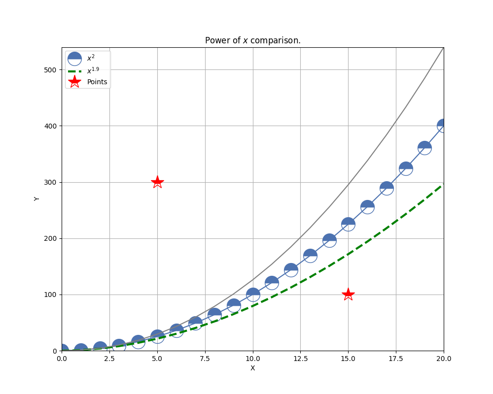
Just plot something
Firstly prepare data:
import numpy as np

x1 = np.arange(21)
y1 = x1 ** 2
y2 = x1 ** 1.9
x3 = 5, 15
y3 = 300, 100
y4 = x1 ** 2.1
Then plot data:
from matchart import plot

plot([x1, y1], [y2], [x3, y3], y4,
	 label=['$x^{2}$', '$x^{1.9}$', 'Points'],
	 xlabel='X', ylabel='Y',
	 title='Power of $x$ comparison.',
	 grid=True,
	 color=[None, 'green', 'red', 'gray'],
	 marker=['o', None, '*'],
	 linestyle=[None, '--'],
	 linewidth=[None, 3, 0],
	 markersize=20,
	 fillstyle='top')
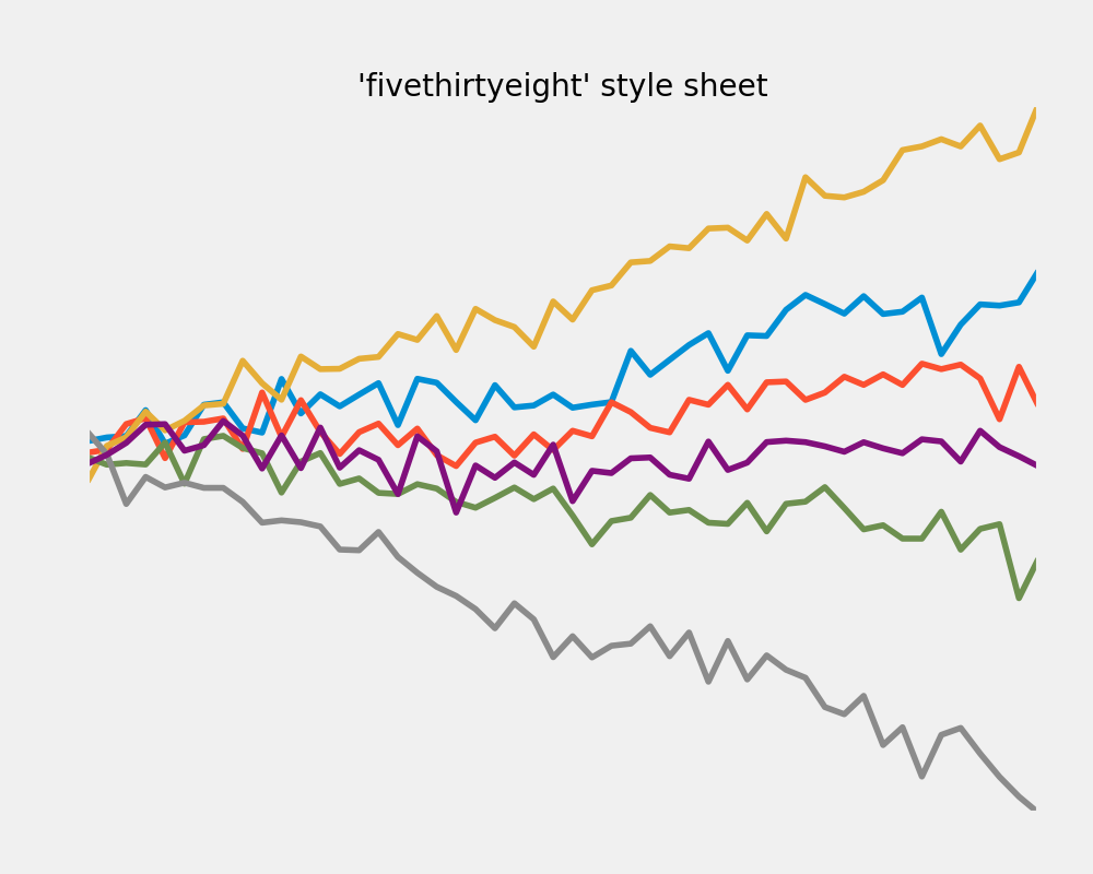
Migrate from matplotlib simple
Let's take FiveThirtyEight style sheet example:
import matplotlib.pyplot as plt
import numpy as np
plt.style.use('fivethirtyeight')
x = np.linspace(0, 10)
np.random.seed(19680801)
fig, ax = plt.subplots()
ax.plot(x, np.sin(x) + x + np.random.randn(50))
ax.plot(x, np.sin(x) + 0.5 * x + np.random.randn(50))
ax.plot(x, np.sin(x) + 2 * x + np.random.randn(50))
ax.plot(x, np.sin(x) - 0.5 * x + np.random.randn(50))
ax.plot(x, np.sin(x) - 2 * x + np.random.randn(50))
ax.plot(x, np.sin(x) + np.random.randn(50))
ax.set_title("'fivethirtyeight' style sheet")
plt.show()
and rewrite it with MatChart:
from matchart import plot
import numpy as np
x = np.linspace(0, 10)
np.random.seed(19680801)
plot([x, np.sin(x) + x + np.random.randn(50)],
[x, np.sin(x) + 0.5 * x + np.random.randn(50)],
[x, np.sin(x) + 2 * x + np.random.randn(50)],
[x, np.sin(x) - 0.5 * x + np.random.randn(50)],
[x, np.sin(x) - 2 * x + np.random.randn(50)],
[x, np.sin(x) + np.random.randn(50)],
title="'fivethirtyeight' style sheet",
theme='fivethirtyeight')
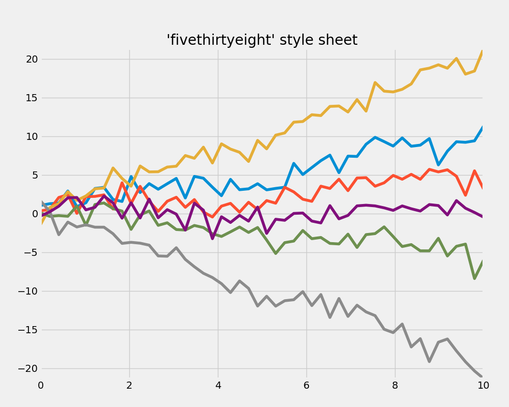
Note that default figure size differs.
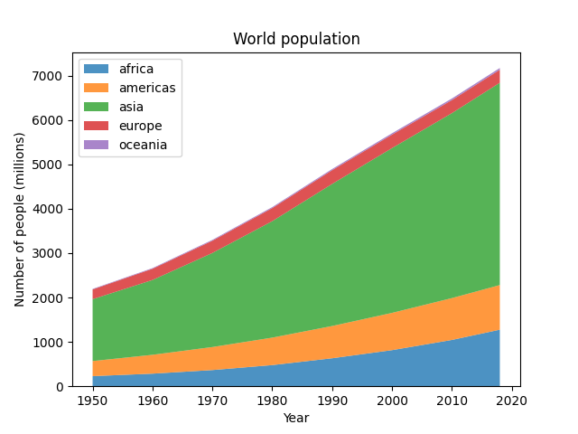
Migrate from matplotlib stackplot
Let's take stackplots example:
import matplotlib.pyplot as plt
year = [1950, 1960, 1970, 1980, 1990, 2000, 2010, 2018]
population_by_continent = {
'africa' : [228, 284, 365, 477, 631, 814, 1044, 1275],
'americas': [340, 425, 519, 619, 727, 840, 943, 1006],
'asia' : [1394, 1686, 2120, 2625, 3202, 3714, 4169, 4560],
'europe' : [220, 253, 276, 295, 310, 303, 294, 293],
'oceania' : [12, 15, 19, 22, 26, 31, 36, 39],
}
fig, ax = plt.subplots()
ax.stackplot(year, population_by_continent.values(),
labels=population_by_continent.keys(), alpha=0.8)
ax.legend(loc='upper left')
ax.set_title('World population')
ax.set_xlabel('Year')
ax.set_ylabel('Number of people (millions)')
plt.show()
and rewrite it with MatChart:
from matchart import plot
year = [1950, 1960, 1970, 1980, 1990, 2000, 2010, 2018]
population_by_continent = {
'africa' : [228, 284, 365, 477, 631, 814, 1044, 1275],
'americas': [340, 425, 519, 619, 727, 840, 943, 1006],
'asia' : [1394, 1686, 2120, 2625, 3202, 3714, 4169, 4560],
'europe' : [220, 253, 276, 295, 310, 303, 294, 293],
'oceania' : [12, 15, 19, 22, 26, 31, 36, 39],
}
plot([year, population_by_continent.values()],
kind='stackplot',
labels=population_by_continent.keys(),
alpha=0.8,
legend=True,
legend_kwargs=dict(loc='upper left'),
limit=False,
title='World population',
xlabel='Year',
ylabel='Number of people (millions)')
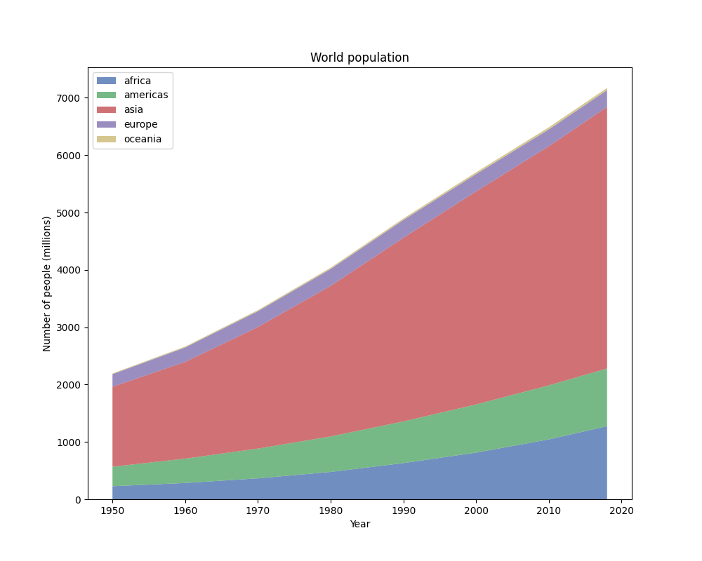
Note that default figure size and theme differ.
Customization of plots
Let's take FiveThirtyEight style sheet example above and customize it before showing.
Imagine now we want to remove X and Y axes.
Straightforward solution (not bad)
To do the trick we can:
- only draw plot with
show=False;
- customize figure with matplotlib stuff;
- show plot with
matplotlib.pyplot.show().
from matchart import plot
import numpy as np
from matplotlib import pyplot as plt
x = np.linspace(0, 10)
np.random.seed(19680801)
fig, ax, arts = plot(
[x, np.sin(x) + x + np.random.randn(50)],
[x, np.sin(x) + 0.5 * x + np.random.randn(50)],
[x, np.sin(x) + 2 * x + np.random.randn(50)],
[x, np.sin(x) - 0.5 * x + np.random.randn(50)],
[x, np.sin(x) - 2 * x + np.random.randn(50)],
[x, np.sin(x) + np.random.randn(50)],
title="'fivethirtyeight' style sheet",
theme='fivethirtyeight',
show=False)
ax.xaxis.set_visible(False)
ax.yaxis.set_visible(False)
plt.show()
Clever solution (better)
To solve such kind of problems there is context manager support:
- draw plot with
context=True;
- customize figure with matplotlib stuff within context manager.
from matchart import plot
import numpy as np
x = np.linspace(0, 10)
np.random.seed(19680801)
with plot(
[x, np.sin(x) + x + np.random.randn(50)],
[x, np.sin(x) + 0.5 * x + np.random.randn(50)],
[x, np.sin(x) + 2 * x + np.random.randn(50)],
[x, np.sin(x) - 0.5 * x + np.random.randn(50)],
[x, np.sin(x) - 2 * x + np.random.randn(50)],
[x, np.sin(x) + np.random.randn(50)],
title="'fivethirtyeight' style sheet",
theme='fivethirtyeight',
context=True) as results:
ax = results[1]
ax.xaxis.set_visible(False)
ax.yaxis.set_visible(False)
The best solution
Specially for lazy people there is special alias to be used within context manager:
- draw plot with
matchart.cplot();
- customize figure with matplotlib stuff within context manager.
from matchart import cplot
import numpy as np
x = np.linspace(0, 10)
np.random.seed(19680801)
with cplot(
[x, np.sin(x) + x + np.random.randn(50)],
[x, np.sin(x) + 0.5 * x + np.random.randn(50)],
[x, np.sin(x) + 2 * x + np.random.randn(50)],
[x, np.sin(x) - 0.5 * x + np.random.randn(50)],
[x, np.sin(x) - 2 * x + np.random.randn(50)],
[x, np.sin(x) + np.random.randn(50)],
title="'fivethirtyeight' style sheet",
theme='fivethirtyeight') as plotter:
plotter.axis.xaxis.set_visible(False)
plotter.axis.yaxis.set_visible(False)
Now you can customize plots just adding literally one letter.
Changelog
1.1.5:
- Add getters to context plotter.
1.1.4:
- Add ticks control parameters.
- Add automatic cleanup on any error (parameter
clear_on_error).
1.1.3:
- Add
context parameter and alias matchart.cplot(...) to delay plot showing within context manager.
- Add
block parameter of matplotlib's show function.
- Small enhancements and bugs fixes.