Security News
Deno 2.6 + Socket: Supply Chain Defense In Your CLI
Deno 2.6 introduces deno audit with a new --socket flag that plugs directly into Socket to bring supply chain security checks into the Deno CLI.
streamlit-echarts
Advanced tools
A Streamlit component to display ECharts.

pip install streamlit-echarts
This library provides 2 functions to display echarts :
st_echarts to display charts from ECharts json options as Python dictsst_pyecharts to display charts from Pyecharts instancesCheck out the demo and source code for more examples.
st_echarts example
from streamlit_echarts import st_echarts

options = {
    "xAxis": {
        "type": "category",
        "data": ["Mon", "Tue", "Wed", "Thu", "Fri", "Sat", "Sun"],
    },
    "yAxis": {"type": "value"},
    "series": [
        {"data": [820, 932, 901, 934, 1290, 1330, 1320], "type": "line"}
    ],
}
st_echarts(options=options)
st_pyecharts example
from pyecharts import options as opts
from pyecharts.charts import Bar
from streamlit_echarts import st_pyecharts

b = (
    Bar()
    .add_xaxis(["Microsoft", "Amazon", "IBM", "Oracle", "Google", "Alibaba"])
    .add_yaxis(
        "2017-2018 Revenue in (billion $)", [21.2, 20.4, 10.3, 6.08, 4, 2.2]
    )
    .set_global_opts(
        title_opts=opts.TitleOpts(
            title="Top cloud providers 2018", subtitle="2017-2018 Revenue"
        ),
        toolbox_opts=opts.ToolboxOpts(),
    )
)
st_pyecharts(b)
st_echarts(
    options: Dict
    theme: Union[str, Dict]
    events: Dict[str, str]
    height: str
    width: str
    renderer: str
    map: Map
    key: str
)
// JS code
option = {
  xAxis: {
    type: "category",
    data: ["Mon", "Tue", "Wed", "Thu", "Fri", "Sat", "Sun"],
  },
  yAxis: { type: "value" },
  series: [{ data: [820, 932, 901, 934, 1290, 1330, 1320], type: "line" }],
};
is represented in Python :
# Python code
option = {
    "xAxis": {
        "type": "category",
        "data": ["Mon", "Tue", "Wed", "Thu", "Fri", "Sat", "Sun"],
    },
    "yAxis": { "type": "value" },
    "series": [
        {"data": [820, 932, 901, 934, 1290, 1330, 1320], "type": "line" }
    ],
}
{
    "click": "function(params) { console.log(params.name) }"
}
will get mapped to :
myChart.on("click", function (params) {
  console.log(params.name);
});
Return values from events are sent back to Python, for example:
option = {
    "xAxis": {
        "type": "category",
        "data": ["Mon", "Tue", "Wed", "Thu", "Fri", "Sat", "Sun"],
    },
    "yAxis": { "type": "value" },
    "series": [
        {"data": [820, 932, 901, 934, 1290, 1330, 1320], "type": "line" }
    ],
}
events = {
    "click": "function(params) { console.log(params.name); return params.name }",
    "dblclick":"function(params) { return [params.type, params.name, params.value] }"
}
value = st_echarts(option, events=events)
st.write(value)  # shows name on bar click and type+name+value on bar double click
The JS code needs to be a one-liner. You can use Javascript minifiers like https://javascript-minifier.com/ or https://www.minifier.org/ to transform your Javascript code to a one-liner.
Map classfrom streamlit_echarts import Map
with open("USA.json", "r") as f:
map = Map(
"USA",
json.loads(f.read()),
{
"Alaska": {"left": -131, "top": 25, "width": 15},
"Hawaii": {"left": -110, "top": 28, "width": 5},
"Puerto Rico": {"left": -76, "top": 26, "width": 2},
},
)
options = {...}
st_echarts(options, map=map)
You'll find a lot of GeoJSON data inside the source code of echarts-countries-js.
def st_pyecharts(
    chart: Base
    theme: Union[str, Dict]
    events: Dict[str, str]
    height: str
    width: str
    renderer: str
    map: Map
    key: str
)
The docs for the remaining inputs are the same as its st_echarts counterpart.
cd frontend
npm install
conda create -n streamlit-echarts python=3.7
conda activate streamlit-echarts
pip install -e .
Both webpack dev server and Streamlit need to run for development mode.
cd frontend
npm run start
Demo example is on https://github.com/andfanilo/streamlit-echarts-demo.
git clone https://github.com/andfanilo/streamlit-echarts-demo
cd streamlit-echarts-demo/
streamlit run app.py
Bar(init_opts=opts.InitOpts(theme=ThemeType.LIGHT))
does not work, you need to call theme in st_pyecharts(c, theme=ThemeType.LIGHT).This library also provides the JsCode util class directly from pyecharts.
This class is used to indicate javascript code by wrapping it with a specific placeholder. On the custom component side, we parse every value in options looking for this specific placeholder to determine whether a value is a JS function.
As such, if you want to pass JS functions as strings in your options,
you should use the corresponding JsCode module to wrap code with this placeholder :
streamlit_echarts.JsCode by calling JsCode(function).jscode.
It's a smaller version of pyecharts.commons.utils.JsCode so you don't need to install pyecharts to use it.series: [
{
type: 'scatter', // this is scatter chart
itemStyle: {
opacity: 0.8
},
symbolSize: JsCode("function (val) { return val[2] * 40;}").js_code,
data: [["14.616","7.241","0.896"],["3.958","5.701","0.955"],["2.768","8.971","0.669"],["9.051","9.710","0.171"],["14.046","4.182","0.536"],["12.295","1.429","0.962"],["4.417","8.167","0.113"],["0.492","4.771","0.785"],["7.632","2.605","0.645"],["14.242","5.042","0.368"]]
}
]
pyecharts.commons.utils.JsCode directly, JsCode automatically calls .jscode when dumping options..set_series_opts(
label_opts=opts.LabelOpts(
position="right",
formatter=JsCode(
"function(x){return Number(x.data.percent * 100).toFixed() + '%';}"
),
)
)
Note: you need the JS string to be on one-line. You can use Javascript minifiers like https://javascript-minifier.com/ or https://www.minifier.org/ to transform your Javascript code to a one-liner.
While this package provides a st_pyecharts method, if you're using pyecharts you can directly embed your pyecharts visualization inside st.html
by passing the output of the chart's .render_embed().
from pyecharts.charts import Bar
from pyecharts import options as opts
import streamlit.components.v1 as components

c = (Bar()
    .add_xaxis(["Microsoft", "Amazon", "IBM", "Oracle", "Google", "Alibaba"])
    .add_yaxis('2017-2018 Revenue in (billion $)', [21.2, 20.4, 10.3, 6.08, 4, 2.2])
    .set_global_opts(title_opts=opts.TitleOpts(title="Top cloud providers 2018", subtitle="2017-2018 Revenue"),
                     toolbox_opts=opts.ToolboxOpts())
    .render_embed() # generate a local HTML file
)
components.html(c, width=1000, height=1000)
Using st_pyecharts is still something you would want if you need to change data regularly
without remounting the component, check for examples examples/app_pyecharts.py for Chart with randomization example.

FAQs
Echarts custom component for Streamlit
We found that streamlit-echarts demonstrated a healthy version release cadence and project activity because the last version was released less than a year ago. It has 1 open source maintainer collaborating on the project.
Did you know?

Socket for GitHub automatically highlights issues in each pull request and monitors the health of all your open source dependencies. Discover the contents of your packages and block harmful activity before you install or update your dependencies.

Security News
Deno 2.6 introduces deno audit with a new --socket flag that plugs directly into Socket to bring supply chain security checks into the Deno CLI.

Security News
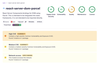
New DoS and source code exposure bugs in React Server Components and Next.js: what’s affected and how to update safely.

Security News
Socket CEO Feross Aboukhadijeh joins Software Engineering Daily to discuss modern software supply chain attacks and rising AI-driven security risks.