Security News
/Research
Wallet-Draining npm Package Impersonates Nodemailer to Hijack Crypto Transactions
Malicious npm package impersonates Nodemailer and drains wallets by hijacking crypto transactions across multiple blockchains.
Yellowbrick is a suite of visual analysis and diagnostic tools designed to facilitate machine learning with scikit-learn. The library implements a new core API object, the Visualizer that is an scikit-learn estimator — an object that learns from data. Similar to transformers or models, visualizers learn from data by creating a visual representation of the model selection workflow.
Visualizer allow users to steer the model selection process, building intuition around feature engineering, algorithm selection and hyperparameter tuning. For instance, they can help diagnose common problems surrounding model complexity and bias, heteroscedasticity, underfit and overtraining, or class balance issues. By applying visualizers to the model selection workflow, Yellowbrick allows you to steer predictive models toward more successful results, faster.
The full documentation can be found at scikit-yb.org and includes a Quick Start Guide for new users.
Visualizers are estimators — objects that learn from data — whose primary objective is to create visualizations that allow insight into the model selection process. In scikit-learn terms, they can be similar to transformers when visualizing the data space or wrap a model estimator similar to how the ModelCV (e.g. RidgeCV, LassoCV) methods work. The primary goal of Yellowbrick is to create a sensical API similar to scikit-learn. Some of our most popular visualizers include:
k by visualizing the silhouette coefficient scores of each cluster in a single model... and more! Yellowbrick is adding new visualizers all the time so be sure to check out our [examples gallery]https://github.com/DistrictDataLabs/yellowbrick/tree/develop/examples) — or even the develop branch — and feel free to contribute your ideas for new Visualizers!
FAQs
A suite of visual analysis and diagnostic tools for machine learning.
We found that yellowbrick demonstrated a healthy version release cadence and project activity because the last version was released less than a year ago. It has 3 open source maintainers collaborating on the project.
Did you know?

Socket for GitHub automatically highlights issues in each pull request and monitors the health of all your open source dependencies. Discover the contents of your packages and block harmful activity before you install or update your dependencies.

Security News
/Research
Malicious npm package impersonates Nodemailer and drains wallets by hijacking crypto transactions across multiple blockchains.

Security News
This episode explores the hard problem of reachability analysis, from static analysis limits to handling dynamic languages and massive dependency trees.

Security News
/Research
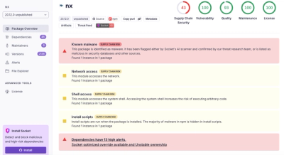
Malicious Nx npm versions stole secrets and wallet info using AI CLI tools; Socket’s AI scanner detected the supply chain attack and flagged the malware.