Product
Announcing Bun and vlt Support in Socket
Bringing supply chain security to the next generation of JavaScript package managers
css-lightbox
Advanced tools
These lightboxes work in all modern browsers with pure CSS. Additional support for Internet Explorer and older browsers is made possible with a small amount of JavaScript.
From the command line:
(sudo) gem install css-lightbox
Add to a project:
// rails: compass.config, other: config.rb
require 'css-lightbox'

// command line
compass install css-lightbox
Or create a new project:
compass -r css-lightbox -f css-lightbox project_directory
The basic CSS-Lightbox works with a combination of internal links, z-index,
positioning and the css3 :target selector. Javascript bootstrapping simply
interupts the link action, and applys active or inactive classes to the
boxes.
Each lightbox contains three important elements:
- Container
    - Box
    - Link to close the box (href="#")
The container gives you extra positioning options, and acts as an optional modal overlay for the page. You can write the HTML to your liking, but here is one example:
<aside id="about-us" class="container">
  <div class="box">

    <!-- Your Lightbox Content -->

    <a href="#" title="close the 'about' lightbox">close</a> <!-- Link to close -->
  </div>
</aside>
To open your lightbox, all you need is a link from somewhere else on the page that points at your lightbox:
<a href="#about-us">a link to the about-us lightbox</a>
For a quick, pre-styled lightbox simply apply the lightbox-with-default-styles
mixin to your lightbox containers.
.container {
  @include lightbox-with-default-styles;
}
lightbox-with-default-styles takes three optional arguments, each with
defaults that you can override globaly for your project.
"> div".false
for no fade..active.Use them like so:
.container {
  @include lightbox-with-default-styles('> div', '300ms', '.visible');
}
For Javascript bootstrapping in IE (using jQuery), simply link the included lightbox.js and make any needed changes to the HTML-related variables that it uses:
// "lightboxes" should point to the lightbox containers on your page
var lightboxes = $('#lightboxes aside');

// "closeLinks" should point at the links used to close boxes
var closeLinks = $('#lightboxes a[title*="close"]');

// "showClass" is the class to use for active lightboxes
// "hideClass" is used for inactive lightboxes
var showClass = 'active'
var hideClass = 'hidden'
The function is called simply, and the variables can be overridden on each call as needed:
$(document).ready(function(){
  lightboxBootstrap(lightboxes, closeLinks, showClass, hideClass);
});
But why would you use my styles when you can create your own? For simple
lightboxes without any styling at all, you can use the simple lightbox mixin:
.container {
  @include lightbox;
}
I'll warn you, it's ugly until you add some style, but adding style isn't hard.
By default absolute positioning is used on the containers to place them in
the top left. You can override that by changing the positioning of your
container as you like. You'll find that each solution has advantages and
disadvantages.
Defaults:
// Set this to a selector for the inner box.
$lightbox-box-to-style: "> div";

// Set the default fade time, or leave false for no fade
$lightbox-fade: false;

// Set the active selector to be used by the JS fallback
$lightbox-active: ".active";
Mixins:
What makes a lightbox inactive
lightbox-hidden();
What makes a lightbox active
lightbox-active();
Initiallizes lightbox styles, and hides them to be revealed later
lightbox-hide();
Shows a lightbox when it should be active
lightbox-show( $active: $lightbox-active );
Set up your lightboxes by applying to each container
lightbox( $active: $lightbox-active );
Set a lightbox to fade
lightbox-fade( $fade-speed: $lightbox-fade or 500ms );
Apply default styles to the lightbox container
lightbox-default-container-styles( $fade-speed: $lightbox-fade );
Apply default styles to the box
lightbox-default-box-styles();
Apply default styles to the container and box in one fell swoop
lightbox-default-styles( $style : $lightbox-box-to-style, $fade-speed : $lightbox-fade );
Create and style a lightbox all at once
lightbox-with-default-styles( $style : $lightbox-box-to-style, $fade-speed : $lightbox-fade, $active : $lightbox-active );
FAQs
Unknown package
We found that css-lightbox demonstrated a not healthy version release cadence and project activity because the last version was released a year ago. It has 1 open source maintainer collaborating on the project.
Did you know?

Socket for GitHub automatically highlights issues in each pull request and monitors the health of all your open source dependencies. Discover the contents of your packages and block harmful activity before you install or update your dependencies.

Product
Bringing supply chain security to the next generation of JavaScript package managers

Product
A safer, faster way to eliminate vulnerabilities without updating dependencies

Product
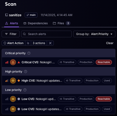
Reachability analysis for Ruby is now in beta, helping teams identify which vulnerabilities are truly exploitable in their applications.