Security News
curl Shuts Down Bug Bounty Program After Flood of AI Slop Reports
A surge of AI-generated vulnerability reports has pushed open source maintainers to rethink bug bounties and tighten security disclosure processes.
github.com/anthinkingcoder/simple-grid
Advanced tools
a simple grid layout(Vue Component)
use npm
npm i simple-xgrid --save
import Grid from 'simple-xgrid'
Vue.use(Grid)
use script
<!-- import Vue.js -->
<script src="//vuejs.org/js/vue.min.js"></script>
<!-- import simple-grid.js -->
<script src="dist/simple-grid.js"></script>
due to conflict,use script, you need change <col><col/> to <i-col><i-col/>。

use scirpt default simple-grid.js include css, if your don't want, your
can excute this command -> npm build:extracss, to extracss.
<!-- import Vue.js -->
<script src="//vuejs.org/js/vue.min.js"></script>
<!-- import simple-grid.css -->
<link rel="stylesheet" href="dist/simple-grid.css"></link>
<!-- import simple-grid.js -->
<script src="dist/simple-grid.js"></script>
| param | description | type | default |
|---|---|---|---|
| gutter | Grid spacing in pixels, split equally left and right | Number | 0 |
| type | Layout mode. Can optionally make use of flex in a modern browser. | String | |
| align | Vertical alignment of flex layout. You can choose between top, middle, bottom. | String | |
| justify | Horizontal arrangement of flex layout. You can choose between start, end, center, space-around, space-between. | String | |
| type | Layout mode. Can optionally make use of flex in a modern browser. | String |
| param | description | type | default |
|---|---|---|---|
| span | Column span. Value can be between 1 and 24. | Number | |
| order | Grid order when using flex layout. if auto responsive, value can only 1-24. | Number | |
| offset | Number of cells to the left of grid spacing. No cells can be inside the grid spacing. | Number | |
| push | Number of cells to move to the right | Number | |
| pull | Number of cells to move to the left | Number | |
| xs | <768px can be a span value or an object containing props | Number or Object | |
| sm | >768px can be a span value or an object containing props | Number or Object | |
| md | ≥992px can be a span value or an object containing props | Number or Object | |
| lg | ≥1200px can be a span value or an object containing props | Number or Object |
    <Row>
      <Col :span="4" class="demo-col">span:4</Col>
      <Col :span="4" class="demo-col">span:4</Col>
      <Col :span="4" class="demo-col">span:4</Col>
      <Col :span="4" class="demo-col">span:4</Col>
      <Col :span="4" class="demo-col">span:4</Col>
      <Col :span="4" class="demo-col">span:4</Col>
    </Row>
    <br>
    <Row :gutter="30">
      <Col :span="8">
        <div class="demo-col">gutter:30</div>
      </Col>
      <Col :span="8">
      <div class="demo-col">gutter:30</div>
      </Col>
      <Col :span="8">
      <div class="demo-col">gutter:30</div>
      </Col>
    </Row>
    <br>
    <Row>
      <Col :span="4" :offset="4" class="demo-col">offset:4</Col>
      <Col :span="4" class="demo-col">span:4</Col>
    </Row>
    <br>
    <Row>
      <Col :span="4"  class="demo-col">col</Col>
      <Col :span="8" :push="4" class="demo-col">push:4</Col>
    </Row>
    <br>
    <Row>
      <Col :xs="2" :sm="4" :md="6" :lg="8" class="demo-col">Response-Col</Col>
      <Col :xs="20" :sm="16" :md="12" :lg="8" class="demo-col">Response-Col</Col>
      <Col :xs="2" :sm="4" :md="6" :lg="8" class="demo-col">Response-Col</Col>
    </Row>
    <br>
    <Row>
      <Col :xs="{ span: 5, offset: 1 }" :lg="{ span: 6, offset: 2 }" class="demo-col">Response-Col</Col>
      <Col :xs="{ span: 11, offset: 1 }" :lg="{ span: 6, offset: 2 }" class="demo-col">Response-Col</Col>
      <Col :xs="{ span: 5, offset: 1 }" :lg="{ span: 6, offset: 2 }" class="demo-col">Response-Col</Col>
    </Row>
    <br>
    <Row  type="flex" justify="space-between">
      <Col :span="4" class="demo-col">
          flex
      </Col>
      <Col :span="4" class="demo-col">
      flex
      </Col>
    </Row>
    <br>
    <Row  type="flex" justify="center" align="middle">
      <Col :span="4" class="demo-col">
      flex
      </Col>
      <Col :span="4" class="demo-col demo-col-large">
      flex
      </Col>
    </Row>
    <br>
    <Row  type="flex" justify="center" align="top">
      <Col :span="4" class="demo-col">
      flex
      </Col>
      <Col :span="4" class="demo-col demo-col-large">
      flex
      </Col>
    </Row>
    <br>
    <Row  type="flex" justify="center" align="bottom">
      <Col :span="4" class="demo-col">
      flex
      </Col>
      <Col :span="4" class="demo-col demo-col-large">
      flex
      </Col>
    </Row>
    <br>
    <Row  type="flex">
      <Col :span="4" class="demo-col" :order="2">
      order:2
      </Col>
      <Col :span="4" class="demo-col" :order="1">
      order:1
      </Col>
      <Col :span="4" class="demo-col" :order="4">
      order:4
      </Col>
      <Col :span="4" class="demo-col" :order="5">
      order:5
      </Col>
      <Col :span="4" class="demo-col" :order="3">
      order:3
      </Col>
    </Row>
     <Row type="flex">
          <Col :xs="{ span: 8,order:1 }" :sm="{ span: 8,order:1 }" :md="{ span: 8,order:2 }" :lg="{ span: 8,order:2 }" class="demo-col">response-order-1</Col>
          <Col :xs="{ span: 8,order:2 }" :sm="{ span: 8,order:2 }" :md="{ span: 8,order:1 }" :lg="{ span: 8,order:1 }" class="demo-col">Response-order-2</Col>
      </Row>

FAQs
Unknown package
Did you know?

Socket for GitHub automatically highlights issues in each pull request and monitors the health of all your open source dependencies. Discover the contents of your packages and block harmful activity before you install or update your dependencies.

Security News
A surge of AI-generated vulnerability reports has pushed open source maintainers to rethink bug bounties and tighten security disclosure processes.

Product
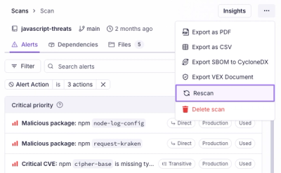
Scan results now load faster and remain consistent over time, with stable URLs and on-demand rescans for fresh security data.

Product
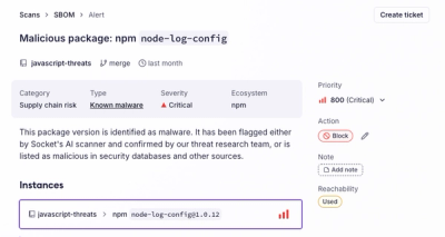
Socket's new Alert Details page is designed to surface more context, with a clearer layout, reachability dependency chains, and structured review.