Product
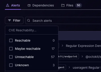
Announcing Precomputed Reachability Analysis in Socket
Socket’s precomputed reachability slashes false positives by flagging up to 80% of vulnerabilities as irrelevant, with no setup and instant results.
github.com/letshare/storybook-addon-customize-antd-theme
A Storybook addon that help you visually customize an ant design theme in the addon panel for better UI-development workflow.
npm install -D storybook-addon-customize-antd-theme
# yarn add -D storybook-addon-customize-antd-theme
main.jsmodule.exports = {
stories: ['storybook-addon-customize-antd-theme/dist/esm/stories/index.js'],
addons: ['storybook-addon-customize-antd-theme'],
};
You can initial setup ant design theme, by setting the customizeAntdTheme property on parameters:
// .storybook/preview.js

export const parameters = {
  customizeAntdTheme: {
    modifyVars: {
      'primary-color': '#ff1771',
      'border-radius-base': '20px',
    },
  },
};
FAQs
Did you know?

Socket for GitHub automatically highlights issues in each pull request and monitors the health of all your open source dependencies. Discover the contents of your packages and block harmful activity before you install or update your dependencies.

Product
Socket’s precomputed reachability slashes false positives by flagging up to 80% of vulnerabilities as irrelevant, with no setup and instant results.

Product
Socket is launching experimental protection for Chrome extensions, scanning for malware and risky permissions to prevent silent supply chain attacks.

Product
Add secure dependency scanning to Claude Desktop with Socket MCP, a one-click extension that keeps your coding conversations safe from malicious packages.