Product
Announcing Precomputed Reachability Analysis in Socket
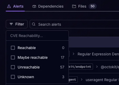
Socket’s precomputed reachability slashes false positives by flagging up to 80% of vulnerabilities as irrelevant, with no setup and instant results.
github.com/scottaohara/aria-switch-button
Similar to a toggle button or checkbox, a switch control is meant to be used when its visual appearance most resembles an "on and off" "switch".
The expected user experience of a switch control is for an immediate action to take place. For instance, toggling a light/dark theme for a website or application, where the change should instantly take effect.
A checkbox, which is often found within a form, or in other UI where multiple elements can be checked, may not be understood to enact an immediate change to other elements or content in the document/screen. That's not to say additional information couldn't be presented to the user to indicate such functionality for a checkbox, but it's not a standard expectation.
A toggle button and switch are a bit more similar in that they both have an expectation for an immediate change from user interaction. Their primary differences revolve around the manner in which they are supposed to communicate state to assistive technology users, as well as the visual design they each may be most associated with.
A toggle button is typically announced as "pressed" or "selected" in its active state, where a switch should be announced as "on".
The baseline for this component requires one of the following markup patterns:
button<button data-switch class="class_here" disabled>
<!-- Meaningful label here -->
</button>
<label class="class_here">
  <input type="checkbox" data-switch>
  <!-- Meaningful label here -->
</label>
div or some other element<div class="class_here" data-switch hidden>
<!-- Meaningful label here -->
</div>
data-switch is required for each markup pattern to be successfully transformed into a role="switch". All setup and functionality is based around this attribute. The attribute can be set without a value, to default a switch to the "off" state. Setting the value to "on", e.g. data-switch="on will default the switch to the "on" state. (Note, if using a checkbox as the base markup element, and the checked attribute will also set the switch to be "on" by default, even if data-switch has no value.)
You may notice that the non-checkbox patterns have a disabled or hidden attribute set by default. This is due to the fact that these patterns will not function without JavaScript. So instead of rendering a partially created control, or an control that doesn't function, they can be set to disabled (button) or hidden (non-interactive element).
If for some reason a switch should be disabled on initial load, use the data-keep-disabled to stop the script from removing the disabled (aria-disabled) or hidden attributes.
The JavaScript will add a role="switch" to the element with data-switch.
An aria-checked attribute will be set to communicate the current state of the switch, if the switch is not based on a checkbox. If the base element is a checkbox, then the native checked attribute will be used instead.
Rather than updating this information in multiple places, please review the breakdown of screen reader issues with role="switch". While this particular link goes to an example of using role=switch on a checkbox, the same issues occur if using role=switch on a button element as well.
Note: With the release of iOS 12.2 (March 2019) the announcement of state has been fixed. VoiceOver will still announce role="switch" as checkboxes, but at least the checked/unchecked states are correctly announced.
This script was written by Scott O'Hara.
It has an MIT license.
Do with it what you will :)
FAQs
Did you know?

Socket for GitHub automatically highlights issues in each pull request and monitors the health of all your open source dependencies. Discover the contents of your packages and block harmful activity before you install or update your dependencies.

Product
Socket’s precomputed reachability slashes false positives by flagging up to 80% of vulnerabilities as irrelevant, with no setup and instant results.

Product
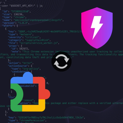
Socket is launching experimental protection for Chrome extensions, scanning for malware and risky permissions to prevent silent supply chain attacks.

Product
Add secure dependency scanning to Claude Desktop with Socket MCP, a one-click extension that keeps your coding conversations safe from malicious packages.