Product
Introducing Rust Support in Socket
Socket now supports Rust and Cargo, offering package search for all users and experimental SBOM generation for enterprise projects.
org.webjars.npm:material__checkbox
Advanced tools
Material Components for the web helps developers execute Material Design. Developed by a core team of engineers and UX designers at Google, these components enable a reliable development workflow to build beautiful and functional web projects.
Material Web strives to seamlessly incorporate into a wider range of usage contexts, from simple static websites to complex, JavaScript-heavy applications to hybrid client/server rendering systems. In short, whether you're already heavily invested in another framework or not, it should be easy to incorporate Material Components into your site in a lightweight, idiomatic fashion.
Material Components for the web is the successor to Material Design Lite. In addition to implementing the Material Design guidelines, it provides more flexible theming customization, not only in terms of color, but also typography, shape, states, and more. It is also specifically architected for adaptability to various major web frameworks.
NOTE: Material Components Web tends to release breaking changes on a monthly basis, but follows semver so you can control when you incorporate them. We typically follow a 2-week release schedule which includes one major release per month with breaking changes, and intermediate patch releases with bug fixes.
<!-- Required styles for Material Web -->
<link rel="stylesheet" href="https://unpkg.com/material-components-web@latest/dist/material-components-web.min.css">
<!-- Render textfield component -->
<label class="mdc-text-field mdc-text-field--filled">
<span class="mdc-text-field__ripple"></span>
<span class="mdc-floating-label" id="my-label">Label</span>
<input type="text" class="mdc-text-field__input" aria-labelledby="my-label">
<span class="mdc-line-ripple"></span>
</label>
<!-- Required Material Web JavaScript library -->
<script src="https://unpkg.com/material-components-web@latest/dist/material-components-web.min.js"></script>
<!-- Instantiate single textfield component rendered in the document -->
<script>
mdc.textField.MDCTextField.attachTo(document.querySelector('.mdc-text-field'));
</script>
Please see quick start demo on codepen for full example.
This guide assumes you have webpack configured to compile Sass into CSS. To configure webpack, please see the full getting started guide. You can also see the final code and result in the Material Starter Kit.
Install textfield node module to your project.
npm install @material/textfield
Sample usage of text field component. Please see Textfield component page for more options.
<label class="mdc-text-field mdc-text-field--filled">
  <span class="mdc-text-field__ripple"></span>
  <input type="text" class="mdc-text-field__input" aria-labelledby="my-label">
  <span class="mdc-floating-label" id="my-label">Label</span>
  <span class="mdc-line-ripple"></span>
</label>
Load styles required for text field component.
@use "@material/floating-label/mdc-floating-label";
@use "@material/line-ripple/mdc-line-ripple";
@use "@material/notched-outline/mdc-notched-outline";
@use "@material/textfield";

@include textfield.core-styles;
Import MDCTextField module to instantiate text field component.
import {MDCTextField} from '@material/textfield';
const textField = new MDCTextField(document.querySelector('.mdc-text-field'));
This'll initialize text field component on a single .mdc-text-field element.
Please see quick start demo on glitch for full example.
We're constantly trying to improve our components. If Github Issues don't fit your needs, then please visit us on our Discord Channel.
FAQs
WebJar for @material/checkbox
We found that org.webjars.npm:material__checkbox demonstrated a not healthy version release cadence and project activity because the last version was released a year ago. It has 0 open source maintainers collaborating on the project.
Did you know?

Socket for GitHub automatically highlights issues in each pull request and monitors the health of all your open source dependencies. Discover the contents of your packages and block harmful activity before you install or update your dependencies.

Product
Socket now supports Rust and Cargo, offering package search for all users and experimental SBOM generation for enterprise projects.

Product
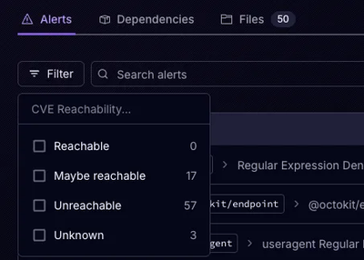
Socket’s precomputed reachability slashes false positives by flagging up to 80% of vulnerabilities as irrelevant, with no setup and instant results.

Product
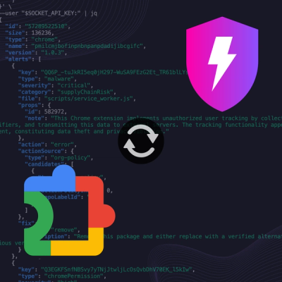
Socket is launching experimental protection for Chrome extensions, scanning for malware and risky permissions to prevent silent supply chain attacks.