ActiveWidgets/Preact • Datagrid


ActiveWidgets is a multi-framework UI component library. This package provides datagrid component for Preact.
Live demo / Developer guide / API reference
Installation
Add @activewidgets/preact to your project dependencies -
> npm i --save @activewidgets/preact
Usage
Now you can import ActiveWidgets component classes -
import { Datagrid } from "@activewidgets/preact";
and use them as any standard Preact component.
import { h, render } from 'preact';
import { Datagrid } from '@activewidgets/preact';
import './styles.css';

const rows = [
    { message: 'Hello, World!' }
];

function App(){
    return <Datagrid rows={rows} />
}

render(<App />, document.getElementById('app'));
Live example | Source on github | Edit on stackblitz
CDN links
For quick prototyping the package is also available over ActiveWidgets CDN -
<script src="https://cdn.activewidgets.com/preact"></script>
In this case you will find the components at ActiveWidgets.Preact global namespace.
var Datagrid = ActiveWidgets.Preact.Datagrid;

var rows = [
    { framework: 'preact', source: 'CDN', language: 'ES5'}
];

var App = preact.h(Datagrid, {rows: rows});
preact.render(App, document.getElementById("app"));
Live example | Source on github | Edit on stackblitz
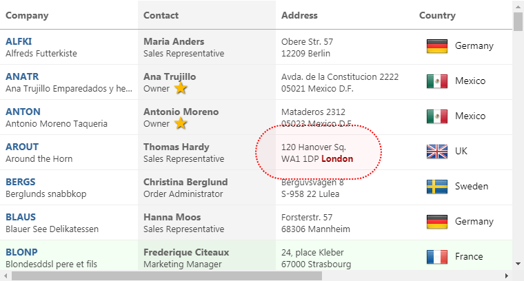
Data properties
You have to provide columns and rows properties to the datagrid to show some data. The properties of each column object define how the data will be rendered -
- field - where the cell data comes from (string|function)
- header - column header (string|object)
- width - column width (number, in pixels)
- align - cell text alignment (left|right|center)
- format - number/date format (string|function)
- fixed - fixed (true/false) for columns on the left or right side
The style (string|object) or className properties allow to change the styling of the column and cell elements.
const columns = [
  {header: 'Code', field: 'customerID', width: 80, style: 'background:#def', fixed: true},
  {header: 'Company Name', field: 'companyName', width: 160},
  {header: 'Contact', field: 'contactName', width: 120},
  {header: 'Title', field: 'contactTitle', width: 120},
  {header: 'Address', field: 'address', width: 120, align: 'right'}
];

const rows = northwind.customers;

function App(){
    return <Datagrid columns={columns} rows={rows} />
}
Live example | Source on github | Edit on stackblitz
User events
In addition to the standard DOM keyboard and mouse events the datagrid emits composite
mouse event which makes it easier to find the elements affected by the user action -
function onMouse({row, column}){
    alert(`row ${row.key} clicked!`);
}

function App(){
    return <Datagrid onMouse={onMouse} columns={columns} rows={rows} />
}
Live example | Source on github | Edit on stackblitz
More info
