Research
/Security News
Critical Vulnerability in NestJS Devtools: Localhost RCE via Sandbox Escape
A flawed sandbox in @nestjs/devtools-integration lets attackers run code on your machine via CSRF, leading to full Remote Code Execution (RCE).
@ambiot/material-ui-multiple-dates-picker
Advanced tools
Date Picker with multiple selection based on Material UI
[ ]
]
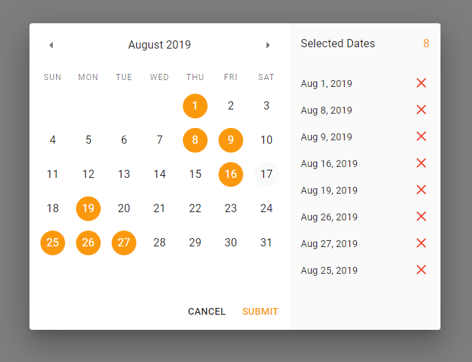
Lets user pick more than one date from the date picker.
This is a fork of react-multiple-datepicker. I needed a date picker that is built on Material-UI and supports multiple dates selections, couldn't find one, so here it is!
Dialog component being the root of itTo install the component run this command:
npm i -S @ambiot/material-ui-multiple-dates-picker react @mui/material @mui/lab @mui/icons-material @emotion/styled @emotion/react
import MultipleDatesPicker from '@ambiot/material-ui-multiple-dates-picker'

const Example = () => {
  const [open, setOpen] = useState(false)

  return (
    <div>
      <Button onClick={() => setOpen(!open)}>
        Select Dates
      </Button>
      <MultipleDatesPicker
        open={open}
        selectedDates={[]}
        onCancel={() => setOpen(false)}
        onSubmit={dates => console.log('selected dates', dates)}
      />
    </div>
  )
}
| Prop Name | Type | Default | Description |
|---|---|---|---|
| open | bool, required | false | Is Date Picker Dialog open or not |
| selectedDates | Array of Date | [] | MultipleDatesPicker uses its own internal array of selected date and sends it only when user clicks Submit button. But you can still use this variable to pass initial value to it — array will be copied. |
| disabledDates | Array of Date | null | An array of dates to disable. They will appear gray and user won't be able to select them. |
| onCancel | func, required | null | Fires when user clicks Cancel button. You need to handle closing the picker when this handler fires. |
| onSubmit | func, required | null | Fires when user clicks Submit button with only one parameter: array of selected Dates: onSubmit(selectedDates). You need to handle closing the picker when this handler fires. |
| readOnly | bool | false | Is Date Picker interactive. Use this if you just want to display dates to the user. Submit button will be hidden and onCancel will be fired when user presses "Dismiss" button. |
| cancelButtonText | string | if readOnly then "Dismiss" is not then "Cancel" | Cancel button title |
| submitButtonText | string | Submit | Submit button title |
| selectedDatesTitle | string | Selected Dates | Selected dates list header title |
| DialogProps | object | {} | properties for the Dialog component. See more |
I don't have enough time to maintain this library, so pull requests will be greatly appreciated!
git clone https://github.com/randex/material-ui-multiple-dates-picker.gitcd material-ui-multiple-dates-pickernpm iapp folder: cd appnpm inpm start to launch the demo app.app/src/lib. Edit the code and watch the changes in the browser.Happy coding and thank you for your help!
FAQs
Date Picker with multiple selection based on Material UI
The npm package @ambiot/material-ui-multiple-dates-picker receives a total of 319 weekly downloads. As such, @ambiot/material-ui-multiple-dates-picker popularity was classified as not popular.
We found that @ambiot/material-ui-multiple-dates-picker demonstrated a not healthy version release cadence and project activity because the last version was released a year ago. It has 1 open source maintainer collaborating on the project.
Did you know?

Socket for GitHub automatically highlights issues in each pull request and monitors the health of all your open source dependencies. Discover the contents of your packages and block harmful activity before you install or update your dependencies.

Research
/Security News
A flawed sandbox in @nestjs/devtools-integration lets attackers run code on your machine via CSRF, leading to full Remote Code Execution (RCE).

Product
Customize license detection with Socket’s new license overlays: gain control, reduce noise, and handle edge cases with precision.

Product
Socket now supports Rust and Cargo, offering package search for all users and experimental SBOM generation for enterprise projects.