MUI Multiple Dates Picker
[ ]
]
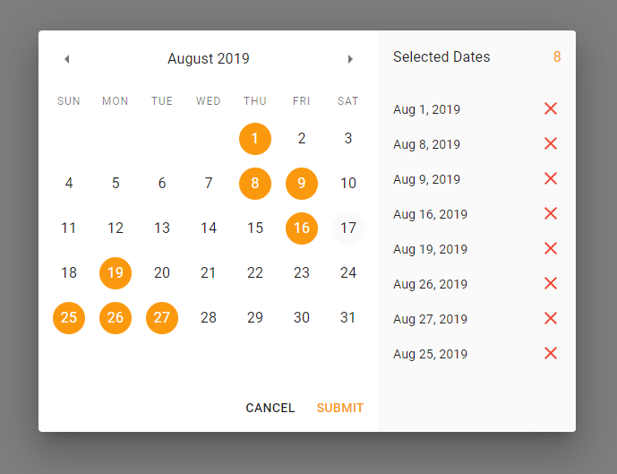
Lets user pick more than one date from the date picker.
Motivation
This is a fork of react-multiple-datepicker. I needed a date picker that is built on Material-UI and supports multiple dates selections, couldn't find one, so here it is!
Features
- Based on Material-UI components with
Dialog component being the root of it - Choose dates right from the calendar
- See all selected dates on the list
- Click on any selected date to remove it (either on calendar or on the list)
- Customize button labels and titles
- Its appearance is based on your configuration of Material-UI theme
Installation
To install the component run this command:
npm i -S @ambiot/material-ui-multiple-dates-picker react @mui/material @mui/lab @mui/icons-material @emotion/styled @emotion/react
Usage example
import MultipleDatesPicker from '@ambiot/material-ui-multiple-dates-picker'

const Example = () => {
  const [open, setOpen] = useState(false)

  return (
    <div>
      <Button onClick={() => setOpen(!open)}>
        Select Dates
      </Button>
      <MultipleDatesPicker
        open={open}
        selectedDates={[]}
        onCancel={() => setOpen(false)}
        onSubmit={dates => console.log('selected dates', dates)}
      />
    </div>
  )
}
API
MultipleDatesPicker (default export)
| Prop Name | Type | Default | Description |
|---|
| open | bool, required | false | Is Date Picker Dialog open or not |
| selectedDates | Array of Date | [] | MultipleDatesPicker uses its own internal array of selected date and sends it only when user clicks Submit button. But you can still use this variable to pass initial value to it — array will be copied. |
| disabledDates | Array of Date | null | An array of dates to disable. They will appear gray and user won't be able to select them. |
| onCancel | func, required | null | Fires when user clicks Cancel button. You need to handle closing the picker when this handler fires. |
| onSubmit | func, required | null | Fires when user clicks Submit button with only one parameter: array of selected Dates: onSubmit(selectedDates). You need to handle closing the picker when this handler fires. |
| readOnly | bool | false | Is Date Picker interactive. Use this if you just want to display dates to the user. Submit button will be hidden and onCancel will be fired when user presses "Dismiss" button. |
| cancelButtonText | string | if readOnly then "Dismiss" is not then "Cancel" | Cancel button title |
| submitButtonText | string | Submit | Submit button title |
| selectedDatesTitle | string | Selected Dates | Selected dates list header title |
| DialogProps | object | {} | properties for the Dialog component. See more |
To-Do
Changelog of version 1.0.2
- Migrated to react 18 and mui 5.
- React and mui moved to peerDependencies.
- Added DialogProps property, now you can forward properties for the Dialog component.
Contributing
I don't have enough time to maintain this library, so pull requests will be greatly appreciated!
- Clone the repository:
git clone https://github.com/randex/material-ui-multiple-dates-picker.git - Get inside the folder:
cd material-ui-multiple-dates-picker - Install all the general dependencies:
npm i - Get inside the
app folder: cd app - Install all dependencies needed to launch the demo app:
npm i - Run
npm start to launch the demo app. - Library is located under
app/src/lib. Edit the code and watch the changes in the browser.
Happy coding and thank you for your help!

 ]
]

