Product
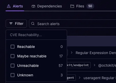
Announcing Precomputed Reachability Analysis in Socket
Socket’s precomputed reachability slashes false positives by flagging up to 80% of vulnerabilities as irrelevant, with no setup and instant results.
@appearhere/react-input-range
Advanced tools
React component for inputting numeric values within a range
InputRange is a React component allowing users to input a numeric value within a predefined range. It can accept a single value, or a range of values (start/end). By default, basic styles are applied, but can be overridden depending on your design requirements.
A CodePen demo is available here.
react-input-range using npm. npm install react-input-rangereact-input-range to use InputRange component.react-input-range.css if you want to apply the default styling.babel-core/polyfill or core-js/es6 polyfill might be needed.If accepting a range of values:
import React from 'react';
import ReactDOM from 'react-dom';
import InputRange from 'react-input-range';

class App extends React.Component {
  constructor(props) {
    super(props);

    this.state = {
      values: {
        min: 2,
        max: 10,
      },
    };
  }

  handleValuesChange(component, values) {
    this.setState({
      values: values,
    });
  }

  render() {
    return (
      <InputRange
        maxValue={20}
        minValue={0}
        value={this.state.values}
        onChange={this.handleValuesChange.bind(this)}
      />
    );
  }
}

ReactDOM.render(
  <App />,
  document.getElementById('app')
);
If accepting a single value, pass a number to value prop, i.e.:
<InputRange
  maxValue={20}
  minValue={0}
  value={this.state.value}
  onChange={this.handleValueChange.bind(this)}
/>
| Property | Type | Description |
|---|---|---|
| ariaLabelledby | string | aria-labelledby attribute |
| ariaControls | string | aria-controls attribute |
| classNames | Object.<string> | CSS class names |
| defaultValue | number | Object.<number> | Default value(s) |
| disabled | boolean | Disabled or not |
| formatLabel | Function | Label formatter |
| labelPrefix | string | Label prefix |
| labelSuffix | string | Label suffix |
| maxValue | number | Maximum value it can accept |
| minValue | number | Minimum value it can accept |
| name | string | Name of form input |
| onChange | Function | onChange callback (required) |
| onChangeComplete | Function | onChangeComplete callback |
| step | number | Increment/decrement value |
| value | number | Object.<number> | Current value(s) (required) |
| Track | Function | Override default Track Component |
| Slider | Function | Override default Slider Component |
| Label | Function | Override default Label Component |
If you want to work on this project locally, you need to grab all of its dependencies.
npm install && bundle install
After that, you should be able run
npm start
Contributions are welcome. :)
FAQs
React component for inputting numeric values within a range
The npm package @appearhere/react-input-range receives a total of 689 weekly downloads. As such, @appearhere/react-input-range popularity was classified as not popular.
We found that @appearhere/react-input-range demonstrated a not healthy version release cadence and project activity because the last version was released a year ago. It has 3 open source maintainers collaborating on the project.
Did you know?

Socket for GitHub automatically highlights issues in each pull request and monitors the health of all your open source dependencies. Discover the contents of your packages and block harmful activity before you install or update your dependencies.

Product
Socket’s precomputed reachability slashes false positives by flagging up to 80% of vulnerabilities as irrelevant, with no setup and instant results.

Product
Socket is launching experimental protection for Chrome extensions, scanning for malware and risky permissions to prevent silent supply chain attacks.

Product
Add secure dependency scanning to Claude Desktop with Socket MCP, a one-click extension that keeps your coding conversations safe from malicious packages.