Security News
minimatch Patches 3 High-Severity ReDoS Vulnerabilities
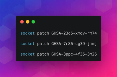
minimatch patched three high-severity ReDoS vulnerabilities that can stall the Node.js event loop, and Socket has released free certified patches.
@asphalt-react/card
Advanced tools
A Card is container to display related pieces of information in a single unit. Cards also provide summary of the information and a linked entry point to further details of that content. Few uses of Card is to show movie titles on an OTT platform, product on an e-commerce website, feed of posts or articles on a website.
Card expands to occupy all available horizontal within its container by default, you can change it to fit the content as well. Card comes in three sizes small (s), medium (m) & large (l).
import { Card } from "@asphalt-react/card"
function App() {
return (
<Card>
<div>Content</div>
</Card>
)
}
Card have two variants -
Elevated - Card appears with shadow around it, which makes it visually distinct from the container surface and has more emphasis.
Outlined - Card appears with border around it, has less emphasis that the elevated variant.
Card can also appears without shadow and border to have more subdued look and minimal emphasis.
If values for none of them is set, then the Card will appear in the elevated variant.
Used for non-interactive or decorative layouts that display information only.
An interactive variant of the Card for actionable content such as selectable items, navigation entries, or toggleable options. It shares the same visual foundation as the Card but supports user interactions like click, selection, focus, and disabled states.
Use the as prop to render the Tile as a button, link, or div. Avoid nesting other interactive elements (e.g., buttons, links, or form controls) inside the Tile to maintain accessibility.
If you need to include interactive elements like a radio button or checkbox inside, use a div as the element instead.
primary
secondary
tertiary
success
info
warning
danger
brand
inverse
Node for card content.
| type | required | default |
|---|---|---|
| node | true | N/A |
Controls size of card. Possible values are "xs", "s", "m" & "l" for extra-small, small, medium & large respectively.
| type | required | default |
|---|---|---|
| enum | false | "m" |
Adds outline around card.
| type | required | default |
|---|---|---|
| union | false | null |
Elevates the card from the container surface.
| type | required | default |
|---|---|---|
| union | false | null |
Adds padding inside card.
| type | required | default |
|---|---|---|
| bool | false | true |
Adjusts the width of the card as per its content.
| type | required | default |
|---|---|---|
| bool | false | false |
Applies primary intent.
| type | required | default |
|---|---|---|
| bool | false | false |
Applies secondary intent.
| type | required | default |
|---|---|---|
| bool | false | false |
Applies tertiary intent.
| type | required | default |
|---|---|---|
| bool | false | false |
Applies brand intent.
| type | required | default |
|---|---|---|
| bool | false | false |
Applies inverse intent.
| type | required | default |
|---|---|---|
| bool | false | false |
Applies danger intent.
| type | required | default |
|---|---|---|
| bool | false | false |
Applies warning intent.
| type | required | default |
|---|---|---|
| bool | false | false |
Applies success intent.
| type | required | default |
|---|---|---|
| bool | false | false |
Applies info intent.
| type | required | default |
|---|---|---|
| bool | false | false |
Applies deboss top effect to the card.
| type | required | default |
|---|---|---|
| bool | false | false |
Adds a bevel top effect to the card.
| type | required | default |
|---|---|---|
| bool | false | false |
Adds a bevel bottom effect to the card.
| type | required | default |
|---|---|---|
| bool | false | false |
Node for the content inside the Tile.
| type | required | default |
|---|---|---|
| node | true | N/A |
Controls the size of the Tile. Possible values: "xs" (extra-small), "s" (small), "m" (medium), "l" (large).
| type | required | default |
|---|---|---|
| enum | false | "m" |
Adds an outline around the Tile.
| type | required | default |
|---|---|---|
| bool | false | false |
Elevates the Tile from the container surface.
| type | required | default |
|---|---|---|
| bool | false | true |
Adds spacing inside the Tile.
| type | required | default |
|---|---|---|
| bool | false | true |
Adjusts the Tile width based on its content.
| type | required | default |
|---|---|---|
| bool | false | false |
Indicates whether the Tile is currently selected.
| type | required | default |
|---|---|---|
| bool | false | false |
Disables interaction with the Tile.
| type | required | default |
|---|---|---|
| bool | false | false |
Applies primary intent styling.
| type | required | default |
|---|---|---|
| bool | false | false |
Applies secondary intent styling.
| type | required | default |
|---|---|---|
| bool | false | false |
Applies brand intent styling.
| type | required | default |
|---|---|---|
| bool | false | false |
Applies inverse intent styling (e.g., for dark backgrounds).
| type | required | default |
|---|---|---|
| bool | false | false |
Applies danger intent styling, usually used for destructive actions.
| type | required | default |
|---|---|---|
| bool | false | false |
Applies warning intent styling, used for cautionary actions or alerts.
| type | required | default |
|---|---|---|
| bool | false | false |
Applies success intent styling, typically used for positive actions.
| type | required | default |
|---|---|---|
| bool | false | false |
Applies info intent styling, used for informational context.
| type | required | default |
|---|---|---|
| bool | false | false |
Applies invalid styles.
| type | required | default |
|---|---|---|
| bool | false | false |
Applies deboss top effect to the card.
| type | required | default |
|---|---|---|
| bool | false | false |
Adds a bevel top effect to the card.
| type | required | default |
|---|---|---|
| bool | false | false |
Adds a bevel bottom effect to the card.
| type | required | default |
|---|---|---|
| bool | false | false |
Html element/React component to render as container.
| type | required | default |
|---|---|---|
| elementType | false | "button" |
Accepts props & attributes for the link element. You can pass attributes like onKeyPress, href.
| type | required | default |
|---|---|---|
| object | false | {} |
FAQs
Card
The npm package @asphalt-react/card receives a total of 320 weekly downloads. As such, @asphalt-react/card popularity was classified as not popular.
We found that @asphalt-react/card demonstrated a healthy version release cadence and project activity because the last version was released less than a year ago. It has 6 open source maintainers collaborating on the project.
Did you know?

Socket for GitHub automatically highlights issues in each pull request and monitors the health of all your open source dependencies. Discover the contents of your packages and block harmful activity before you install or update your dependencies.

Security News
minimatch patched three high-severity ReDoS vulnerabilities that can stall the Node.js event loop, and Socket has released free certified patches.

Research
/Security News
Socket uncovered 26 malicious npm packages tied to North Korea's Contagious Interview campaign, retrieving a live 9-module infostealer and RAT from the adversary's C2.

Research
An impersonated golang.org/x/crypto clone exfiltrates passwords, executes a remote shell stager, and delivers a Rekoobe backdoor on Linux.