Product
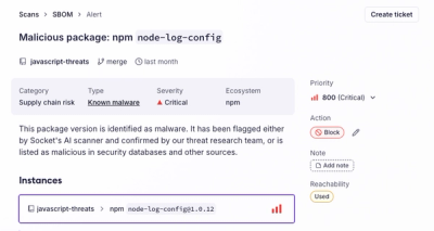
Introducing the Alert Details Page: A Better Way to Explore Alerts
Socket's new Alert Details page is designed to surface more context, with a clearer layout, reachability dependency chains, and structured review.
@asphalt-react/flag
Advanced tools
Flag component can be used to provide important information in a page. All Flags support multiple variants which are success, info, warning and danger. Flag defaults to danger if no variant is applied.
Every Flag's icon & looks changes as per its variant. It is possible to dismiss some Flags.
There are different categories of Flags:
Inline: Can be used to show information inline to any other element. This is the default.
Floating: Can be used for showing alerts or toasts as it ascends the Flag from the page.
Page: Can be used to show information within the page along with the page's flow. Embeds the Flag into the page.
Banner: Can be used to show information within the page and the Flag also matches the container's width.
There are different types of Flags:
Actionable: Can be used when an action needs to be performed from the Flag. Adds a button to the Flag.
Navigable: Can be used when any navigation needs to be performed from the Flag. Adds a link as an <a/> tag to the Flag.
Inline Flags do not support these types
Only Floating Flags can be dismissed.
engageCaption and engageProps are required if either
actionableornavigableprop is passed.
import Flag from "@asphalt-react/flag"

<Flag title="some important information"/>
React node for Flag's body. Overrides content prop if both exist
Note: Not applicable for inline and banner Flags
| type | required | default |
|---|---|---|
| node | false | N/A |
Content for Flag's body
Note: Not applicable for inline and banner Flags
⚠️ This prop is deprecated and will be removed in the next major version
| type | required | default |
|---|---|---|
| string | false | "" |
Title for Flag
| type | required | default |
|---|---|---|
| string | true | N/A |
Remove title from inline Flag
| type | required | default |
|---|---|---|
| bool | false | false |
Renders as danger Flag
| type | required | default |
|---|---|---|
| bool | false | false |
Renders as warning Flag
| type | required | default |
|---|---|---|
| bool | false | false |
Renders as info Flag
| type | required | default |
|---|---|---|
| bool | false | false |
Renders as success Flag
| type | required | default |
|---|---|---|
| bool | false | false |
Embeds the Flag into the page.
| type | required | default |
|---|---|---|
| bool | false | false |
Embeds the Flag into the page and matches container width
| type | required | default |
|---|---|---|
| bool | false | false |
Ascends the Flag from the page. Can be used for showing alerts or toasts. Also renders a cross icon to dismiss the Flag.
| type | required | default |
|---|---|---|
| bool | false | false |
Function called on click of dismiss button in floating Flag
| type | required | default |
|---|---|---|
| func | false | N/A |
Adds a button for Flag.
Note: Not applicable for inline Flag
| type | required | default |
|---|---|---|
| bool | false | N/A |
Adds a link for Flag.
Note: Not applicable for inline Flag
| type | required | default |
|---|---|---|
| bool | false | N/A |
Caption for action or navigation element
| type | required | default |
|---|---|---|
| string | false | N/A |
Props to be applied to action or navigation element
| type | required | default |
|---|---|---|
| object | false | N/A |
Render inline Flag as error message. Can be used to show error messages in form fields
Note: Applicable to inline Flags only
| type | required | default |
|---|---|---|
| bool | false | false |
Hides the icon
Note: Depends on error prop. Applicable to inline Flags only
| type | required | default |
|---|---|---|
| bool | false | false |
Flag component to be wrapped.
Works only with
banner
| type | required | default |
|---|---|---|
| node | true | N/A |
Maximum width for the content of Flag
| type | required | default |
|---|---|---|
| string | true | N/A |
FAQs
Flag
We found that @asphalt-react/flag demonstrated a healthy version release cadence and project activity because the last version was released less than a year ago. It has 0 open source maintainers collaborating on the project.
Did you know?

Socket for GitHub automatically highlights issues in each pull request and monitors the health of all your open source dependencies. Discover the contents of your packages and block harmful activity before you install or update your dependencies.

Product
Socket's new Alert Details page is designed to surface more context, with a clearer layout, reachability dependency chains, and structured review.

Product
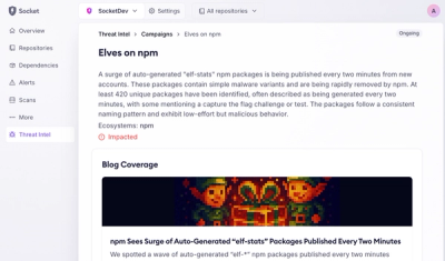
Campaign-level threat intelligence in Socket now shows when active supply chain attacks affect your repositories and packages.

Research
Malicious PyPI package sympy-dev targets SymPy users, a Python symbolic math library with 85 million monthly downloads.