Tag
This component is displayed as an accessible tag with an optional link and/or button to remove it.
Although the tag component can be used by itself, it works best in conjunction with the
@atlskit/tag-group component.
Try it out
Interact with a live demo of the @atlaskit/tag component with code examples.
Installation
npm install @atlaskit/tag
Using the component
The tag package exports the Tag React component.
import ReactDOM from 'react-dom';
import Tag from '@atlaskit/tag';
ReactDOM.render(
  <Tag
    text="Jelly bean"
    removeButtonText="Come join us!"
  />,
  document.getElementById('root')
);
Tag
Kind: global class
Emits: Tag#event:onBeforeRemoveAction, Tag#event:onAfterRemoveAction
new Tag()
Create instances of the component programmatically, or using markup.
JS Example
import Tag from 'ak-tag';
ReactDOM.render(<Tag text="Cupcake" />, container);
ReactDOM.render(<Tag text="Atlassian" href="https://www.atlassian.com"/>, container);
ReactDOM.render(<Tag text="Atlassian"
href="https://www.atlassian.com"
removeButtonText="Remove Me"/>, container);
tag.appearance : string
Allowed values: "default", "rounded".
Rounded is recommended only for use with Avatars in elemBefore
Kind: instance property of Tag
JS Example
ReactDOM.render(<Tag
  text="Cupcake"
  elemBefore={<Avatar size="xsmall" />}
  appearance="rounded"
/>, container);
tag.text : string
(Required) The tag text content.
This is a required attribute.
Omitting it will stop the tag from being rendered.
The text passed will be sanitized, e.g. passed HTML will be represented
as plain text.
Kind: instance property of Tag
JS Example
ReactDOM.render(<Tag text="Cupcake" />, container);
tag.href : string
(Optional) A target href for the tag text to link to.
If this attribute is non-empty, the tag will contain a link to the given URL.
The given URL reference will be used as-is and will open in the same window.
This attribute implicitly controls Tag#isLinked.
Kind: instance property of Tag
JS Example
import Tag from 'ak-tag';
ReactDOM.render(<Tag text="Cupcake" href="http://www.cupcakeipsum.com/"/>, container);
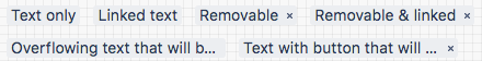
tag.removeButtonText : string
(Optional) The text for the remove button tooltip.
Implicitly defines that there will be a remove button.
This attribute implicitly controls Tag#isRemovable.
Kind: instance property of Tag
JS Example
import Tag from 'ak-tag';
ReactDOM.render(<Tag text='Cupcake' href='http://www.cupcakeipsum.com/' removeButtonText = 'OMG, I am so full!'/>, container);
Shows a tag with the text 'Cupcake' with the link and a remove button
tag.onBeforeRemoveAction : function
This handler is called before a Tag gets removed
(e.g. before the remove animation starts).
It is cancelable by returning boolean false.
Kind: instance property of Tag
JS Example
ReactDOM.render(
<Tag
text="Cupcake"
onBeforeRemoveAction={(e) => false}
/>,
container);
tag.onAfterRemoveAction : function
This handler is called after a Tag has been removed
(e.g. after the remove animation finishes).
It is not cancelable.
Kind: instance property of Tag
JS Example
ReactDOM.render(
  <Tag
    text="Cupcake"
    onAfterRemoveAction={(e) => { console.log('Tag removed!'); }}
  />,
container);
* Please note that this module could have dependencies that are governed by the Atlassian Design Guidelines license which will be automatically included on install. Each dependency has a license file that indicates whether the Atlassian Design Guidelines license applies.
We're here to help!
Let us know what you think of our components and docs, your feedback is really important for us.
Are you in trouble? Read through our contribution guidelines and raise an issue to us.