Product
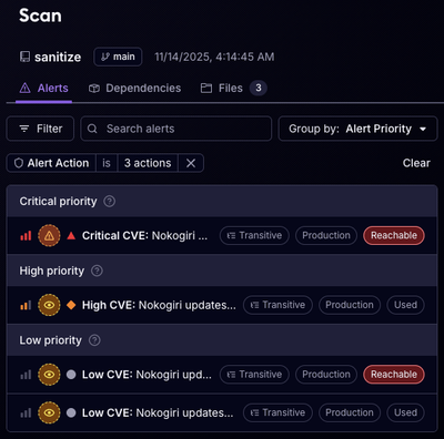
Reachability for Ruby Now in Beta
Reachability analysis for Ruby is now in beta, helping teams identify which vulnerabilities are truly exploitable in their applications.
@ayush-2002/load-it
Advanced tools
A lightweight React library that provides simple loader, skeleton loader, and toast notification components to enhance user experience.
Load-It is a lightweight and easy-to-use React library designed to handle loading states in your web applications. With Load-It, you can seamlessly manage loading animations and skeleton loaders to enhance user experience during data fetching and content loading.
The Load-It library currently offers the following features:
Simple Loader: Display a straightforward loading spinner to indicate ongoing background tasks or data loading processes.
Skeleton Loader: Implement skeleton loaders to create an elegant and subtle loading effect for components and content placeholders.
To use Load-It in your React project, simply install it via npm:
npm i @ayush-2002/load-it
Each Loader component provides a straightforward loading spinner that you can easily integrate into your React components. When loading is set to true, the spinner will be displayed, indicating ongoing background tasks or data loading processes.
import React, { useState, useEffect } from "react";
import { CircleInLoader } from "@ayush-2002/load-it";

const MyComponent = () => {
  const [isLoading, setIsLoading] = useState(true);

  useEffect(() => {
    setTimeout(() => {
      setIsLoading(false);
    }, 2000); // Set the loading state to false after 2 seconds
  }, []);

  return (
    <div>
      {/* Your component content */}
      <CircleInLoader loading={isLoading} />
    </div>
  );
};

export default MyComponent;
Most loader components have default props for seamless integration. Here are the common default props shared among several loaders:
loading (boolean, default: true): Controls the visibility of the loader.size (string, default: '48px'): Specifies the width and height of the loader.primary (string, default: '#B5B5B5'): Sets the primary color of the loader.secondary (string, default: '#ff3d00'): Sets the secondary color of the loader.speedMultiplier (number, default: 1): Adjusts the animation speed of the loader.cssOverride (CSSProperties object, default: {}): Provides the ability to apply custom CSS styles to the loader.primary and secondary propsprimary and secondary color props accept a string value in the formats '#xxx', '#xxxxxx', 'rgb(r, g, b)', or 'rgba(r, g, b, a)'
size PropIt accepts a string value representing the size, which can be specified in various units such as pixels (px) or percentages (%).
Example: size="64px"
If no unit is provided with the size value, it is assumed to be in pixels by default. So, if you provide a numeric value without a unit, like size="64", it will be treated as size="64px".
speedMultiplier propIt accepts a numeric value that serves as a multiplier for the default animation duration.
Example: If speedMultiplier={2}, the loader's animation will be twice as fast as the default speed.
cssOverride propThe cssOverride prop allows you to customize the styles of the loader by passing a CSSProperties object. You can use this prop to override any specific styles and apply your own customizations to the loader.
const customStyles = {
  color: "blue",
  border: "2px solid red",
};

<CircleInLoader cssOverride={customStyles} />;
ProgressBarLoader ComponentThe ProgressBarLoader component in Load-It is designed to display a progress bar while tracking the progress of a given Promise.
| Prop | Type | Description | Default Value |
|---|---|---|---|
promise | Promise | (required) The Promise to track the progress of. The progress bar will update as the Promise progresses, and the component will show the success or error message based on the Promise result. | - |
primary | string | (optional) The color of the progress bar. Can be specified as a string in the format "#xxx", "#xxxxxx", "rgb", or "rgba". | "#B5B5B5" |
secondary | string | (optional) The color of the progress bar's background. Can be specified as a string in the format "#xxx", "#xxxxxx", "rgb", or "rgba". | "#ff3d00" |
width | string | (optional) The width of the progress bar. Can be specified as a string with or without units (e.g., "100%" or "200px"). | "100%" |
height | string | (optional) The height of the progress bar. Can be specified as a string with or without units (e.g., "25px" or "50%"). | "25px" |
percentage | boolean | (optional) A boolean flag indicating whether to show the progress percentage on the progress bar. | true |
successMessage | string | (optional) The message to display when the Promise resolves successfully. | "" |
errorMessage | string | (optional) The message to display when the Promise encounters an error. | "Error" |
messageCSS | CSSProperties | (optional) Additional CSS styles to apply to the message displayed on the progress bar. | {} |
cssOverride | CSSProperties | (optional) Additional CSS styles to override the default styles of the progress bar. | {} |
import React from "react";
import { ProgressBarLoader } from "@ayush-2002/load-it";

const MyComponent = () => {
  const [loading, setLoading] = React.useState(true);
  const [data, setData] = React.useState(null);

  const fetchData = async () => {
    try {
      const response = await fetch(
        "https://jsonplaceholder.typicode.com/posts/1"
      );
      const data = await response.json();
      setData(data);
      setLoading(false);
    } catch (error) {
      console.error("Error fetching data:", error);
      setLoading(false);
    }
  };

  React.useEffect(() => {
    fetchData();
  }, []);

  return (
    <div>
      {loading ? (
        <ProgressBarLoader
          promise={fetchData()}
          width="80%"
          height="20px"
          percentage={true}
          successMessage="Data loaded successfully!"
          errorMessage="Failed to fetch data."
          messageCSS={{ fontSize: "12px", color: "green" }}
          cssOverride={{ borderRadius: "8px" }}
        />
      ) : data ? (
        <div>{data.title}</div>
      ) : null}
    </div>
  );
};

export default MyComponent;
| Loader | Requires Secondary Prop? |
|---|---|
| BarLoader | Yes |
| BufferingLoader | No |
| CircleInLoader | Yes |
| CircleLoader | Yes |
| CirclePulseLoader | No |
| DoubleDotLoader | Yes |
| DualBoxCrossLoader | Yes |
| DualBoxRotationLoader | Yes |
| DualRingLoader | Yes |
| ElectronLoader | Yes |
| FillBoxLoader | No |
| FlipLoader | No |
| FlippingDiamondLoader | No |
| GridLoader | No |
| LinearQueueLoader | No |
| LocationLoader | No |
| MergeSplitLoader | Yes |
| MultiCircleLoader | Yes |
| RingLoader | No |
| ScaleLoader | No |
| SearchLoader | No |
| SpinBoxLoader | No |
| TimerLoader | Yes |
| TriDotCircleLoader | Yes |
| TripleBoxLoader | Yes |
| TriPulseLoader | Yes |
| TwoDotsCircleLoader | Yes |
| UmbrellaLoader | Yes |
| UmbrellaPulseLoader | No |
Some loaders use a single primary color for their animations.
To use the Skeleton Loader, wrap your components or content that require loading with the Skeleton component.
import React, { useState } from "react";
import { Skeleton } from "@ayush-2002/load-it";

const MyComponent = () => {
  const [isLoading, setIsLoading] = useState(true);

  const toggleLoading = () => {
    setIsLoading((prevIsLoading) => !prevIsLoading);
  };
  return (
    <div>
      <p>this will always visible</p>
      <Skeleton loading={isLoading}>
        <p>When isLoading is false, this will be visible</p>
      </Skeleton>
      <button onClick={toggleLoading}>Toggle Loading</button>
    </div>
  );
};
Skeleton Component Props| Prop | Type | Description | Default Value |
|---|---|---|---|
loading | boolean (required) | Set to true to show the skeleton loader. | true |
circle | boolean (optional) | Set to true for a circular skeleton loader. | false |
inline | boolean (optional) | Set to true for inline rendering of the skeleton loader. | false |
className | string (optional) | Custom CSS class name to be applied to the Skeleton component. | |
children | ReactNode (required) | Content to display when loading is false. | |
cssOverride | CSSProperties (optional) | CSS properties to override default styles of the skeleton loader. | {} |
width | string (optional) | Width of the skeleton loader. | 100% |
height | string (optional) | Height of the skeleton loader. | 100% |
primary | string (optional) | Primary color of the skeleton loader (e.g., #xxxxxx, #xxx, rgb(), or rgba()). | #2c2b2b |
secondary | string (optional) | Secondary color of the skeleton loader (e.g., #xxxxxx, #xxx, rgb(), or rgba()). | #575757 |
borderRadius | string/number (optional) | Border radius of the skeleton loader. | 4px |
duration | number (optional) | Duration of the animation for the skeleton loader, in seconds. | 2 |
direction | "ltr" or "rtl" (optional) | Animation direction for the skeleton loader. | "ltr" |
enableAnimation | boolean (optional) | Set to false to disable animation for the skeleton loader. | true |
SkeletonTheme Component PropSkeletonTheme is a context provider component used in conjunction with the Skeleton Loader. It allows you to set default styles and configurations for all Skeleton components within its scope. By wrapping your components with SkeletonTheme, you can ensure consistent loading styles and properties across your application.
SkeletonTheme Usageimport React from "react";
import { Skeleton, SkeletonTheme } from "@ayush-2002/load-it";
const MyComponent = () => {
return (
<SkeletonTheme
primary="#FF5733"
borderRadius="8px"
duration={1.5}
direction="rtl"
>
<p>This content will always be visible</p>
<Skeleton loading={true}>
{" "}
// This will use the default styles provided by SkeletonTheme
<p>Your content </p>
</Skeleton>
</SkeletonTheme>
);
};
SkeletonTheme Props| Prop | Type | Description | Default Value |
|---|---|---|---|
loading | boolean (required) | Set to true to show the skeleton loader. | true |
className | string (optional) | Custom CSS class name to be applied to the Skeleton component. | |
children | ReactNode (required) | Content to display when loading is false. | |
width | string (optional) | Width of the skeleton loader. | 100% |
height | string (optional) | Height of the skeleton loader. | 100% |
primary | string (optional) | Primary color of the skeleton loader (e.g., #xxxxxx, #xxx, rgb(), or rgba()). | #2c2b2b |
secondary | string (optional) | Secondary color of the skeleton loader (e.g., #xxxxxx, #xxx, rgb(), or rgba()). | #575757 |
borderRadius | string/number (optional) | Border radius of the skeleton loader. | 4px |
duration | number (optional) | Duration of the animation for the skeleton loader, in seconds. | 2 |
direction | "ltr" or "rtl" (optional) | Animation direction for the skeleton loader. | "ltr" |
enableAnimation | boolean (optional) | Set to false to disable animation for the skeleton loader. | true |
import React, { useState } from "react";
import { Skeleton } from "@ayush-2002/load-it";

const MyComponent = () => {
  const [isLoading, setIsLoading] = useState(true);

  const toggleLoading = () => {
    setIsLoading((prevIsLoading) => !prevIsLoading);
  };

  return (
    <div>
      <p>this will always visible</p>
      <Skeleton loading={isLoading} circle>
        {/* Circular skeleton loader will be displayed when loading is true */}
        <p>When isLoading is false, this will be visible</p>
      </Skeleton>
      <button onClick={toggleLoading}>Toggle Loading</button>
    </div>
  );
};
import React, { useState } from "react";
import { Skeleton } from "@ayush-2002/load-it";

const MyComponent = () => {
  const [isLoading, setIsLoading] = useState(true);

  const toggleLoading = () => {
    setIsLoading((prevIsLoading) => !prevIsLoading);
  };

  return (
    <div>
      <p>This is some text in your component.</p>
      <Skeleton loading={isLoading} inline>
        <p>This content will be displayed when loading is false.</p>
      </Skeleton>
      <p>More text in your component.</p>
      <button onClick={toggleLoading}>Toggle Loading</button>
    </div>
  );
};
The styles for the Simple Loaders used in this library are inspired by the amazing work of Vineeth TRV on CodePen.
This project is licensed under the MIT License - see the LICENSE file for details.
FAQs
A lightweight React library that provides simple loader, skeleton loader, and toast notification components to enhance user experience.
We found that @ayush-2002/load-it demonstrated a not healthy version release cadence and project activity because the last version was released a year ago. It has 1 open source maintainer collaborating on the project.
Did you know?

Socket for GitHub automatically highlights issues in each pull request and monitors the health of all your open source dependencies. Discover the contents of your packages and block harmful activity before you install or update your dependencies.

Product
Reachability analysis for Ruby is now in beta, helping teams identify which vulnerabilities are truly exploitable in their applications.

Research
/Security News
Malicious npm packages use Adspect cloaking and fake CAPTCHAs to fingerprint visitors and redirect victims to crypto-themed scam sites.

Security News
Recent coverage mislabels the latest TEA protocol spam as a worm. Here’s what’s actually happening.