Product
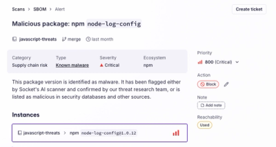
Introducing the Alert Details Page: A Better Way to Explore Alerts
Socket's new Alert Details page is designed to surface more context, with a clearer layout, reachability dependency chains, and structured review.
@bento/field-error
Advanced tools
The FieldError component renders error messages for form controls, such as RadioGroup or CheckboxGroup
import { Meta, ArgTypes, Story, Controls, Source, } from '@storybook/addon-docs/blocks';
The @bento/field-error package provides the FieldError component, which is used to display error messages in form primitives, such as RadioGroup or CheckboxGroup. It is meant to be used in conjunction with form controls such as the RadioGroup or CheckboxGroup primitives.
npm install --save @bento/field-error
The following properties are available to be used on the FieldError component:
| Prop | Type | Required | Description |
|---|---|---|---|
align | "start" | "center" | "end" | "justify" | No | The alignment of the text. |
as | string | No | The HTML element to render the text as. |
children | ReactNode | No | The content to display inside the text. |
maxLines | number | No | The maximum number of lines to display. |
wrap | "wrap" | "nowrap" | "balance" | "pretty" | "stable" | No | The wrapping behavior of the text. |
slot | string | No | A named part of a component that can be customized. This is implemented by the consuming component. |
| The exposed slot names of a component are available in the components documentation. | |||
slots | Record<string, object | Function> | No | An object that contains the customizations for the slots. |
| The main way you interact with the slot system as a consumer. |
A simple usage of the FieldError component. The error message is only displayed when isInvalid is true.
import { FieldError, type FieldErrorProps } from '@bento/field-error';
/* v8 ignore next */
import React from 'react';

export function DefaultExample(args: FieldErrorProps) {
  return <FieldError {...args}>This field is required</FieldError>;
}
FAQs
The FieldError component renders error messages for form controls, such as RadioGroup or CheckboxGroup
The npm package @bento/field-error receives a total of 6 weekly downloads. As such, @bento/field-error popularity was classified as not popular.
We found that @bento/field-error demonstrated a healthy version release cadence and project activity because the last version was released less than a year ago. It has 4 open source maintainers collaborating on the project.
Did you know?

Socket for GitHub automatically highlights issues in each pull request and monitors the health of all your open source dependencies. Discover the contents of your packages and block harmful activity before you install or update your dependencies.

Product
Socket's new Alert Details page is designed to surface more context, with a clearer layout, reachability dependency chains, and structured review.

Product
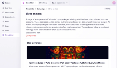
Campaign-level threat intelligence in Socket now shows when active supply chain attacks affect your repositories and packages.

Research
Malicious PyPI package sympy-dev targets SymPy users, a Python symbolic math library with 85 million monthly downloads.