Product
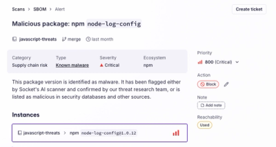
Introducing the Alert Details Page: A Better Way to Explore Alerts
Socket's new Alert Details page is designed to surface more context, with a clearer layout, reachability dependency chains, and structured review.
@bento/portal
Advanced tools
Portal component primitive - render children into a target DOM container
The @bento/portal package exports the Portal component, which renders
children into a target DOM container outside the normal React component
hierarchy. Portal solves common UI challenges like z-index conflicts, clipping
issues, and overlay stacking by rendering content to document.body or a custom
container.
Portal integrates seamlessly with React ARIA's UNSAFE_PortalProvider while
remaining fully independent and functional without it.
Portal is essential for UI elements that need to escape their parent container's boundaries:
npm install --save @bento/portal
The @bento/portal package exports the Portal component:
<Source language='tsx' code={ BasicExample } />
The following properties are available to be used on the Portal component:
| Prop | Type | Required | Description |
|---|---|---|---|
container | Element | No | The container to render the portal content into. |
| If not provided, Portal will check for React ARIA's PortalProvider, | |||
| and fall back to document.body. | |||
mounted | boolean | No | Should the portal content be mounted. |
| Set to false by default for server-side rendering compatibility. | |||
| Portal will not render children if not mounted. | |||
children | ReactNode | ((data: { props: { mounted?: boolean; }; }) => ReactNode) | Yes | The content to render inside the portal. |
| Can be a React node or a render prop function that receives props. | |||
slot | string | No | A named part of a component that can be customized. This is implemented by the consuming component. |
| The exposed slot names of a component are available in the components documentation. | |||
slots | Record<string, object | Function> | No | An object that contains the customizations for the slots. |
| The main way you interact with the slot system as a consumer. |
Basic portal usage that renders content to document.body:
<Source language='tsx' code={ BasicExample } />
Portal can render to a custom container instead of document.body. This is
useful when you need to control the exact DOM location where portal content
appears:
<Source language='tsx' code={ CustomContainerExample } />
Portal optionally integrates with React ARIA's UNSAFE_PortalProvider to
provide consistent portal container management across your application. This
example demonstrates how Portal automatically detects and uses the
PortalProvider's container:
<Source language='tsx' code={ PortalProviderExample } />
Container priority:
container prop (highest priority)UNSAFE_PortalProvider container (via useUNSAFE_PortalContext)document.body (fallback)Benefits:
Portal is SSR-safe and will not render content on the server. The mounted prop
should be set to true only after the component has mounted on the client:
function MyComponent() {
  const [mounted, setMounted] = useState(false);

  useEffect(() => {
    setMounted(true);
  }, []);

  return (
    <Portal mounted={mounted}>
      <Container>Content</Container>
    </Portal>
  );
}
Portal is designed with accessibility in mind:
Note: Portal is a rendering utility and doesn't provide built-in focus *trapping or modal behavior. For accessible modals and dialogs, combine Portal *with proper focus management and ARIA attributes.
Portal applies the following data attributes to portal content:
| Attribute | Description | Example Values |
|---|---|---|
data-portal | Marks content rendered via portal | "true" |
data-mounted | Whether portal content has mounted | "true" / "false" |
Portal is a rendering utility component that doesn't render its own DOM
elements. Instead, it renders children into a target container using React's
createPortal. Because of this, Portal doesn't introduce internal slots like
other Bento components.
Portal is created using the @bento/slots package via withSlots('BentoPortal', ...), which means it supports the standard slot and slots props for
integration with parent components. However, Portal itself doesn't define any
internal slot assignments since it acts as a transparent rendering boundary.
See the @bento/slots package for more information on how to use the slot and
slots properties.
Portal applies data attributes to the children it renders, making it possible to
style portal content based on its state. Since Portal doesn't render wrapper
elements, you should apply className or style props directly to the children
you pass to Portal.
The data attributes Portal applies can be used in your CSS selectors:
/* Target all portal content */
[data-portal="true"] {
  /* Styles for content rendered through Portal */
}

/* Target mounted portal content */
[data-portal="true"][data-mounted="true"] {
  /* Styles for mounted portal content */
  animation: fadeIn 200ms ease-in;
}
When using Portal with other Bento components like Container, you can apply
styling through those components:
<Portal mounted={mounted}>
  <Container className="my-overlay">
    <Text>Styled portal content</Text>
  </Container>
</Portal>
The data attributes will be applied to the Container element, allowing you to target it:
.my-overlay[data-portal="true"] {
  /* Your custom styles */
}
FAQs
Portal component primitive - render children into a target DOM container
We found that @bento/portal demonstrated a healthy version release cadence and project activity because the last version was released less than a year ago. It has 4 open source maintainers collaborating on the project.
Did you know?

Socket for GitHub automatically highlights issues in each pull request and monitors the health of all your open source dependencies. Discover the contents of your packages and block harmful activity before you install or update your dependencies.

Product
Socket's new Alert Details page is designed to surface more context, with a clearer layout, reachability dependency chains, and structured review.

Product
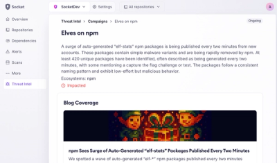
Campaign-level threat intelligence in Socket now shows when active supply chain attacks affect your repositories and packages.

Research
Malicious PyPI package sympy-dev targets SymPy users, a Python symbolic math library with 85 million monthly downloads.