Product
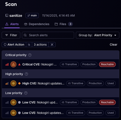
Reachability for Ruby Now in Beta
Reachability analysis for Ruby is now in beta, helping teams identify which vulnerabilities are truly exploitable in their applications.
@braid-design-system/docs-ui
Advanced tools


Components for building documentation sites with a consistent user experience to the Braid Design System website.
npm install @braid-design-system/docs-ui
LinkableHeadingA heading wrapped in a link to a hash that is generated based on the heading content, enabling deep links within documentation pages.
import { LinkableHeading } from '@braid-design-system/docs-ui';

<LinkableHeading>Section heading</LinkableHeading>;
| props | value | description |
|---|---|---|
| level | HeadingLevel | The heading size (defaults to 3) |
| component | string | HTML element to render, e.g. “h1”, “h2”, etc. |
| children | string | Visible heading content, converted to slug (e.g. “section-heading”) to be used as hash link. |
| label | string | Override the slug used as the hash link. Note: If the content of the heading is more than a simple string that can be slugified, then the label is required. |
MenuButtonA hamburger button used for showing and hiding the Navigation Sidebar on mobile devices.
import { MenuButton } from '@braid-design-system/docs-ui';

<MenuButton open={menuOpen} onClick={handleOnClick} />;
| props | value | description |
|---|---|---|
| open | boolean | The Menu can either be open or closed. If open, the button will change to a close icon (defaults to false). |
| onClick | () => void | A callback function to manage events when the button is triggered. |
SideNavigationSectionA navigation section containing a list of links, designed for the side bar.
import { SideNavigationSection } from '@braid-design-system/docs-ui';

<SideNavigationSection title={title} items={items} />;
| props | value | description |
|---|---|---|
| title | string | Title of the Navigation Section. |
| hideTitle | boolean | Optional to visually hide the group title. |
| items | Array<{ name: stringpath: stringbadge?: 'New' | 'Deprecated'onClick?: () => voidtarget?: stringactive?: boolean}> | An array of items in the sidebar, each linking to a specific docs page. |
HeaderNavigationLayout for the site logo, a MenuButton on smaller screens, and an optional theme selector.
import { HeaderNavigation } from '@braid-design-system/docs-ui';

<HeaderNavigation
  menuOpen={menuOpen}
  menuClick={handleMenuClick}
  logo={<Logo />}
  logoLabel={logoLabel}
  themeToggle={<ThemeToggle />}
/>;
| props | value | description |
|---|---|---|
| menuOpen | boolean | The Menu can either be open or closed. If open, the button will change to a close icon (defaults to false). |
| menuClick | () => void | An optional callback function to handle events when the menu button is clicked. |
| logo | React.ReactNode | A React component for the logo of your site (which should act as a link to your homepage). |
| logoLabel | string | An accessibility label for the logo. |
| logoHref | string | An optional href which sets the link for when the logo is clicked. |
| themeToggle | React.ReactNode | An optional React component for a theme selector. |
FAQs
<img src="https://raw.githubusercontent.com/seek-oss/b
The npm package @braid-design-system/docs-ui receives a total of 41 weekly downloads. As such, @braid-design-system/docs-ui popularity was classified as not popular.
We found that @braid-design-system/docs-ui demonstrated a healthy version release cadence and project activity because the last version was released less than a year ago. It has 3 open source maintainers collaborating on the project.
Did you know?

Socket for GitHub automatically highlights issues in each pull request and monitors the health of all your open source dependencies. Discover the contents of your packages and block harmful activity before you install or update your dependencies.

Product
Reachability analysis for Ruby is now in beta, helping teams identify which vulnerabilities are truly exploitable in their applications.

Research
/Security News
Malicious npm packages use Adspect cloaking and fake CAPTCHAs to fingerprint visitors and redirect victims to crypto-themed scam sites.

Security News
Recent coverage mislabels the latest TEA protocol spam as a worm. Here’s what’s actually happening.