Product
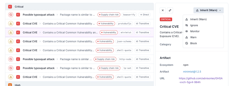
Introducing Enhanced Alert Actions and Triage Functionality
Socket now supports four distinct alert actions instead of the previous two, and alert triaging allows users to override the actions taken for all individual alerts.
@bynder/compact-view
Advanced tools
Readme
import * as React from 'react';
import * as ReactDOM from 'react-dom';
import { CompactView, Modal, Login } from '@bynder/compact-view';
const assetFieldSelection = `
name
url
originalUrl
derivatives {
thumbnail
webImage
}
... on Video {
previewUrls
}
`;
class App extends React.Component {
constructor(props) {
super(props);
this.state = { isOpen: false };
}
onSuccess(assets) {
console.log(assets);
}
render() {
return (
<>
<button onClick={() => this.setState({ isOpen: true })}>Open Compact View</button>
<Modal isOpen={this.state.isOpen} onClose={() => this.setState({ isOpen: false })}>
<Login>
<CompactView
language="en_US"
onSuccess={this.onSuccess}
assetFieldSelection={assetFieldSelection}
/>
</Login>
</Modal>
</>
);
}
}
ReactDOM.render(<App />, document.getElementById('app'));
See more info on Bynder Docs
The optional options object accepts the following attributes (which are also all optional):
| Attribute | Description | Possible Values | Default Value |
|---|---|---|---|
onSuccess | Comma separated list of asset types to display | function (assets: asset[], { selectedFile?: File })): void | console.log |
container | A DOM element to act as the container for Compact View (disables modal) | A Dom.HTMLElement instance | None |
portal | Portal config object | None | |
portal.url | Set a default portal URL for the Compact View login screen | A string containing Bynder portal URL | None |
portal.readOnly | If true, limits Compact View to a single portal | true, false | false |
defaultSearchTerm | Set the initial value for search term | "Keyword" | None |
language | Set language for the Compact View | "en_US", "nl_NL", "de_DE", "fr_FR", "es_ES", | "en_US" |
mode | Set the Compact View to allow multiple or single asset selection | "SingleSelect", "SingleSelectFile", "MultiSelect" | "MultiSelect" |
theme | A theme object for customizing Compact View look and feel | Object (see below for recognized keys) | None |
assetTypes | An array of strings for limiting allowed asset types | AssetType[] | ["image", "audio", "video", "document"] |
hideExternalAccess | If true, removes access to external DAM from assets and collections | true, false | false |
hideLimitedUse | If true, limited assets are hidden | true, false | false |
selectedAssets | An array of asset ids. When mode is different than MultiSelect, the last id in the array will be selected | ["id1", "id2", "id3"] | [] |
modalStyles | An object with css properties for modal wrapper using strings as keys and values { [key: string]: string } | {"width": "100%"} | None |
assetFieldSelection | A multiline string containing desired asset fields | string | None |
assetFilter | Set predefined filters for the Compact View | AssetFilterJson | None |
type File = {
	url: string;
	width?: number;
	height?: number;
	fileSize?: number;
};

type AssetFilterJson = {
	assetType_in?: AssetType[]; //predefined asset types
	collectionId?: string; //predefined collection id
	metapropertyOptionId_in?: string[]; //predefined metaproperty IDs
	searchTerm?: string; //predefined search term
	tagNames_in?: string[]; //predefined tags
	isLimitedUse?: boolean; //whether or not this asset is marked as Limited Use
	showToolbar?: boolean; //show toolbar for predefined filters (false by default)
};

type AssetType = 'AUDIO' | 'DOCUMENT' | 'IMAGE' | 'VIDEO' | 'ARCHIVE';

type theme = {
	colorPrimary?: CSSColor;
	colorButtonPrimary?: CSSColor;
	colorButtonPrimaryLabel?: CSSColor;
	colorButtonPrimaryActive?: CSSColor;
	colorButtonPrimaryHover?: CSSColor;
	colorButtonPrimaryHoverLabel?: CSSColor;
};
FAQs
Bynder Compact View
The npm package @bynder/compact-view receives a total of 2,002 weekly downloads. As such, @bynder/compact-view popularity was classified as popular.
We found that @bynder/compact-view demonstrated a healthy version release cadence and project activity because the last version was released less than a year ago. It has 0 open source maintainers collaborating on the project.
Did you know?

Socket for GitHub automatically highlights issues in each pull request and monitors the health of all your open source dependencies. Discover the contents of your packages and block harmful activity before you install or update your dependencies.

Product
Socket now supports four distinct alert actions instead of the previous two, and alert triaging allows users to override the actions taken for all individual alerts.

Security News
Polyfill.io has been serving malware for months via its CDN, after the project's open source maintainer sold the service to a company based in China.

Security News
OpenSSF is warning open source maintainers to stay vigilant against reputation farming on GitHub, where users artificially inflate their status by manipulating interactions on closed issues and PRs.