Product
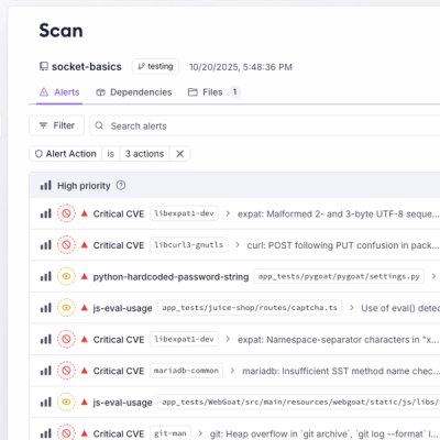
Unify Your Security Stack with Socket Basics
A single platform for static analysis, secrets detection, container scanning, and CVE checks—built on trusted open source tools, ready to run out of the box.
@cocokits/angular-divider
Advanced tools
The `@cocokits/angular-divider` package provides a simple yet essential UI component designed to visually separate content within Angular applications. The `DividerComponent` helps improve the organization and clarity of your interface by creating clear d
The @cocokits/angular-divider package provides a simple yet essential UI component designed to visually separate content within Angular applications. The DividerComponent helps improve the organization and clarity of your interface by creating clear distinctions between different sections or elements.
DividerComponentThe DividerComponent is a fundamental layout element that enhances user experience by providing visual separation in your application's design. This makes it easier for users to navigate and understand different sections of your app.
Like other CocoKits components, the DividerComponent does not come with built-in styles. It applies CSS classes based on configuration, giving you the freedom to style it as needed or apply a pre-built theme from CocoKits.
For more detailed information and configuration options, visit the documentation:
We welcome contributions! If you'd like to contribute to this project, please read our Contributing Guidelines
This project is licensed under the Apache License. See the LICENSE file for details.
FAQs
The `@cocokits/angular-divider` package provides a simple yet essential UI component designed to visually separate content within Angular applications. The `DividerComponent` helps improve the organization and clarity of your interface by creating clear d
We found that @cocokits/angular-divider demonstrated a healthy version release cadence and project activity because the last version was released less than a year ago. It has 1 open source maintainer collaborating on the project.
Did you know?

Socket for GitHub automatically highlights issues in each pull request and monitors the health of all your open source dependencies. Discover the contents of your packages and block harmful activity before you install or update your dependencies.

Product
A single platform for static analysis, secrets detection, container scanning, and CVE checks—built on trusted open source tools, ready to run out of the box.

Product
Socket is launching experimental protection for the Hugging Face ecosystem, scanning for malware and malicious payload injections inside model files to prevent silent AI supply chain attacks.

Research
/Security News
The Socket Threat Research Team uncovered a coordinated campaign that floods the Chrome Web Store with 131 rebranded clones of a WhatsApp Web automation extension to spam Brazilian users.