Product
Announcing Bun and vlt Support in Socket
Bringing supply chain security to the next generation of JavaScript package managers
@commercetools-uikit/accessible-button
Advanced tools
A React component that you can use to wrap your buttons in an accessible element.
A React component that you can use to wrap your buttons in an accessible <button/> element.
yarn add @commercetools-uikit/accessible-button
npm --save install @commercetools-uikit/accessible-button
Additionally install the peer dependencies (if not present)
yarn add react
npm --save install react
import AccessibleButton from '@commercetools-uikit/accessible-button';

// The `AccessibleButton` component is intended to be used as a wrapper
// for your actual button component.
const Example = (props) => (
  <AccessibleButton label="Log in" onClick={() => {}}>
    Log in
  </AccessibleButton>
);

export default Example;
| Props | Type | Required | Default | Description |
|---|---|---|---|---|
as | unionPossible values: string , ComponentType | By default the component renders a button element. You can pass an optional React.ElemenType
in case this needs to be rendered as a different element. | ||
id | string | The ID of the element. | ||
type | unionPossible values: 'submit' , 'reset' , 'button' | 'button' | The type of the button element. | |
label | string | ✅ | The aria-label value. | |
children | ReactNode | ✅ | Any React node. | |
isToggleButton | boolean | false | If true, indicates that this is a toggle button. | |
isToggled | boolean | false | If true, indicates that this element is in a toggled state.
This prop is only used if isToggleButton is true. | |
isDisabled | boolean | If true, indicates that the element is in a disabled state. | ||
className | string | Allow to override the styles by passing a className prop.
Custom styles can also be passed using the css prop from emotion. | ||
onClick | FunctionSee signature. | Event handler when the button is clicked, or the user presses ENTER or SPACE. | ||
buttonAttributes | Record | {} | Any HTML attributes to be forwarded to the HTML element. |
onClick(
event: MouseEvent<HTMLButtonElement> | KeyboardEvent<HTMLButtonElement>
) => void
<button/>If you can use a native HTML element or attribute with the semantics and behavior you require already built in, instead of re-purposing an element and adding an ARIA role, state or property to make it accessible, then do so.
This means that instead of using a <div/> to create a button we should use the
<button/> element.
The problem with using the <button/> element for creating a button is that in
some browsers the <button/> element cannot be used as a flex
container.
To solve both problems at once we need to nest a <div/> inside the
<button/>. This <div/> contains the actual button content, like the label
and/or an icon.
In order to indicate to screen readers that a button is a toggle button — meaning
that it will keep the active state once clicked — you need to set the
aria-pressed attribute accordingly.
This is automatically done when you specify the isToggled property. If this
prop is omitted though we don't set the aria-pressed attribute at all so
screen readers to not mistake our button for a toggle button.
In order for screen readers to know what a button does we need to provide a
proper label. The <button/> element is able to figure out the aria-label on
its own for simple buttons that only contain text.
For buttons that contain an icon however the default aria-label would also
contain the icon, which probably our screenreader does not know how to read out
😉.
So we need to manually set the aria-label attribute. You need to do so by
providing the label prop.
In order for screen readers to know if your button is disabled we need to set the
aria-disabled and disabled attributes on the button. We do so automatically
if you set the isDisabled prop to true.
FAQs
Did you know?

Socket for GitHub automatically highlights issues in each pull request and monitors the health of all your open source dependencies. Discover the contents of your packages and block harmful activity before you install or update your dependencies.

Product
Bringing supply chain security to the next generation of JavaScript package managers

Product
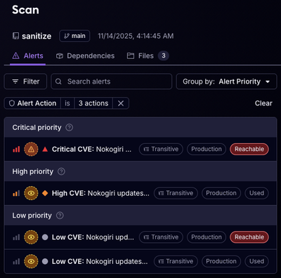
A safer, faster way to eliminate vulnerabilities without updating dependencies

Product
Reachability analysis for Ruby is now in beta, helping teams identify which vulnerabilities are truly exploitable in their applications.