Product
Introducing Enhanced Alert Actions and Triage Functionality
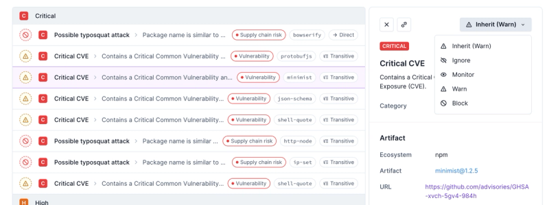
Socket now supports four distinct alert actions instead of the previous two, and alert triaging allows users to override the actions taken for all individual alerts.
@commercetools-uikit/accessible-button
Advanced tools
Readme
A React component that you can use to wrap your buttons in an accessibile
<button/> element.
The AccessibleButton component is intended to be used as a wrapper for your
actual button component.
import AccessibleButton from '@commercetools-uikit/accessible-button';

const Button = props => (
  <AccessibleButton
    label={props.label}
    onClick={props.onClick}
    isToggled={props.isToggled}
    isDisabled={props.isDisabled}
    className={styles.button}
  >
    <div className={styles.default}>
      {Boolean(props.iconLeft) && props.iconLeft}
      <span>{props.label}</span>
    </div>
  </AccessibleButton>
);
Button.propTypes = {
  label: PropTypes.string.isRequired,
  iconLeft: PropTypes.node,
  /* set to true or false to indicate a toggle button */
  isToggled: PropTypes.bool,
  isDisabled: PropTypes.bool,
  onClick: PropTypes.func.isRequired,
};

Button.displayName = 'Button';

export default Button;
| Property | Type | Required? | Description |
|---|---|---|---|
| id | String | - | Used as the HTML id attribute. |
| type | String | - | Used as the HTML type attribute. Supported values are submit, reset and button. |
| label | String | ✓ | The text that should be used as aria-label |
| children | Node | ✓ | Button content |
| isToggled | Bool | - | Set this prop to indicate a toggle button and it's state |
| ref | React ref | - | Used as button reference |
| isToggleButton | Bool | - | Used to set `aria-pressed˚ state |
| isDisabled | Bool | - | Set this prop to indicate a disabled button |
| onClick | Function | ✓ | Callback that is called when the button is clicked |
| buttonAttributes | Object | - | Attributes to be applied to the <button/> element. Can be use to e.g. add data-* attributes to the button. |
<button/>If you can use a native HTML element or attribute with the semantics and behaviour you require already built in, instead of re-purposing an element and adding an ARIA role, state or property to make it accessible, then do so.
This means that instead of using a <div/> to create a button we should use the
<button/> element.
The problem with using the <button/> element for creating a button is that in
some browsers the <button/> element cannot be used as a flex
container.
To solve both problems at once we need to nest a <div/> inside the
<button/>. This <div/> contains the actual button content, like the label
and/or an icon.
In order to indicate to screenreaders that a button is a toggle button — meaning
that it will keep the active state once clicked — you need to set the
aria-pressed attribute accordingly.
This is automatically done when you specify the isToggled property. If this
prop is omitted though we don't set the aria-pressed attribute at all so
screenreaders to not mistake our button for a togglable button.
In order for screenreaders to know what a button does we need to provide a
proper label. The <button/> element is able to figure out the aria-label on
its own for simple buttons that only contain text.
For buttons that contain an icon however the default aria-label would also
contain the icon, which probably our screenreader does not know how to read out
😉.
So we need to manually set the aria-label attribute. You need to do so by
providing the label prop.
In order for screenreaders to know if your button is disabled we need to set the
aria-disabled and disabled attributes on the button. We do so automatically
if you set the isDisabled prop to true.
FAQs
A React component that you can use to wrap your buttons in an accessible element.
The npm package @commercetools-uikit/accessible-button receives a total of 13,371 weekly downloads. As such, @commercetools-uikit/accessible-button popularity was classified as popular.
We found that @commercetools-uikit/accessible-button demonstrated a healthy version release cadence and project activity because the last version was released less than a year ago. It has 0 open source maintainers collaborating on the project.
Did you know?

Socket for GitHub automatically highlights issues in each pull request and monitors the health of all your open source dependencies. Discover the contents of your packages and block harmful activity before you install or update your dependencies.

Product
Socket now supports four distinct alert actions instead of the previous two, and alert triaging allows users to override the actions taken for all individual alerts.

Security News
Polyfill.io has been serving malware for months via its CDN, after the project's open source maintainer sold the service to a company based in China.

Security News
OpenSSF is warning open source maintainers to stay vigilant against reputation farming on GitHub, where users artificially inflate their status by manipulating interactions on closed issues and PRs.