Product
Announcing Bun and vlt Support in Socket
Bringing supply chain security to the next generation of JavaScript package managers
@commercetools-uikit/secondary-icon-button
Advanced tools
Secondary Icon Buttons are "icon-only" buttons and a restricted version of the ``. They trigger an action when clicked (`onClick` prop). You must also pass a label for accessibility reasons.
Secondary Icon Buttons are "icon-only" buttons and a restricted version of the `<IconButton>`. They trigger an action when clicked (`onClick` prop). You must also pass a label for accessibility reasons.
yarn add @commercetools-uikit/secondary-icon-button
npm --save install @commercetools-uikit/secondary-icon-button
Additionally install the peer dependencies (if not present)
yarn add react
npm --save install react
import SecondaryIconButton from '@commercetools-uikit/secondary-icon-button';
import { InformationIcon } from '@commercetools-uikit/icons';

const Example = () => (
  <SecondaryIconButton
    icon={<InformationIcon />}
    label="A label text"
    onClick={() => alert('Button clicked')}
  />
);

export default Example;
| Props | Type | Required | Default | Description |
|---|---|---|---|---|
as | TStringOrComponent | You may pass in a string like "a" to have the button element render an anchor tag, or
you could pass in a React Component, like a Link.
The <SecondaryIconButton> additionally accepts any props or attributes specific to the given element or component. | ||
type | unionPossible values: 'submit' , 'reset' , 'button' | 'button' | Used as the HTML type attribute. | |
icon | ReactElement | An component. | ||
color | unionPossible values: 'solid' , 'primary' , 'info' | 'solid' | Indicates the color scheme of the button. | |
label | string | ✅ | Should describe what the button does, for accessibility purposes (screen-reader users) | |
isDisabled | boolean | false | Tells when the button should present a disabled state. | |
size | unionPossible values: TLegacySizes , TSizes | '40' | Indicates the size of the icon. Available sizes are '10', '20', '30', '40'. | |
onClick | FunctionSee signature. | Handler when the button is clicked. |
onClick(
event: MouseEvent<HTMLButtonElement> | KeyboardEvent<HTMLButtonElement>
) => void
The component further forwards all valid HTML attributes to the underlying button component.
The size of the button should be adjusted directly on the passed Icon component. Example:
<SecondaryIconButton
  icon={<ArrowRightIcon size="small" />}
  label="Next"
  onClick={() => alert('Button clicked')}
/>
Mostly in all places where you just need a "clickable" icon, without the complex behaviors of the IconButton.
FAQs
Did you know?

Socket for GitHub automatically highlights issues in each pull request and monitors the health of all your open source dependencies. Discover the contents of your packages and block harmful activity before you install or update your dependencies.

Product
Bringing supply chain security to the next generation of JavaScript package managers

Product
A safer, faster way to eliminate vulnerabilities without updating dependencies

Product
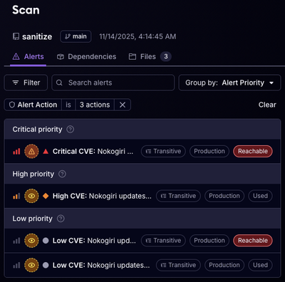
Reachability analysis for Ruby is now in beta, helping teams identify which vulnerabilities are truly exploitable in their applications.