Product
Introducing Enhanced Alert Actions and Triage Functionality
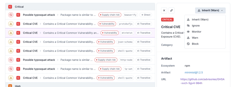
Socket now supports four distinct alert actions instead of the previous two, and alert triaging allows users to override the actions taken for all individual alerts.
@commercetools-uikit/tooltip
Advanced tools
Readme
Tooltips display informative text when users hover over or focus on an element.
import Tooltip from '@commercetools-uikit/tooltip';
<Tooltip
placement="left"
title="If you buy a pizza, you will also get a free ice cream :)"
>
<button onClick={orderPizza({ freeIceCream: 'yes please' })}>Submit</button>
</Tooltip>;
When you use a tooltip with a disabled element, you should define the style pointer-events: none to the disabled element to stop it from capturing events.
The Button components from ui-kit already support this functionality.
<Tooltip
  placement="left"
  title="You do not have permission to delete the database"
>
  <button
    disabled
    onClick={deleteDb()}
    style={{
      pointerEvents: 'none',
    }}
  >
    Delete production database
  </button>
</Tooltip>
The tooltip applies event listeners (onMouseOver, onMouseLeave, onFocus, and onBlur) to a wrapping div component around the children element. By default, this wrapper is displayed with style inline-block. If you want to customize this behaviour, then you can pass in a custom element. Be sure to use React.forwardRef, as we need the to pass the ref to the wrapper.
const Wrapper = React.forwardRef((props, ref) => (
  <div ref={ref} style={{ display: 'block' }} {...props}>
    {props.children}
  </div>
));

const FullWidthButton = styled.button`
  display: block;
  width: 100%;
`;

<Tooltip title="Delete" components={{ WrapperComponent: Wrapper }}>
  <FullWidthButton>Submit</FullWidthButton>
</Tooltip>;
You can customize the look and feel of the tooltip body by passing in a custom BodyComponent
const Body = styled.div`
  color: red;
`;

<Tooltip title="Delete" components={{ BodyComponent: Body }}>
  <button>Submit</button>
</Tooltip>;
When you are dealing with virtualized components, it can be useful to render the tooltip into another part of the document. You can define a TooltipWrapperComponent to do this.
const Portal = props => ReactDOM.createPortal(props.children, document.body);

<Tooltip title="Delete" components={{ TooltipWrapperComponent: Portal }}>
  <button>Submit</button>
</Tooltip>;
There may be cases when you only want to enable the display of a tooltip under a certain condition. In these cases, you may want to use the off prop.
In the following example, the tooltip text only appears on hover when the button is disabled.
<Tooltip
  off={props.isDisabled}
  title="You do not have permission to perform this action"
>
  <button disabled={props.isDisabled}>Submit</button>
</Tooltip>
This component uses Popper.js under the hood. Popper provides a way to adjust how tooltip element should behave, by providing a set of modifiers.
For instance, forcing tooltip to stay in the original placement and not to try flipping when it's getting out of boundaries, can be implemented as follows:
<Tooltip
  placement="left"
  title="I will always be on the left side"
  modifiers={{
    preventOverflow: {
      enabled: false,
      }
    flip: {
      enabled: false,
    },
  }}
>
  <button disabled={props.isDisabled}>Submit</button>
</Tooltip>
| Props | Type | Required | Values | Default | Description |
|---|---|---|---|---|---|
off | bool | - | - | false | Whether or not the tooltip opens and closes as a result of event listeners. |
isOpen | bool | - | - | - | If passed, the tooltip's open and closed states are controlled by this prop |
closeAfter | number | - | - | 0 | Delay (in milliseconds) between the end of the user interaction, and the closing of the tooltip |
onOpen | func | - | - | - | Called when the tooltip is opened |
onClose | func | - | - | - | Called after the tooltip is closed |
placement | object | - | top, top-start, top-end, right, right-start, right-end, bottom, bottom-end, bottom-start, left, left-start, left-end | top | How the tooltip is positioned relative to the child element |
horizontalConstraint | object | - | xs, s, m, l, xl, scale | scale | Horizontal size limit of the tooltip |
children | node | ✅ | - | - | Content rendered within the tooltip |
components | object | - | WrapperComponent, BodyComponent | - | If passed, the tooltip will wrap your component with this element |
styles.body | object | - | - | - | If passed, these styles will be spread onto the div surrounding the tooltip body |
modifiers | object | - | - | - | Provides a way to fine-tune an appearance of underlying Popper tooltip element. For more information, please check Popper.js documentation |
FAQs
Tooltips display informative text when users hover over or focus on an element.
The npm package @commercetools-uikit/tooltip receives a total of 5,222 weekly downloads. As such, @commercetools-uikit/tooltip popularity was classified as popular.
We found that @commercetools-uikit/tooltip demonstrated a healthy version release cadence and project activity because the last version was released less than a year ago. It has 0 open source maintainers collaborating on the project.
Did you know?

Socket for GitHub automatically highlights issues in each pull request and monitors the health of all your open source dependencies. Discover the contents of your packages and block harmful activity before you install or update your dependencies.

Product
Socket now supports four distinct alert actions instead of the previous two, and alert triaging allows users to override the actions taken for all individual alerts.

Security News
Polyfill.io has been serving malware for months via its CDN, after the project's open source maintainer sold the service to a company based in China.

Security News
OpenSSF is warning open source maintainers to stay vigilant against reputation farming on GitHub, where users artificially inflate their status by manipulating interactions on closed issues and PRs.