elevation-overlay 
IMPORTANT: The Material Web Components are a work in progress and subject to
major changes until 1.0 release.
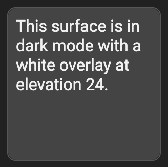
An overlay is a semi-transparent covering on an element that indicates its
state. Overlays provide a systematic approach to visualizing states by using
opacity.
Material Design Guidelines: States - Overlay
Demo
Installation
npm install @dev.mohe/mwc-elevation-overlay
NOTE: The Material Web Components are distributed as ES2017 JavaScript
Modules, and use the Custom Elements API. They are compatible with all modern
browsers including Chrome, Firefox, Safari, Edge, and IE11, but an additional
tooling step is required to resolve bare module specifiers, as well as
transpilation and polyfills for IE11. See
here
for detailed instructions.
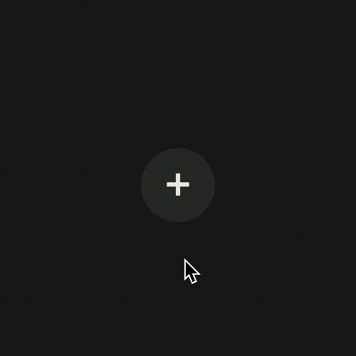
Example usage
Standard

<style>
body {
background-color: #212121;
}
</style>
<my-element></my-element>
<script type="module">
import {style as elevationStyle} from '@dev.mohe/mwc-elevation-overlay/mwc-elevation-overlay-css';
import {LitElement, css, html} from 'lit-element';
class MyElement extends LitElement {
static get styles() {
return [
elevationStyle,
css`
button {
--mdc-elevation-overlay-opacity: 9%;
}
button:hover,
button:focus {
--mdc-elevation-overlay-opacity: 15%;
}
button:active {
--mdc-elevation-overlay-opacity: 24%;
}
button {
background-color: #212121;
position: relative;
color: #eeeeee;
border: none;
border-radius: 26px;
height: 52px;
width: 52px;
font-size: 2em;
outline: none;
}
`,
];
}
render() {
return html`
<button>
<div class="mdc-elevation-overlay"></div>
+
</button>
`;
}
}
customElements.define('my-element', MyElement);
</script>
Customize colors
Appending to the example from above:
button {
--mdc-elevation-overlay-fill-color: lightgreen;
}
button:hover,
button:focus {
--mdc-elevation-overlay-fill-color: yellow;
}
button:active {
--mdc-elevation-overlay-fill-color: red;
}
.mdc-elevation-overlay {
transition: opacity 280ms cubic-bezier(0.4, 0, 0.2, 1), background-color 280ms cubic-bezier(0.4, 0, 0.2, 1);
}
API
CSS Custom Properties
| Name | Default | Description |
|---|
--mdc-elevation-overlay-opacity | 0 | Opacity of the overlay. |
--mdc-elevation-overlay-fill-color | #fff | Fill color of the overlay. |
--mdc-elevation-overlay-width | 100% | Width of the overlay (absolute positioning may need to be set as well e.g. .mdc-elevation-overlay {--mdc-elevation-overlay-width: 50%; left: 50%;}). |
--mdc-elevation-overlay-height | 100% | Height of the overlay (absolute positioning may need to be set as well e.g. .mdc-elevation-overlay {--mdc-elevation-overlay-height: 50%; top: 50%;}). |
Additional references


