<mwc-ripple> 
IMPORTANT: The Material Web Components are a work in progress and subject to
major changes until 1.0 release.
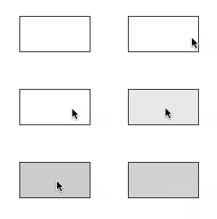
Ripple provides the JavaScript and CSS required to provide components (or any element at all) with a material "ink ripple" interaction effect.
Material Design Guidelines: States
Demo
Installation
npm install @dev.mohe/mwc-ripple
NOTE: The Material Web Components are distributed as ES2017 JavaScript
Modules, and use the Custom Elements API. They are compatible with all modern
browsers including Chrome, Firefox, Safari, Edge, and IE11, but an additional
tooling step is required to resolve bare module specifiers, as well as
transpilation and polyfills for IE11. See
here
for detailed instructions.
Example Usage
Standard

<mwc-ripple></mwc-ripple>
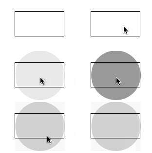
Unbounded

<mwc-ripple unbounded></mwc-ripple>
API
Properties/Attributes
| Name | Type | Default | Description |
|---|
primary | boolean | false | When true, sets the ripple color to --mdc-theme-primary. Will be overridden by --mdc-ripple-color if set. |
accent | boolean | false | When true, sets the ripple color to --mdc-theme-secondary. Will be overridden by --mdc-ripple-color if set. |
unbounded | boolean | false | When true, the ripple will flow outside the component in a circle. |
activated | boolean | false | Set true when the container of the ripple should be in an activated state. |
selected | boolean | false | Set true when the container of the ripple should be in a selected state. |
disabled | boolean | false | Set true to disable the ripple when the container of the ripple is disabled. |
Methods
| Name | Description |
|---|
startPress(event?: Event) => void | Begin the press state of the ripple. Optional Event will be used to determine the beginning coordinates of the ripple animation when unbounded is false. |
endPress() => void | End the press state of the ripple. |
startFocus() => void | Begin the focus state of the ripple. |
endFocus() => void | End the focus state of the ripple. |
startHover() => void | Begin the hover state of the ripple. |
endHover() => void | End the hover state of the ripple. |
CSS Custom Properties
| Name | Default | Description |
|---|
--mdc-ripple-color |  #000 | Color of the ripple will have when activated. |
--mdc-ripple-press-opacity | 0.12 | Opacity of the ripple when pressed. |
--mdc-ripple-hover-opacity | 0.04 | Opacity of the ripple when hovered. |
--mdc-ripple-focus-opacity | 0.12 | Opacity of the ripple when focused. |
--mdc-ripple-selected-opacity | 0.08 | Opacity of the ripple when the host component is "selected". This opacity is added to press, hover, and focus states. |
--mdc-ripple-activated-opacity | 0.12 | Opacity of the ripple when the host component is "activated". This opacity is added to press, hover, and focus states. |
--m-ripple-z-index | 0 | Z-index of the ripple. |


