

Security News
The Hidden Blast Radius of the Axios Compromise
The Axios compromise shows how time-dependent dependency resolution makes exposure harder to detect and contain.
By Ahmad Nassri - Apr 01, 2026
@diatonic/piano
Advanced tools
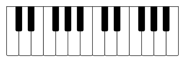
Interactive SVG piano as a React component.
npm install @diatonic/piano
Then import the component:
import { Piano } from "@diatonic/piano";

function App() {
  return <Piano />;
}
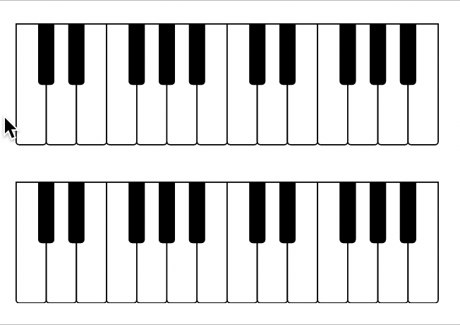
By default, the piano will expand to fill its container. If you place the <Piano> tag inside a div with fixed width, you'll get a simple, static piano:
<Piano />
The following props can be set to modify the SVG representation static piano:
| Prop | Description | Default |
|---|---|---|
| octaves | Number of octaves | 2 |
| width | Width of the <svg> element | '100%' |
| height | Height of the <svg> element | '100%' |
| preserveAspectRatio | Attribute for <svg> element (details) | 'xMinYMin meet' |
Two props can be used to set a key as pressed or highlighted. There are no real differences between the two, but it can be used to separate permanently pressed keys from the key currently being hovered, or to mark a chord and a scale at the same time. Highlighted keys are lighter in the default style. The two props are:
| Prop | Description | Default |
|---|---|---|
| pressed | Keys will be pressed | [] |
| highlighted | Keys will be highlighted | [] |
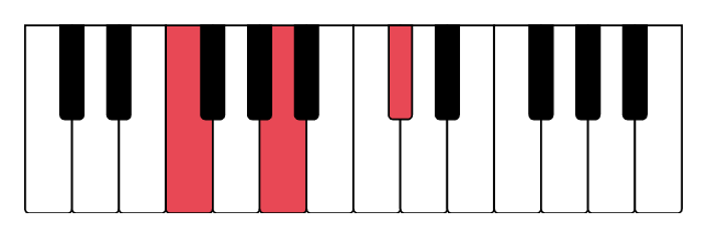
As an example, you can press F4, A4, and C#5 to highlight an F augmented chord:
<Piano pressed={["F4", "A4", "C#5"]} />
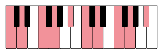
Internally, the component uses kamasi to figure out which notes to highlight. The component also accepts kamasi objects as input. So if your cool friends want to improvise over a D minor blues scale, you're just a single line from knowing which keys to use:
import { scale } from "kamasi";

<Piano highlighted={scale("D blues minor")} />;
The piano includes built-in default colors via SVG presentation attributes, so it works out-of-the-box with sensible default colors:
import { Piano } from "@diatonic/piano";

<Piano />
Import the default stylesheet to override variables:
import "@diatonic/piano/styles.css";
:root {
  /* White keys */
  --piano-key-diatonic-fill: #f0f0f0;
  --piano-key-diatonic-pressed-fill: #4caf50;
  --piano-key-diatonic-highlighted-fill: #81c784;
  --piano-key-diatonic-stroke: #333;

  /* Black keys */
  --piano-key-chromatic-fill: #333;
  --piano-key-chromatic-pressed-fill: #4caf50;
  --piano-key-chromatic-highlighted-fill: #81c784;
  --piano-key-chromatic-stroke: #000;

  /* Global */
  --piano-key-stroke-width: 4;
}
All available CSS variables:
| Variable | Description | Default |
|---|---|---|
--piano-key-diatonic-fill | White key default color | #f7f5f0 |
--piano-key-diatonic-pressed-fill | White key pressed color | #e07858 |
--piano-key-diatonic-highlighted-fill | White key highlighted color | #eca088 |
--piano-key-chromatic-fill | Black key default color | #4a423c |
--piano-key-chromatic-pressed-fill | Black key pressed color | #c04838 |
--piano-key-chromatic-highlighted-fill | Black key highlighted color | #b86850 |
--piano-key-diatonic-stroke | White key border color | #c0b8b0 |
--piano-key-diatonic-pressed-stroke | White key pressed border | #b8624c |
--piano-key-diatonic-highlighted-stroke | White key highlighted border | #b8624c |
--piano-key-chromatic-stroke | Black key border color | #4a423c |
--piano-key-chromatic-pressed-stroke | Black key pressed border | #4a423c |
--piano-key-chromatic-highlighted-stroke | Black key highlighted border | #4a423c |
--piano-key-stroke-width | Border width for all keys | 2 |
For maximum control, target CSS classes and data attributes directly:
Classes:
| Class | Description |
|---|---|
.diatonic-piano | Top <svg> component |
.diatonic-piano-octave-<n> | The <g> tag grouping all keys within one octave |
.diatonic-piano-key | The <path> tag for all keys |
.diatonic-piano-key-<pitchclass> | All keys of this pitch class (e.g., C, Cs) |
.diatonic-piano-key-<pitch> | Specific key (e.g., C4, Cs4) |
Data attributes:
| Attribute | Values | Description |
|---|---|---|
data-key-type | diatonic, chromatic | White or black key |
data-pressed | true, false | Whether the key is pressed |
data-highlighted | true, false | Whether the key is highlighted |
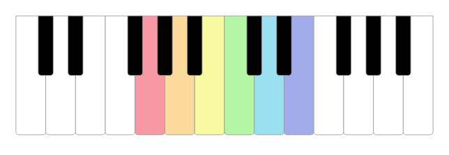
Example: Rainbow keys
/* Using a parent class ensures proper specificity */
#rainbow-piano {
  --piano-key-stroke-width: 2;
}
#rainbow-piano .diatonic-piano-key-G4 {
  fill: #f898a4;
}
#rainbow-piano .diatonic-piano-key-A4 {
  fill: #fcda9c;
}
#rainbow-piano .diatonic-piano-key-B4 {
  fill: #f7faa1;
}
#rainbow-piano .diatonic-piano-key-C5 {
  fill: #b4f6a4;
}
#rainbow-piano .diatonic-piano-key-D5 {
  fill: #9be0f1;
}
#rainbow-piano .diatonic-piano-key-E5 {
  fill: #a2aceb;
}
<div id="rainbow-piano">
  <Piano />
</div>
Enable direct interaction with piano keys using the interactive prop and event handlers:
| Prop | Description |
|---|---|
| interactive | Enables clicking, hovering, and keyboard navigation of keys |
| onPress | Called with (note, event) when a key is clicked or activated with Enter |
| onHighlightStart | Called with (note, event) when pointer enters a key or the key receives focus |
| onHighlightEnd | Called with (note, event) when pointer leaves a key or the key loses focus |
Each event handler receives two parameters:
note - The note string (e.g., 'C4')event - The original DOM event (MouseEvent, KeyboardEvent, PointerEvent, or FocusEvent)The component is fully stateless and relies on the parent to update pressed and highlighted props. This gives you complete control over the piano's behavior and enables synchronization with other components.
Using React hooks, you only need a few lines of code. The following is the complete App.js file showing two pianos where the second mirrors the first, transposed a perfect fifth:
import { useState } from "react";
import { Piano } from "@diatonic/piano";
import { NoteList } from "kamasi";

function App() {
  const [pressed, setPressed] = useState(new NoteList());
  const [highlighted, setHighlighted] = useState(new NoteList());

  return (
    <div style={{ width: "300px" }}>
      <Piano
        interactive={true}
        pressed={pressed}
        highlighted={highlighted}
        onPress={(n) => setPressed((note) => note.toggle(n))}
        onHighlightStart={(n) => setHighlighted(new NoteList([n]))}
        onHighlightEnd={() => setHighlighted(new NoteList())}
      />
      <Piano
        pressed={pressed.transpose("P5")}
        highlighted={highlighted.transpose("P5")}
      />
    </div>
  );
}

export default App;
See kamasi's documentation for more manipulation you can do, or check the Diatonic web app for inspiration.
The component automatically adapts its ARIA roles and labels based on usage:
role="img" with aria-label="Piano - Pressed keys: ..." or "Piano - No pressed keys"interactive or keyboardShortcuts): role="group" containing interactive buttonsThe aria-label always includes the currently pressed keys for screen reader users, regardless of interactivity mode.
The component offers two complementary modes of keyboard access:
| Prop | Description | Default |
|---|---|---|
| interactive | Enables keyboard navigation with <Tab> and <Enter> | false |
| keyboardShortcuts | Enables QWERTY keyboard shortcuts to play notes | false |
Direct key navigation (interactive={true}): Users can traverse through keys in chromatic order (left to right) using Tab, and activate a key with Enter. This works for all visible keys on the piano. The onPress event fires whether the key is clicked or activated with Enter, and onHighlightStart/onHighlightEnd work for both pointer hover and keyboard focus.
QWERTY shortcuts (keyboardShortcuts={true}): Turns the keyboard into a virtual piano. Keys Q-U play octave 3, A-J play octave 4, and Z-M play octave 5 (white keys). Hold Shift to play the black key (sharp) for any key. The onPress event fires with the played note when a keyboard shortcut is used.
Both modes can be enabled simultaneously, and both trigger the same onPress event handler.
FAQs
Interactive SVG piano for React
We found that @diatonic/piano demonstrated a healthy version release cadence and project activity because the last version was released less than a year ago. It has 1 open source maintainer collaborating on the project.
Did you know?

Socket for GitHub automatically highlights issues in each pull request and monitors the health of all your open source dependencies. Discover the contents of your packages and block harmful activity before you install or update your dependencies.
Security News
The Axios compromise shows how time-dependent dependency resolution makes exposure harder to detect and contain.

Research
A supply chain attack on Axios introduced a malicious dependency, plain-crypto-js@4.2.1, published minutes earlier and absent from the project’s GitHub releases.

Research
Malicious versions of the Telnyx Python SDK on PyPI delivered credential-stealing malware via a multi-stage supply chain attack.